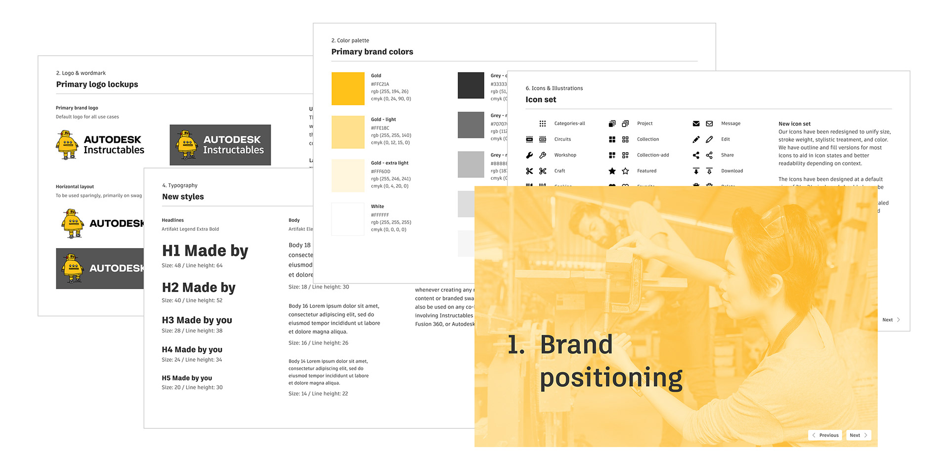
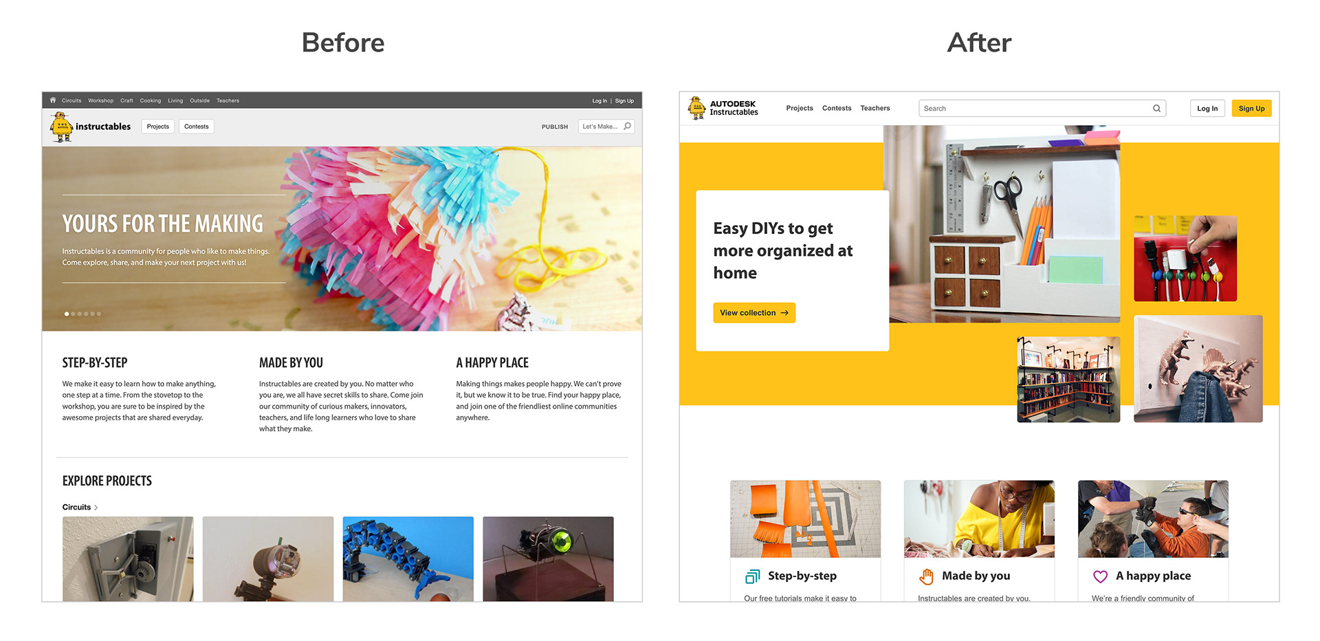
The Instructables website has evolved a lot over time. When I joined the team I conducted an audit across the site and found many inconsistencies in terms of brand style and visual treatment. I took the initiative to rebuild the style guide from scratch so that we could have a single source of truth, improve the accessibility of our site, and better reflect our creative brand and personality.
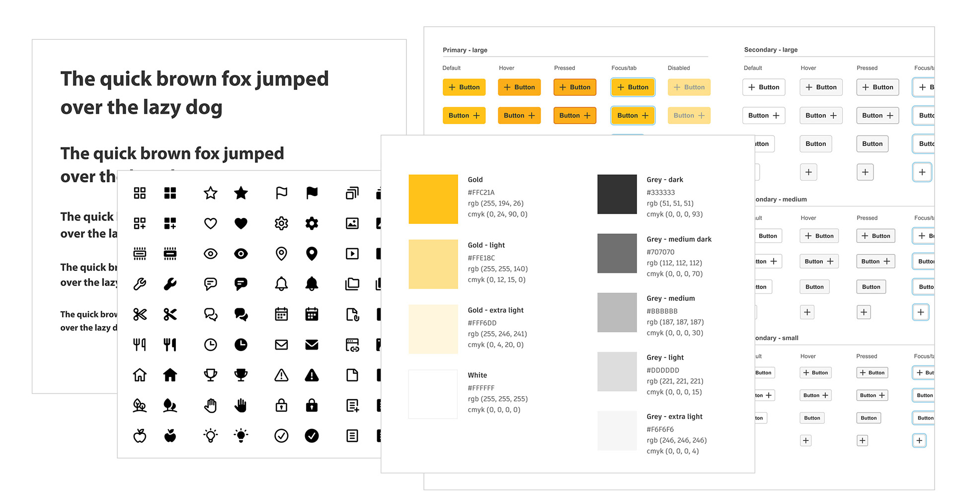
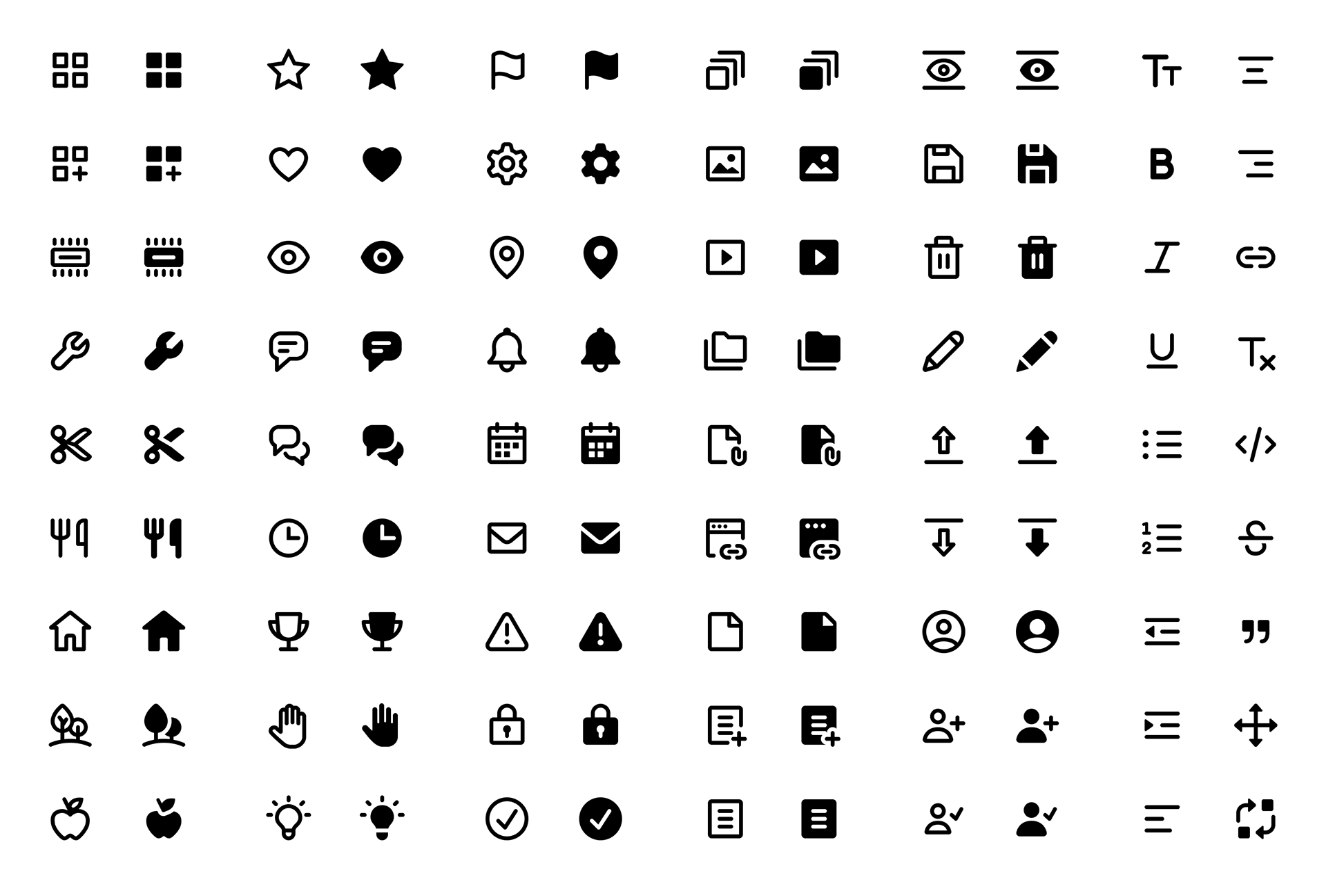
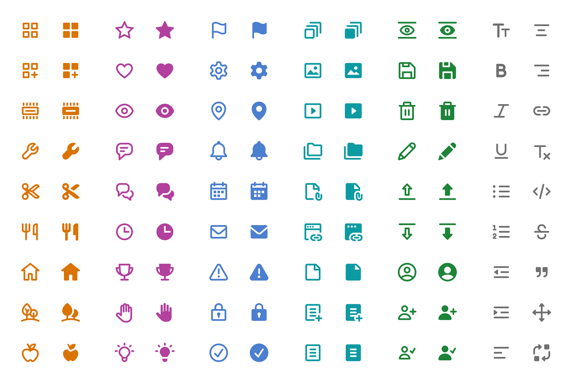
New icon library
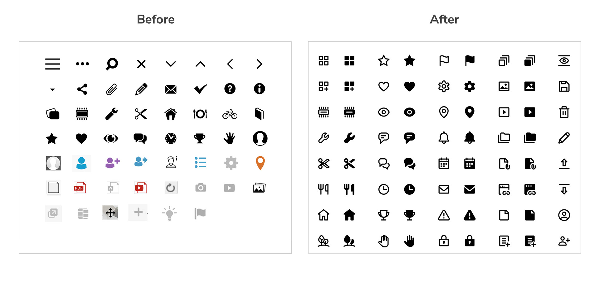
Before
• Inconsistent styling (stroke weights, perspective, etc.)
• Lots of small fine details that don’t scale well
After
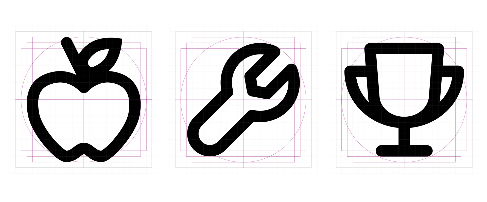
• Consistent stroke weight, size & styling
• Simplified modern shapes with friendly round personality
• Outline and fill versions for each to indicate different states
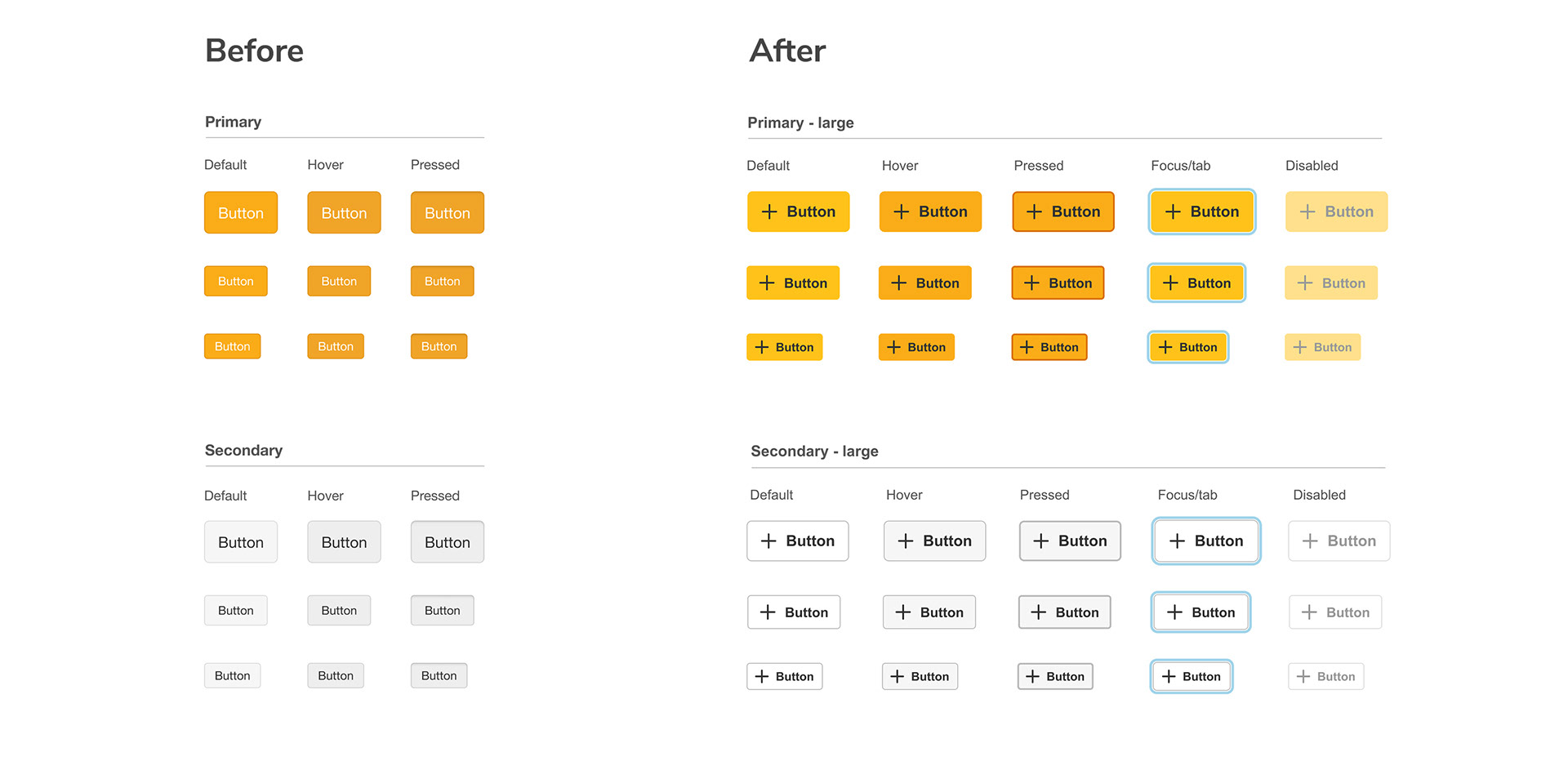
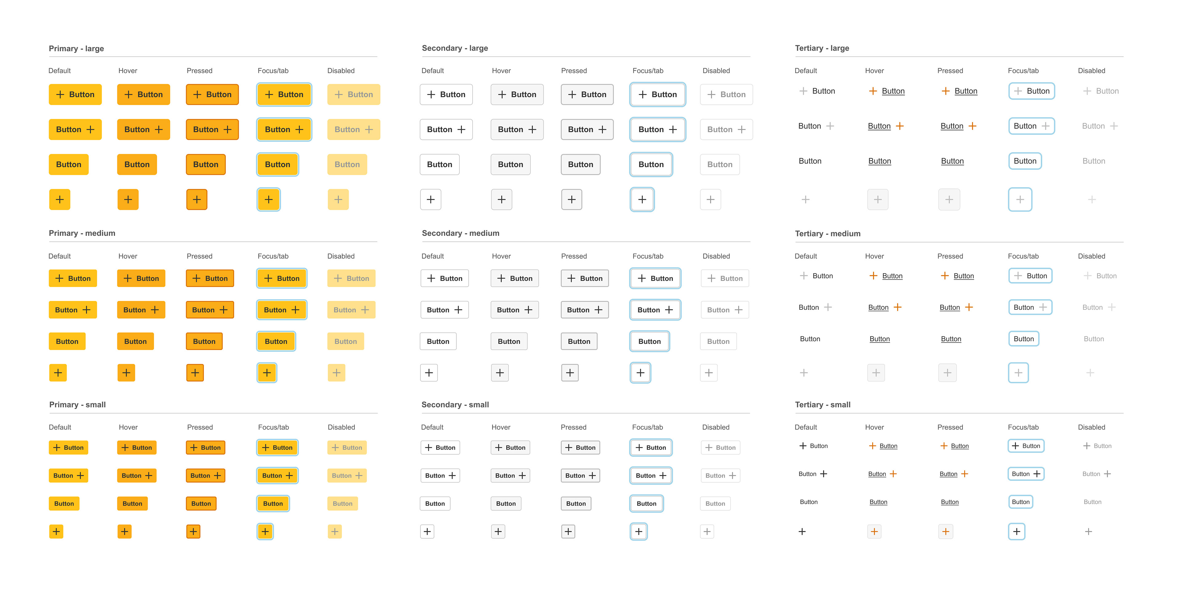
New button styles
Before
• Old button has contrast ratio of 1.91:1, fails even basic A accessibility standard
• Only 3 states, no focus state, they all look very similar
After
• Much better contrast of 7.92:1, passes AAA accessibility standards
• Bright yellow from logo is on brand, joyful
• New focus and disabled states and more obvious hover/pressed states
• More layout options with icon on either right or left side, no icon, icon only
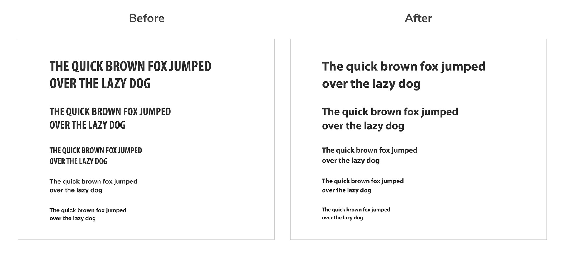
New typography styles
Before
• Lots of all caps and condensed text which are both harder to read
• Inconsistent link colors across the site and some don't meet A standard (3:1 ratio)
After
• Consistent sentence case for all headlines and no more condensed style
• Consistent link color across site and improved color contrast
New brand style guide document
After I worked through all of these updates I created a comprehensive style guide to share out with our internal and external teammates so that everyone had access to and alignment on the new brand positioning and visual standards.