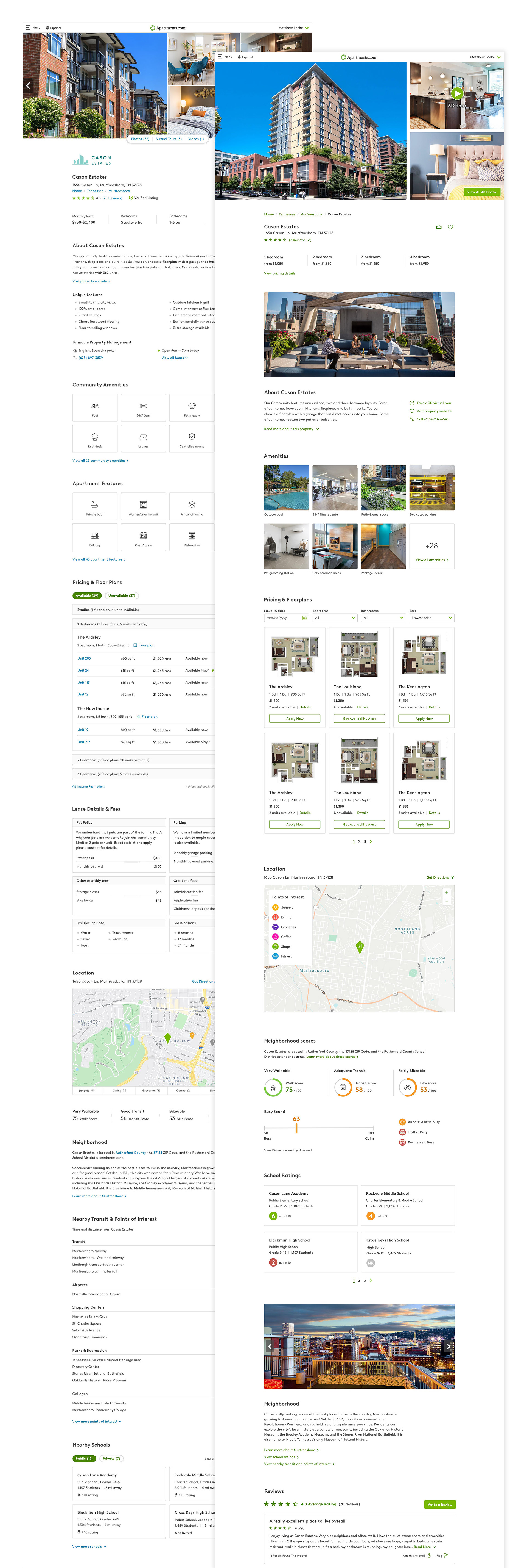
I was tasked with redesigning the apartment listing detail page to clean up and simplify the content, reduce page abandonment, evoke more emotion, and bring a "cool" factor. This started as a quick one-week design sprint to re-imagine how this page might look.
My roles: UI design, creating interactive prototypes, planning user testing.
Process
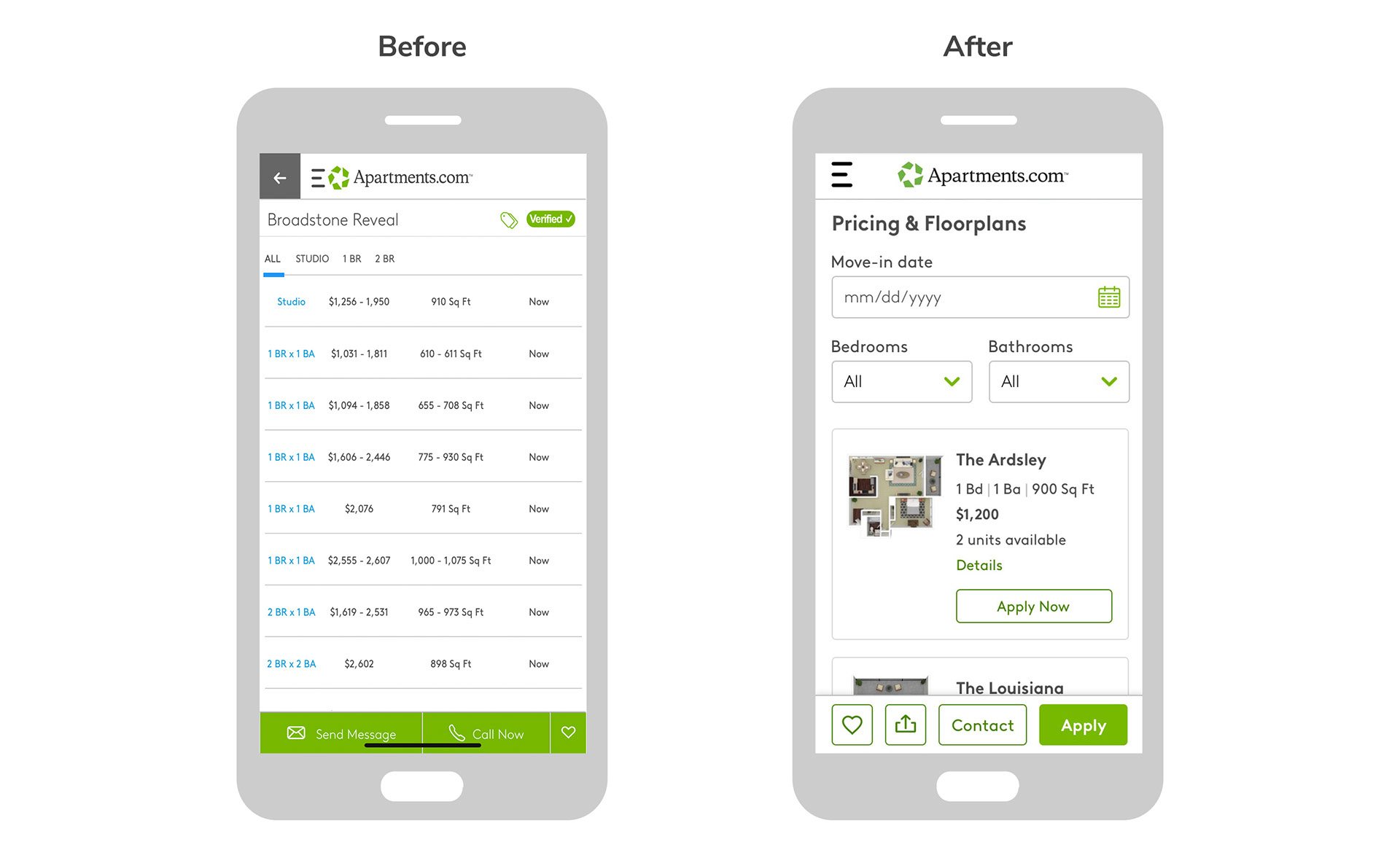
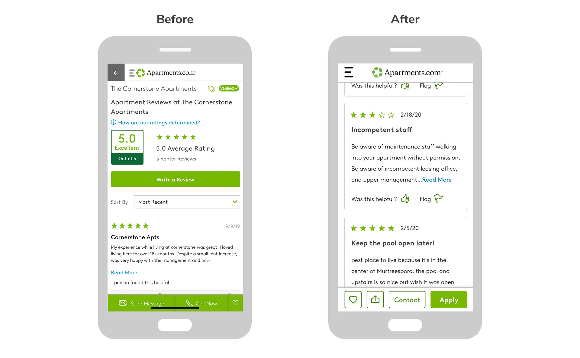
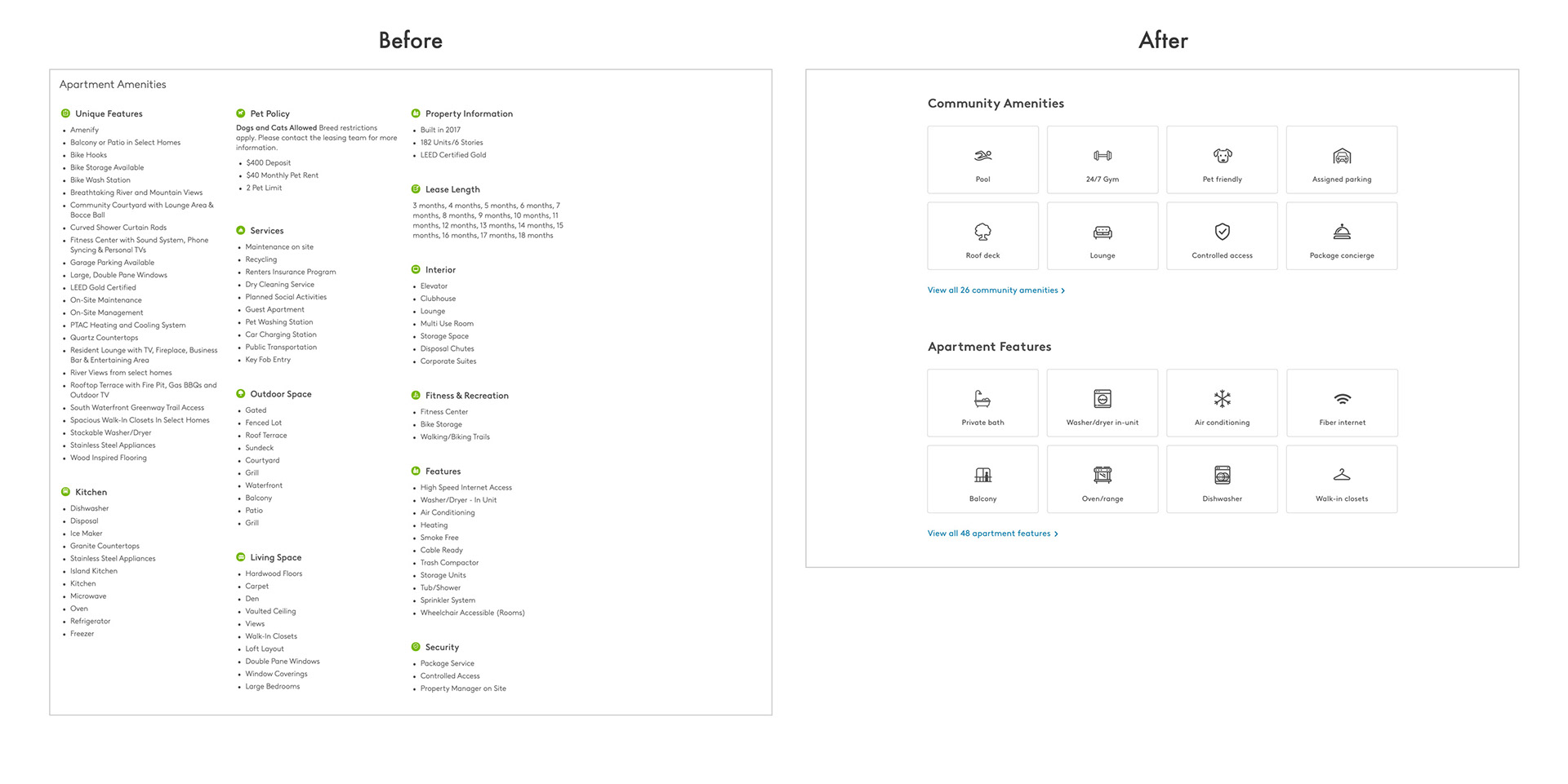
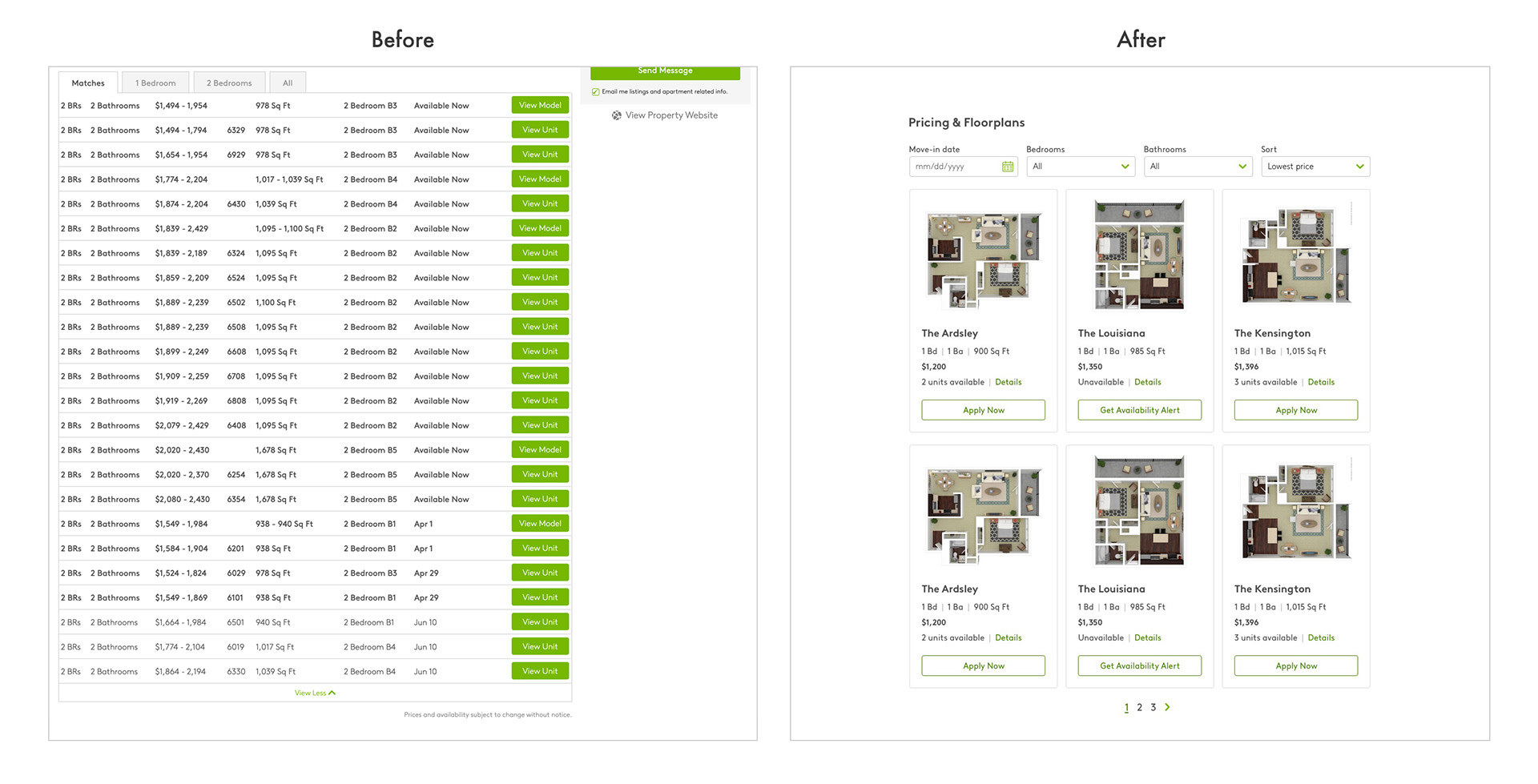
We learned from prior user testing that photos, pricing, and availability are the most important factors in influencing a decision to rent. The current pricing grid was described as complicated and hard to read and too many amenities and features were overwhelming.
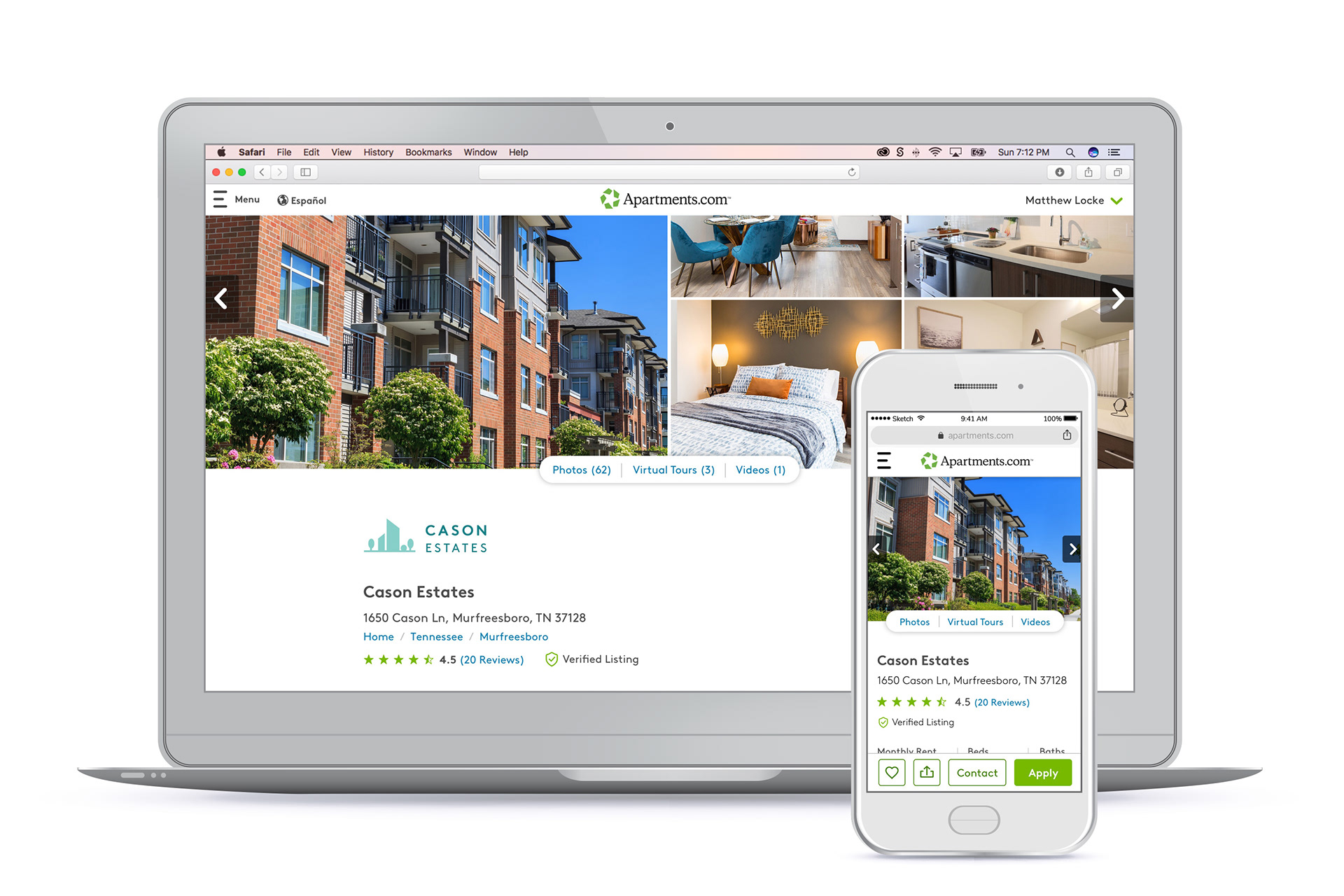
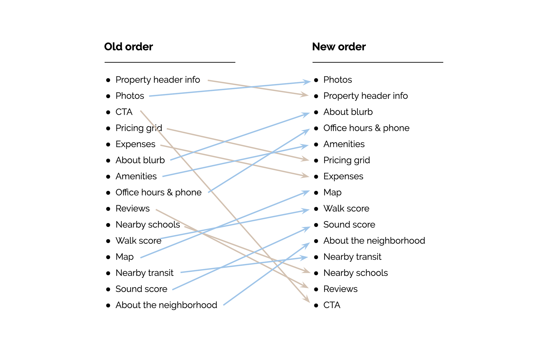
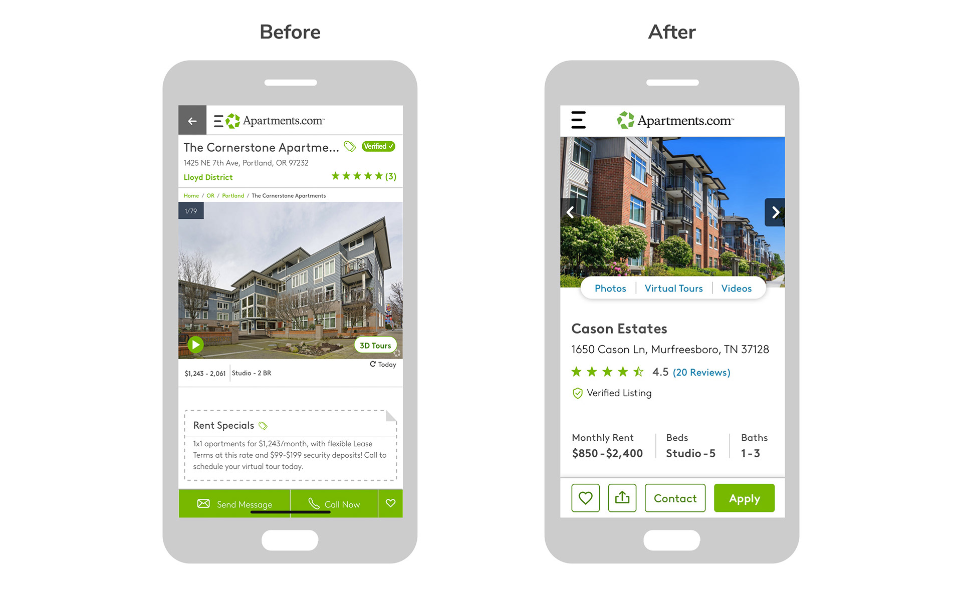
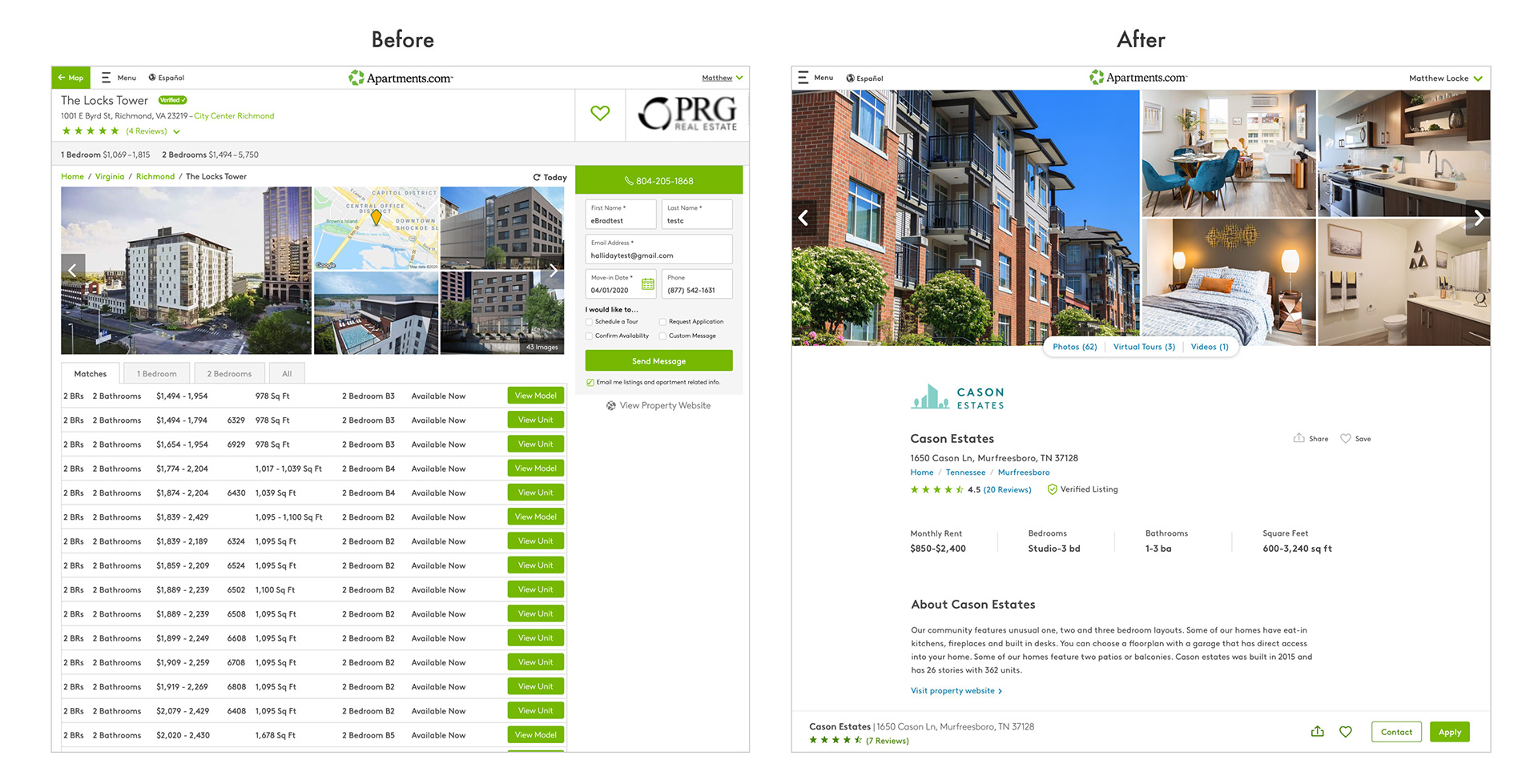
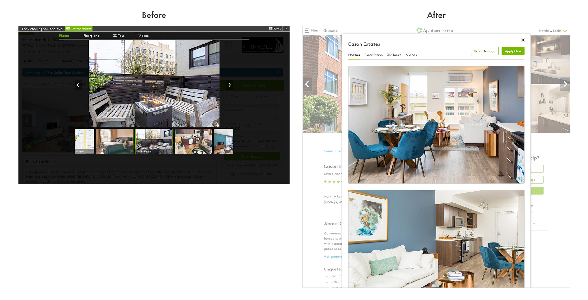
After reviewing the research findings, I began by taking a look at all of the existing content on the page and rethinking the organization and grouping of information. I decided to put the photos front and center to lead with more of an emotional connection. I also brought the About blurb and amenities info up so that users had a better idea of what they were getting before getting bogged down in pricing details.
Summary of ideas for improvement
Once I was feeling better about the basic user journey and flow of information on the page, I moved on to initial ideation.
• Open up the design with ample white space and clearly distinguishing sections to make it easier for users to quickly find what they are looking for.
• Move the CTA to a sticky footer (instead of a floating sidebar) which allows the page content to span the full width of the screen and reduces the noisiness of the page.
• Utilize progressive disclosure so that we are only showing the most important information first and helping direct and prioritize attention.
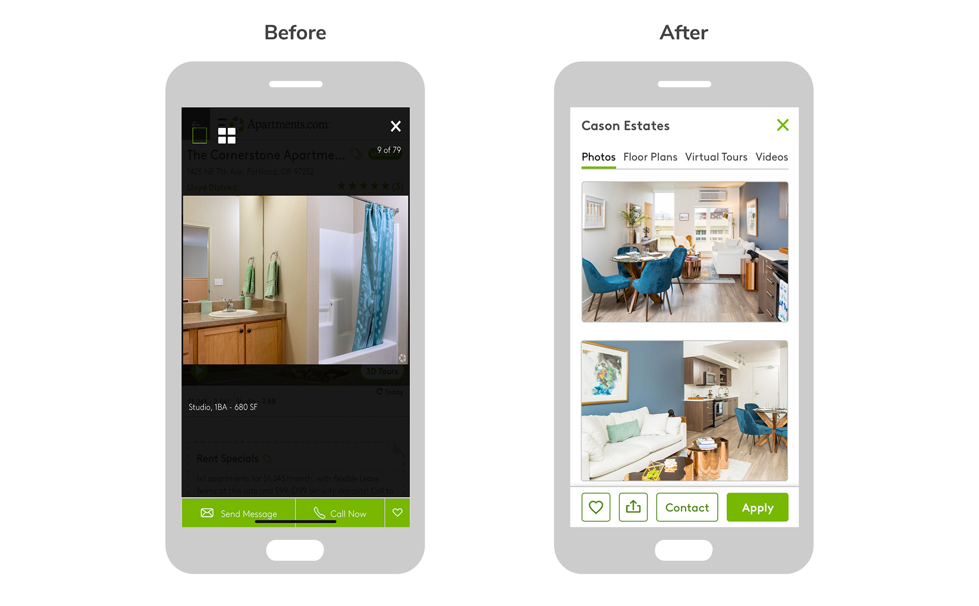
• Change the image gallery to a vertically scrolling page (instead of a carousel), which allows users to quickly scroll through images and get an idea of what the apartment looks like.
• Provide ways to quickly filter unit pricing results based on bedrooms. Display floor plan images right away, and simplify the content with better hierarchy to emphasize pricing and availability.
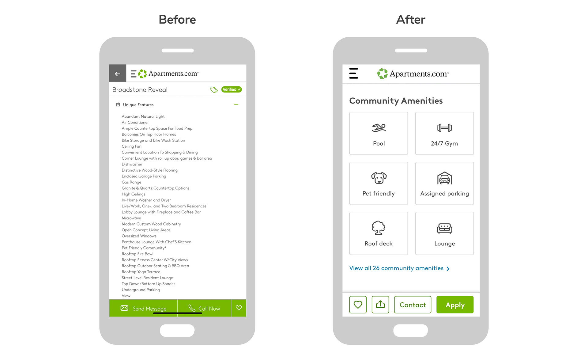
• Split community amenities & apartment features up into two separate categories and use large icons for quick visual scanning. Only display the most important features by default.
Mobile views
Desktop views
Next steps
Overall, everyone loved the new vision. I got a lot of helpful feedback from leadership as well as from our SEO team and I made some updates and iterations to explore how to balance this cleaner look with SEO optimization needs. Then I helped prep the design options for user testing to validate that the changes really did improve the user experience of the page.