The Tinkercad Classrooms workspace enables teachers to onboard students, monitor student progress, and review student work. I redesigned core areas of Classrooms based on teacher feedback in order to better support their needs and speed up their daily workflows.
I was the sole UX designer on a small Agile team. I conducted the initial research that surfaced teacher pain points, helped translate findings into solutions, created mockups, and worked with the team to spec, prioritize and launch the feature improvements.
Time: A series of projects over the course of late 2024 through 2025.
Problem to solve
The primary use case for Tinkercad is in the classroom. We have 3.2M registered teachers who manage ~4.5M monthly active students on Tinkercad. As such, it is incredibly important that we ensure teachers' needs are supported.
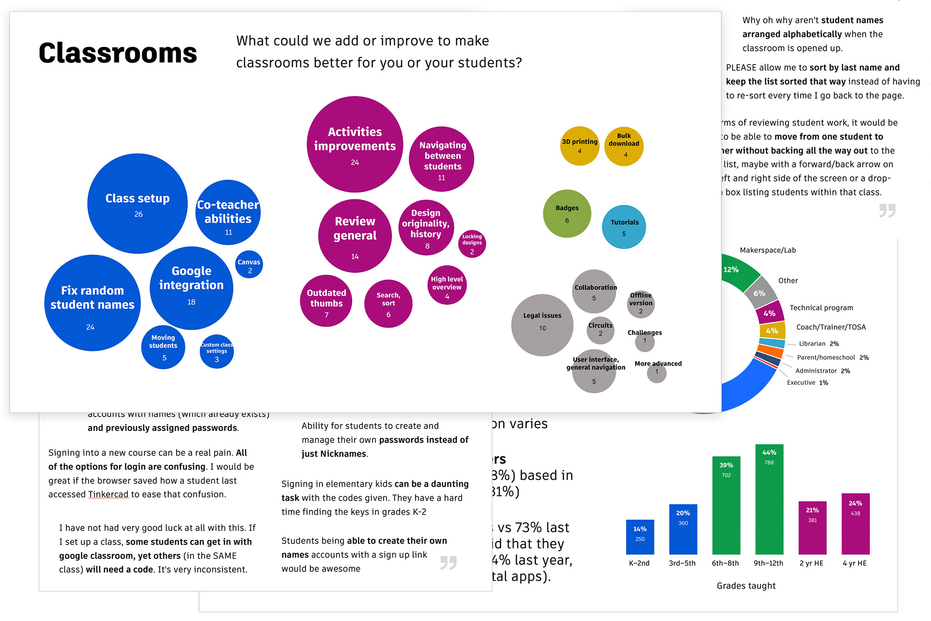
We send out a yearly teacher survey to understand how we’re doing and what we might improve to make Tinkercad more intuitive and supportive for teachers and students. The past few years many themes have emerged centering around our classroom workspace.
After synthesizing the results from the annual survey, I was able to report back on some of the biggest pain points teachers were experiencing and the most impactful opportunities for improvement. Some of the most frequently mentioned topics revolved around classroom setup, navigation, and reviewing student work. We then prioritized these pain points and split them up into smaller projects.
Teacher interviews
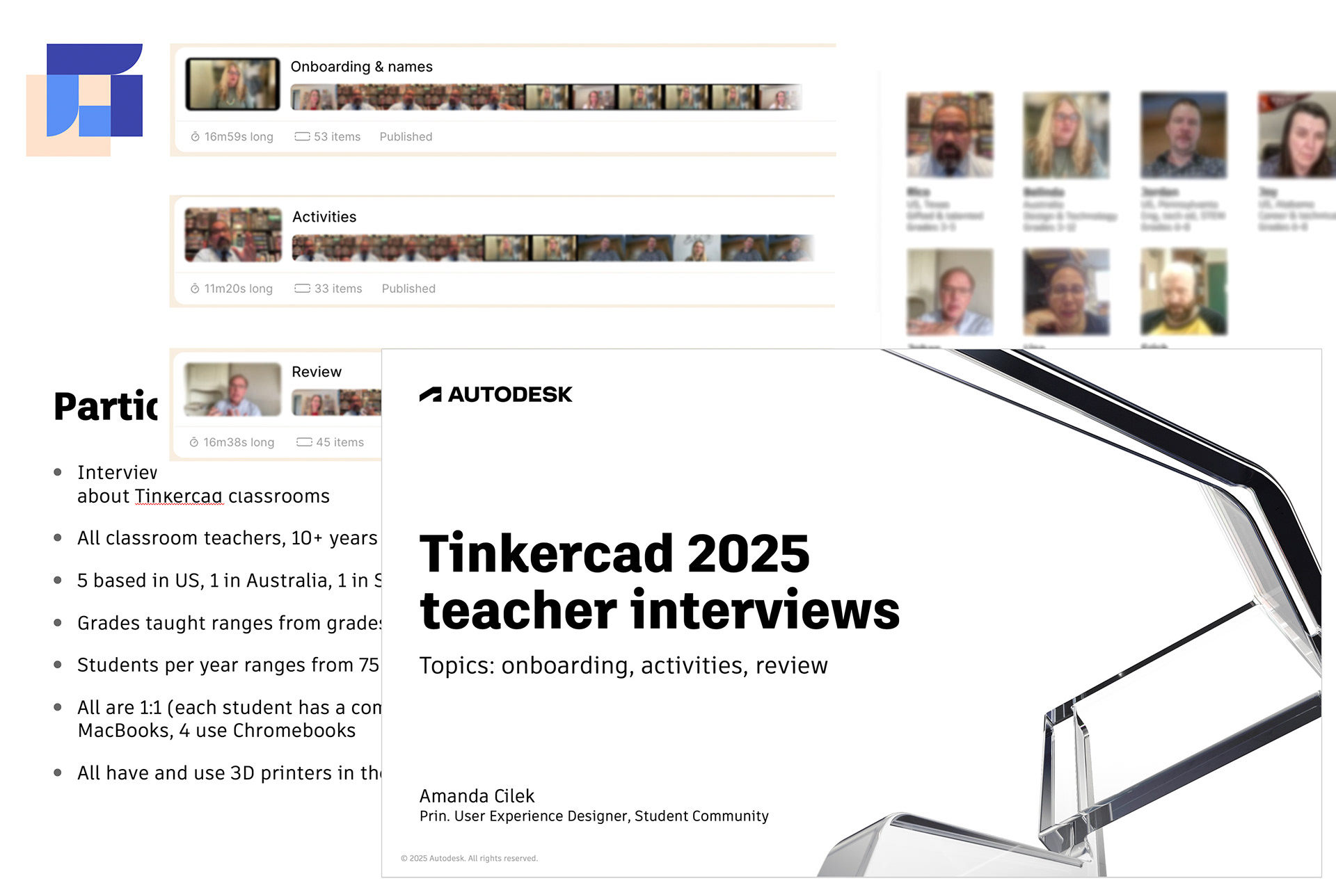
The challenges teachers were experiencing with classroom setup seemed like a top priority. Because of how complex this topic is, and because of the range of experiences and opinions, I suggested that we start with some additional deeper research to better understand the problems and context. I planned and conducted 1:1 video interviews with 7 teachers from a wide array of backgrounds and geos focusing on this topic. I then created summaries of the key findings as well as video highlight reels to pitch the project to leadership.
Quotes on student names:
“The student management features are very lacking.”
“I have no idea who most of my students are unless they go in and edit their profile because you randomly generate a name for them.”
“Add a column in the dashboard that shows students' names so that they can make-up a completely anonymous username and I can still see who is who.”
Key findings from the interviews
• Confusion about the various methods to add students and key differences. May muddle through with workarounds because no time to investigate.
• Balance privacy with clarity. Everyone wants to maintain student privacy. But it is also very important to teachers that they themselves know who is who in the app.
• Flexibility is key. Lots of different opinions on how the student name should appear, if at all. Our solution needs to be flexible and leave teachers in control.
Improved onboarding solutions
It took a lot of internal discussion and brainstorming with various stakeholders and subject matter experts to arrive at our final solutions for how to improve onboarding. We had to consider technical constraints as well as the legal landscape to ensure our approach was feasible. Here's what we landed on:
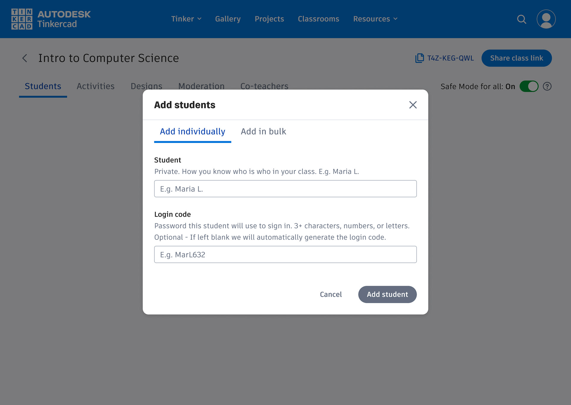
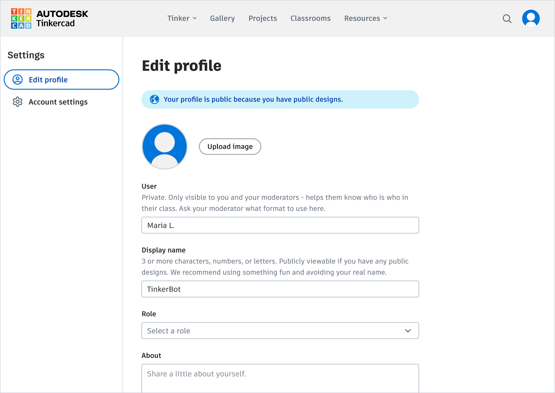
• Split into two fields for maximum flexibility. We updated our handling of student names so that there are separate private names and public display names.
• Student names are always private and we don't dictate the format.
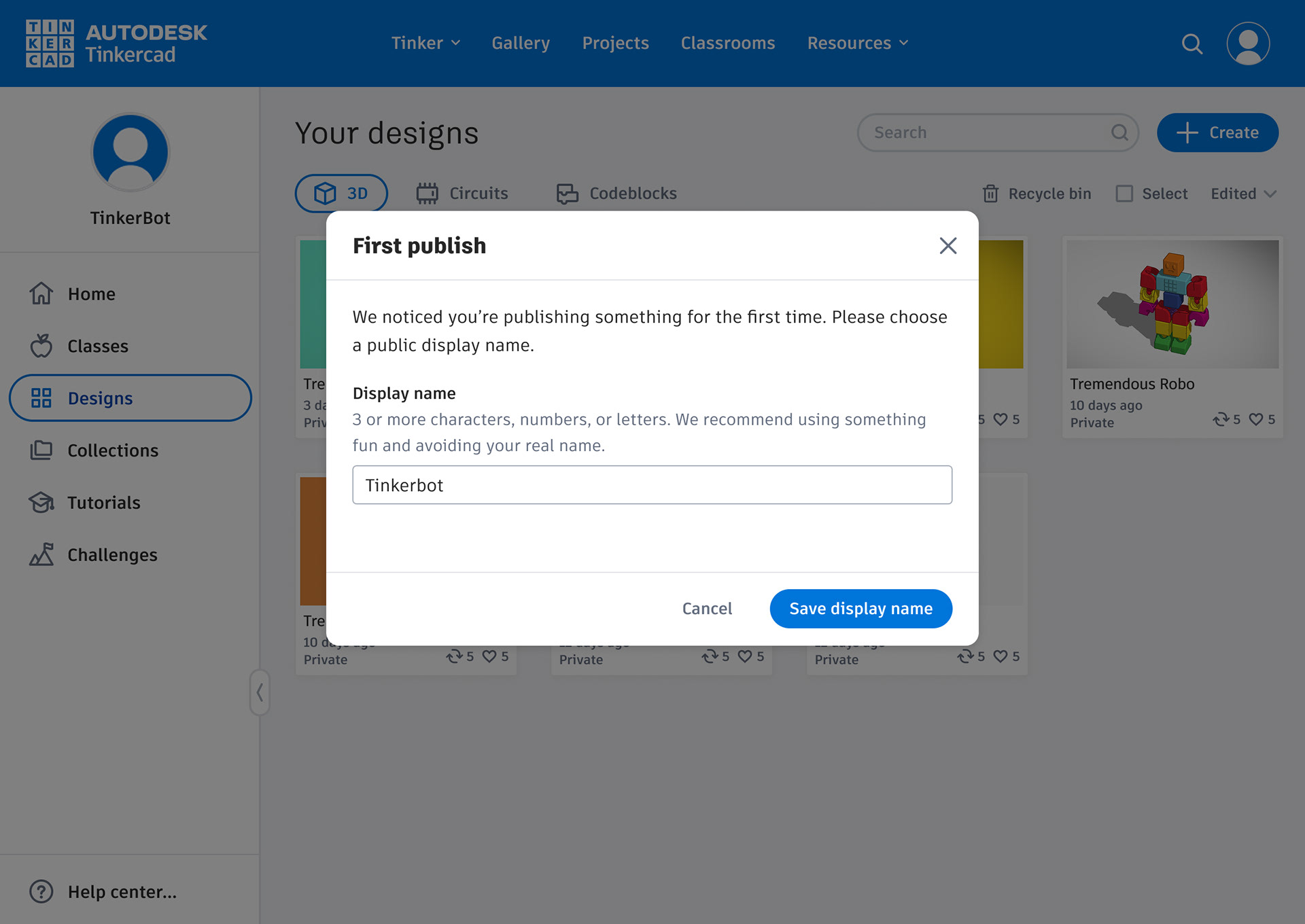
• We prompt for a display name when someone tries to publish for the first time.
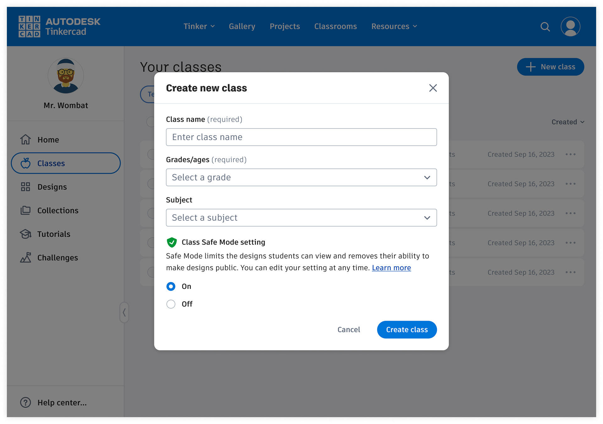
• Improve class empty state to clarify options, with a link to learn more.
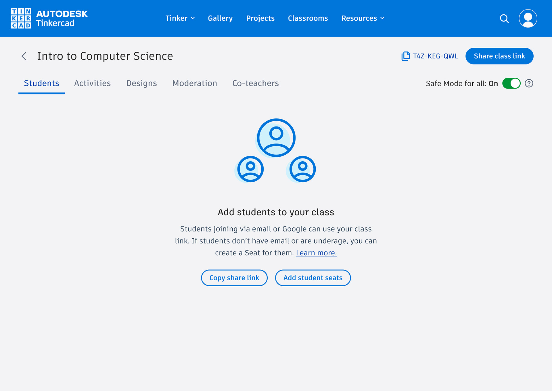
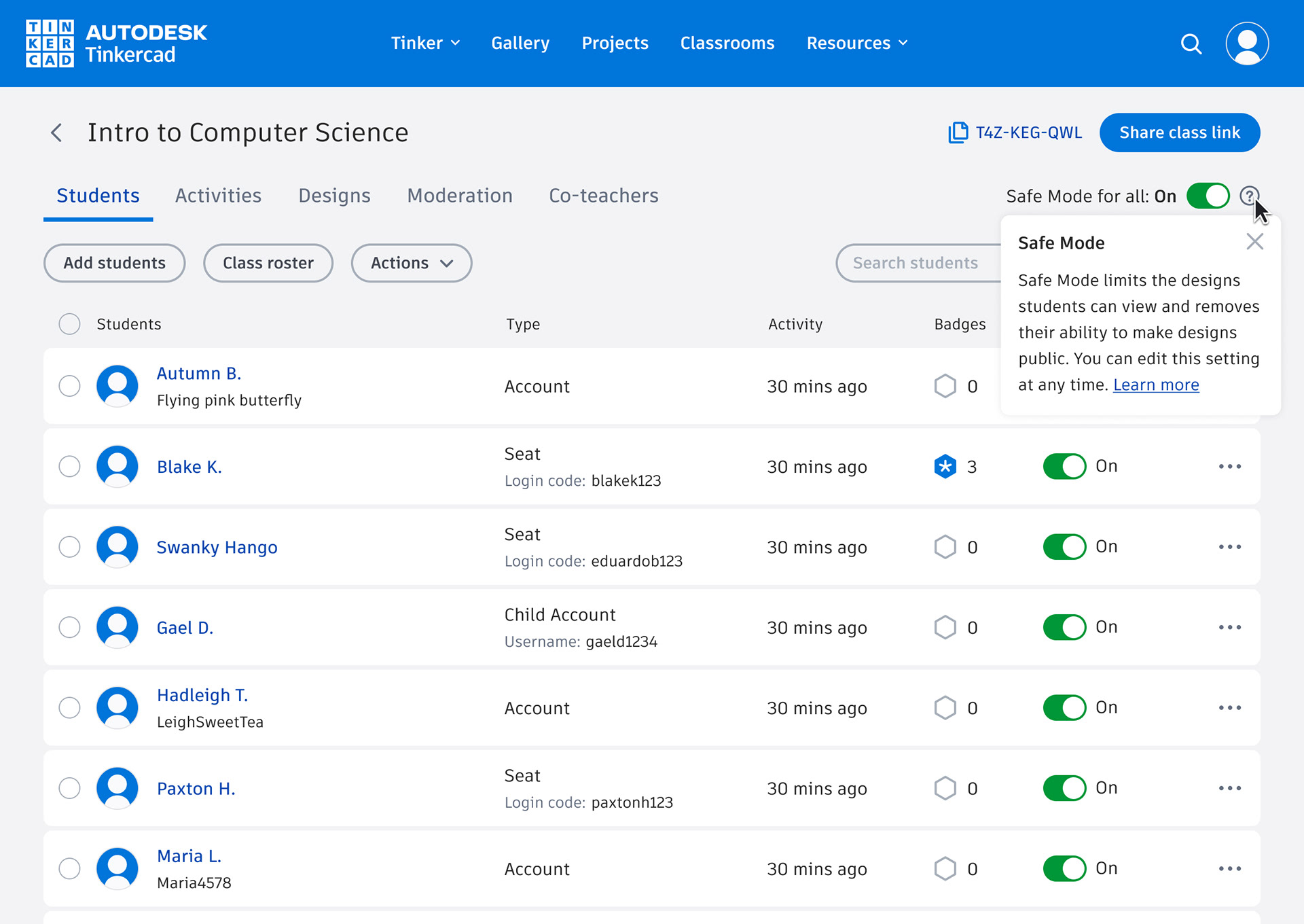
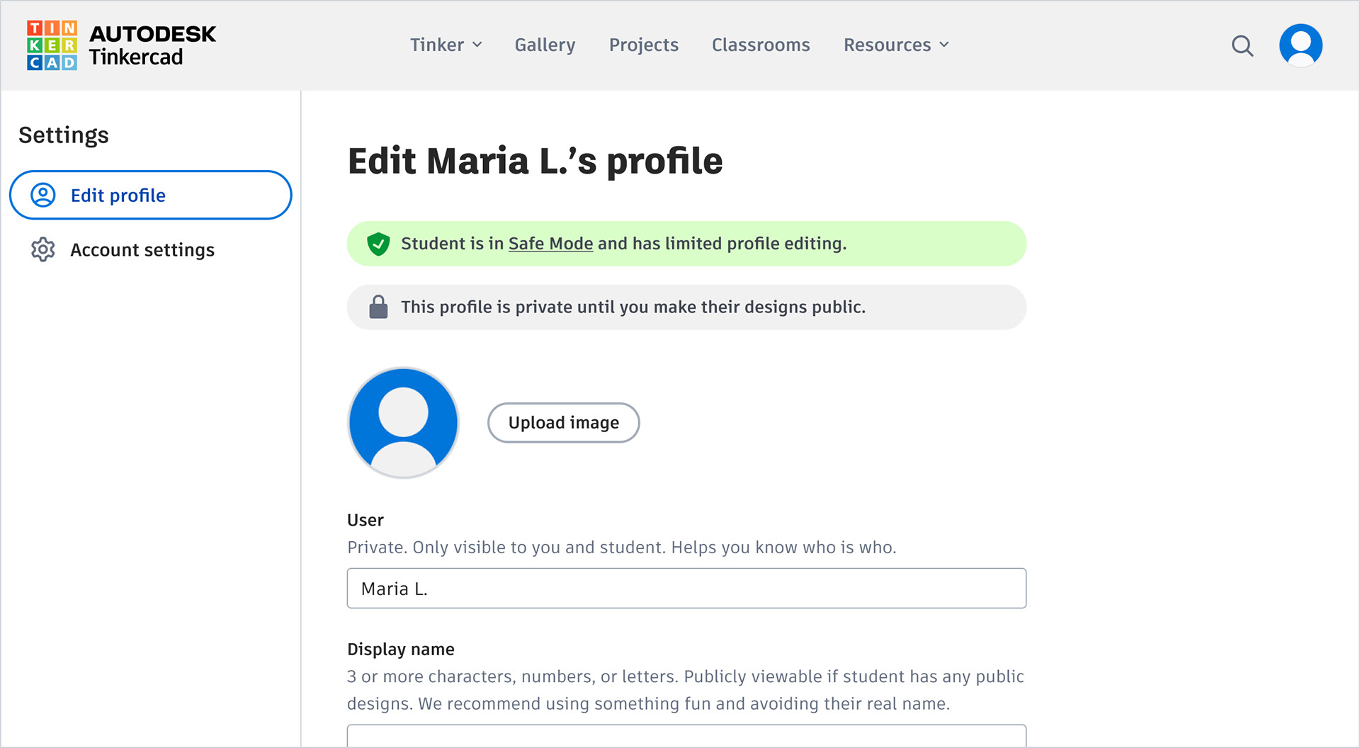
Safe mode opportunities
Most respondents (43%) have no idea whether or not their class is in safe mode (awareness issue). For those that leave it on, most say they didn't think about it or just kept the default.
Safe mode quotes:
“I've been using Tinkercad for several years and I didn't even know that Safe Mode existed.”
“I don't know if it is turned on? Where do I see that?”
“Safe mode? How the heck do I turn this off?”
Safe mode solutions
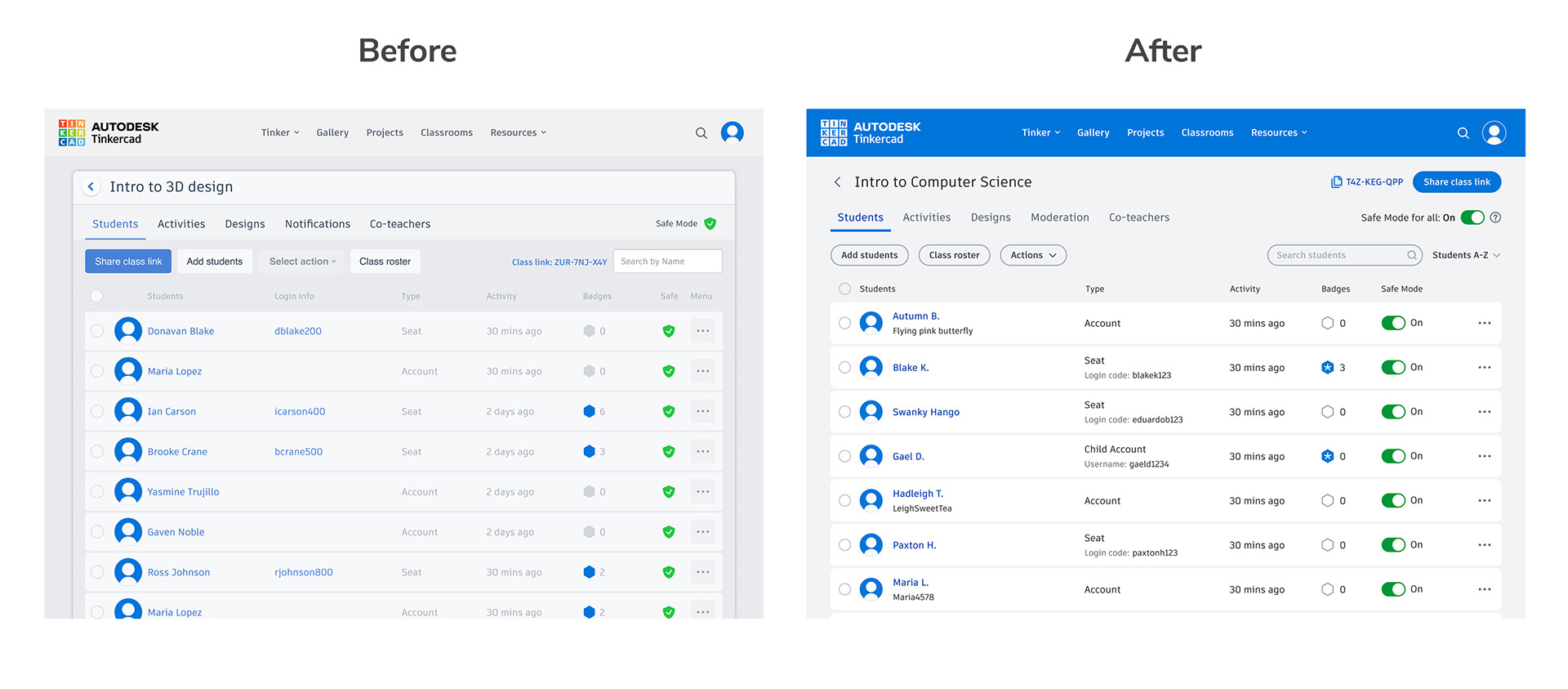
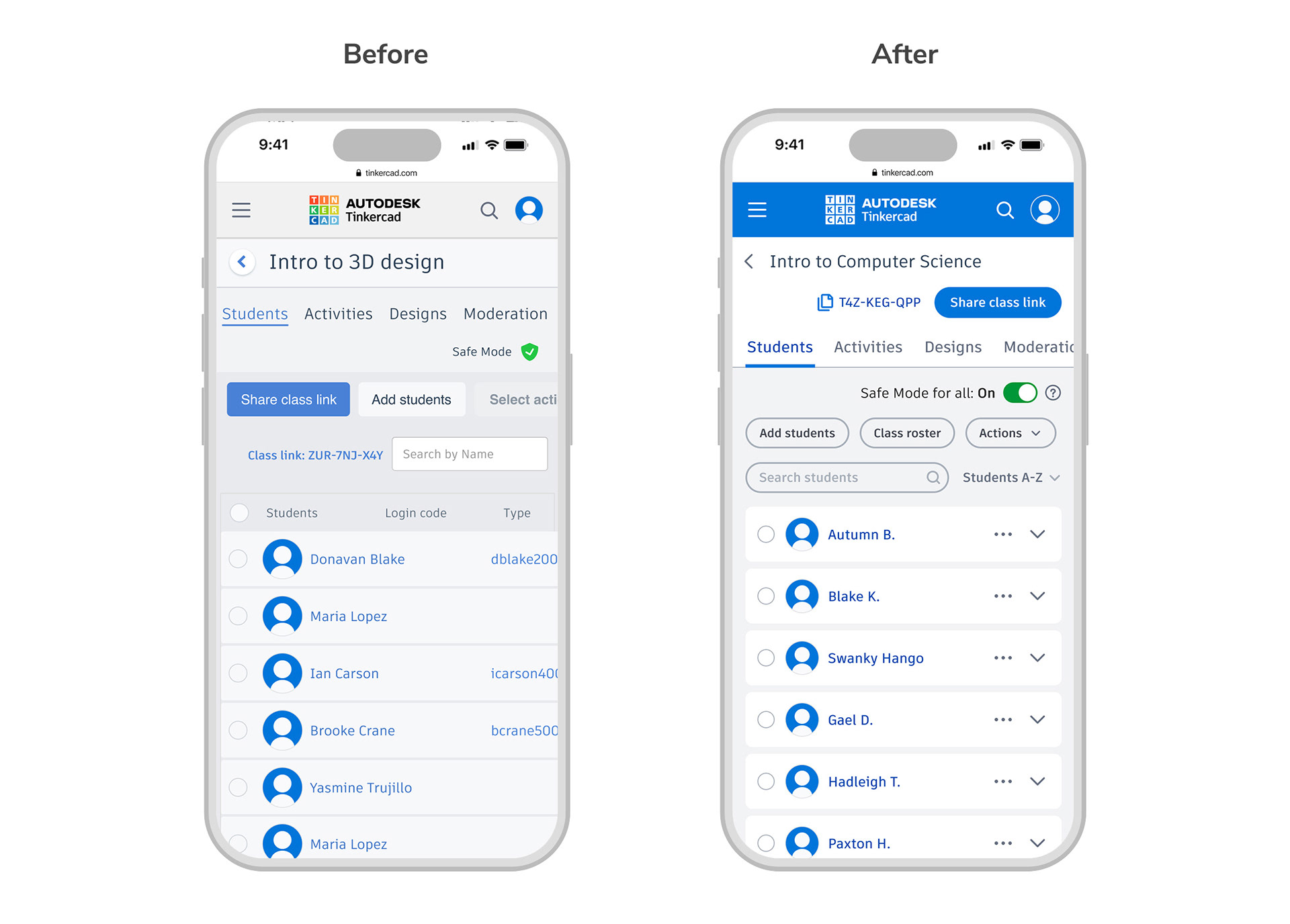
In order to solve the awareness problem I suggested we have more touch points highlighting and explaining Safe Mode. We also updated the classroom styling.
• Added a blurb about Safe Mode when teachers are creating a new class.
• Re-styled Classroom Safe Mode switch so that it actually looks like an actionable toggle, and added text labels for maximum clarity.
• Added help icon and learn more link next to main toggle with a brief description.
• Added callouts on student profiles stating if the student is in Safe Mode.
Navigation opportunities
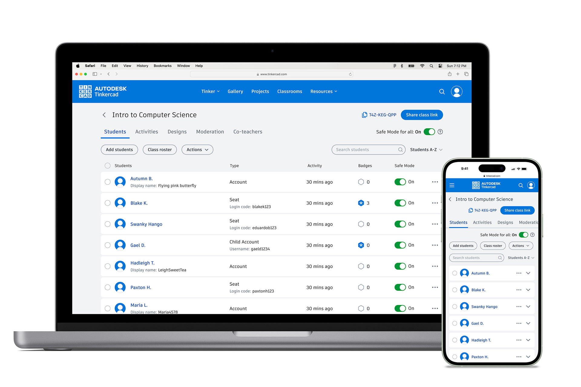
The original Classrooms workspace had some challenges in terms of getting around and presenting content to teachers in meaningful ways. Student activity was split apart by workspace so there was no overarching view of latest work. There was no way to change the sorting of students or designs. And it took teachers many clicks to view student work and then move on to the next student.
Teacher quotes:
“PLEASE allow me to sort by last name and keep the list sorted that way instead of having to re-sort every time I go back to the page.”
“In terms of reviewing student work, it would be nice to be able to move from one student to another without backing all the way out.”
“When looking at a students work I would like to be able to just go from student to student and not back to the main page to pick classroom then the student again.”
Navigation solutions
The necessary improvements to general navigation, filtering, and sorting were fairly straightforward and clear from a heuristic UX analysis. The ability to arrow through student work was a request we heard so often from teachers that it just made sense. I conducted a competitive analysis of how other LMS platforms handle review and used that as a foundation for our approach, so that we took advantage of design patterns teachers were already accustomed to using.
• Added sorting functionality to all views so teachers can toggle between last edited, created date, and alphabetically by design or student name.
• Added sorting functionality to all views so teachers can toggle between last edited, created date, and alphabetically by design or student name.
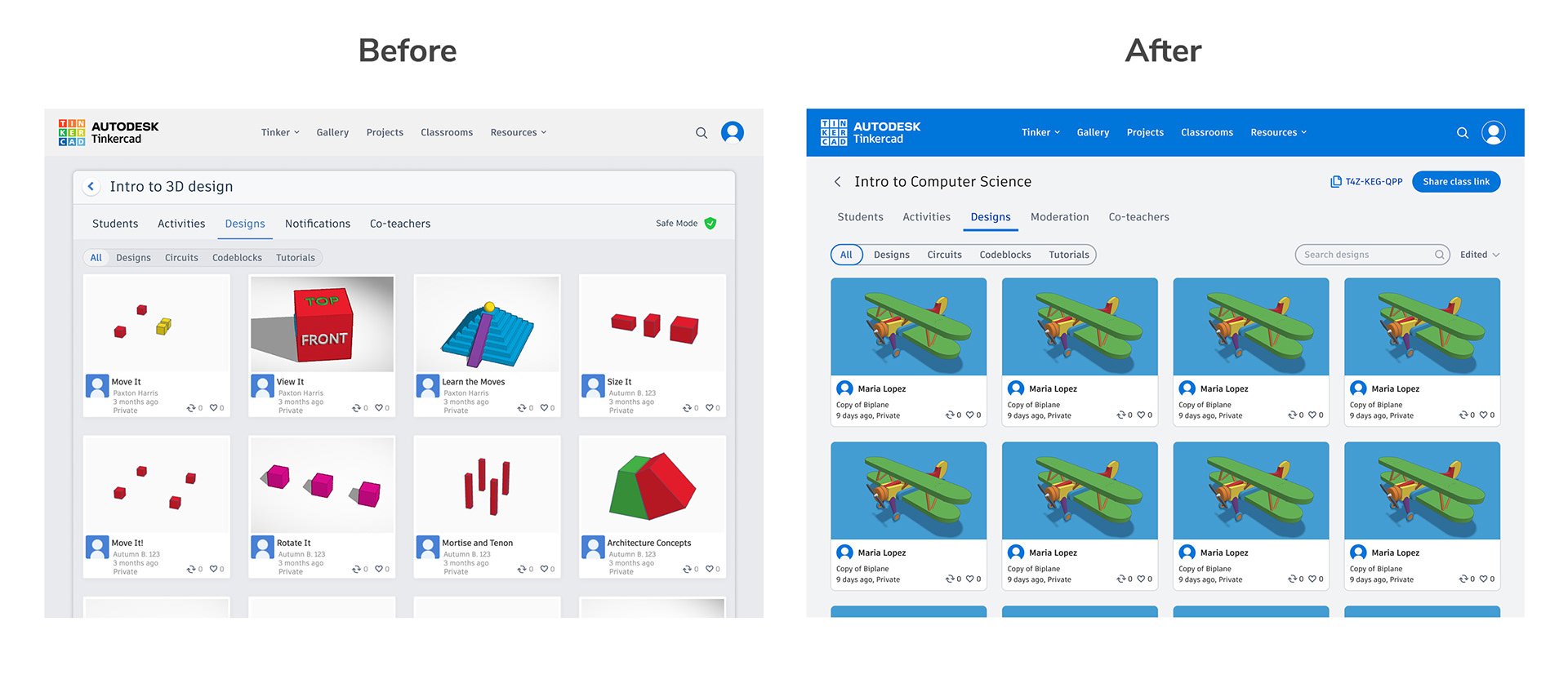
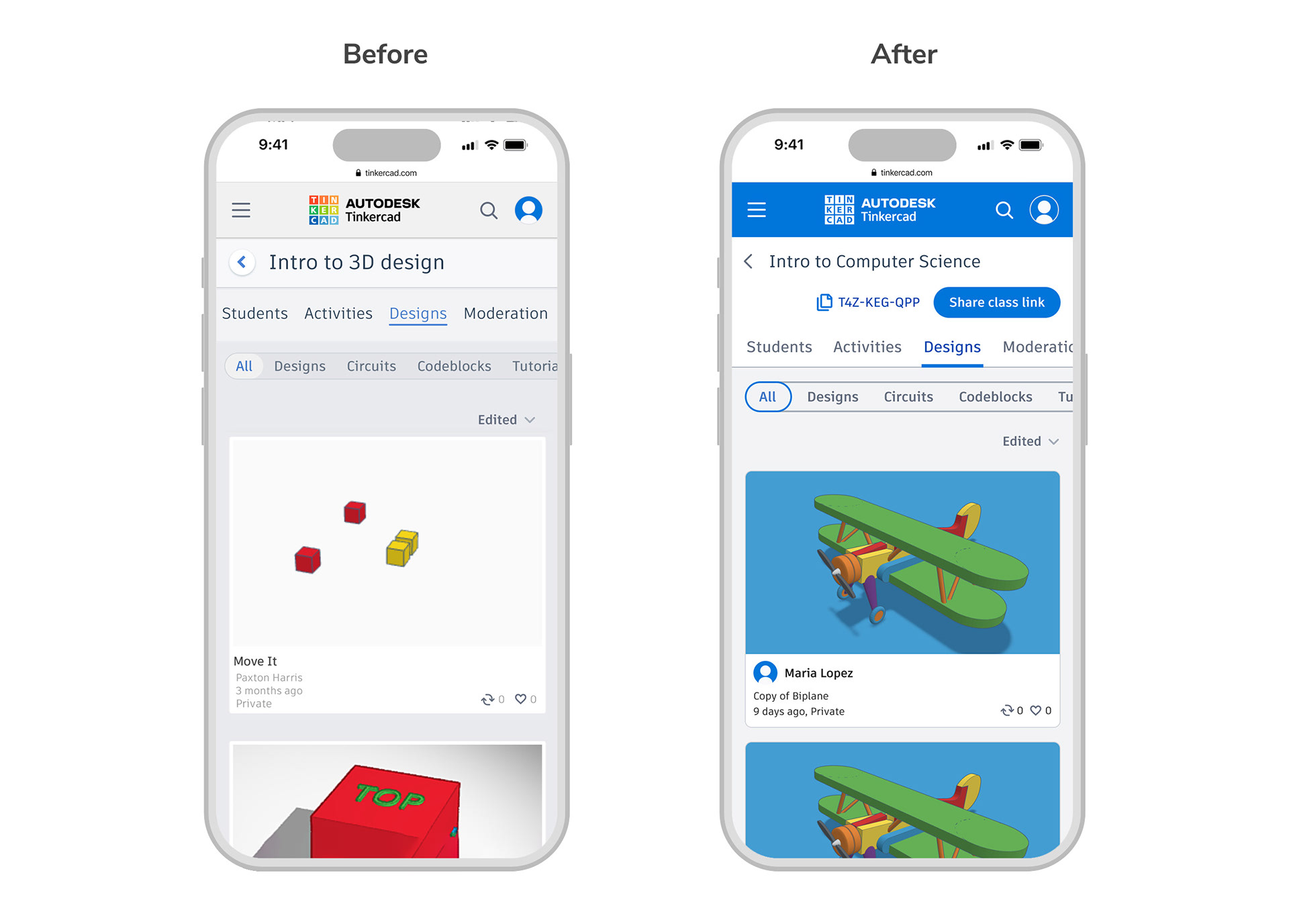
• Added high level All tabs on Activities and Designs so that teachers can have a bird’s eye view of all student activity across different workspaces.
• New student view to quickly navigate between different students, view student work, and access student profiles.
• Ability to arrow through different design preview pages to help with teacher review.
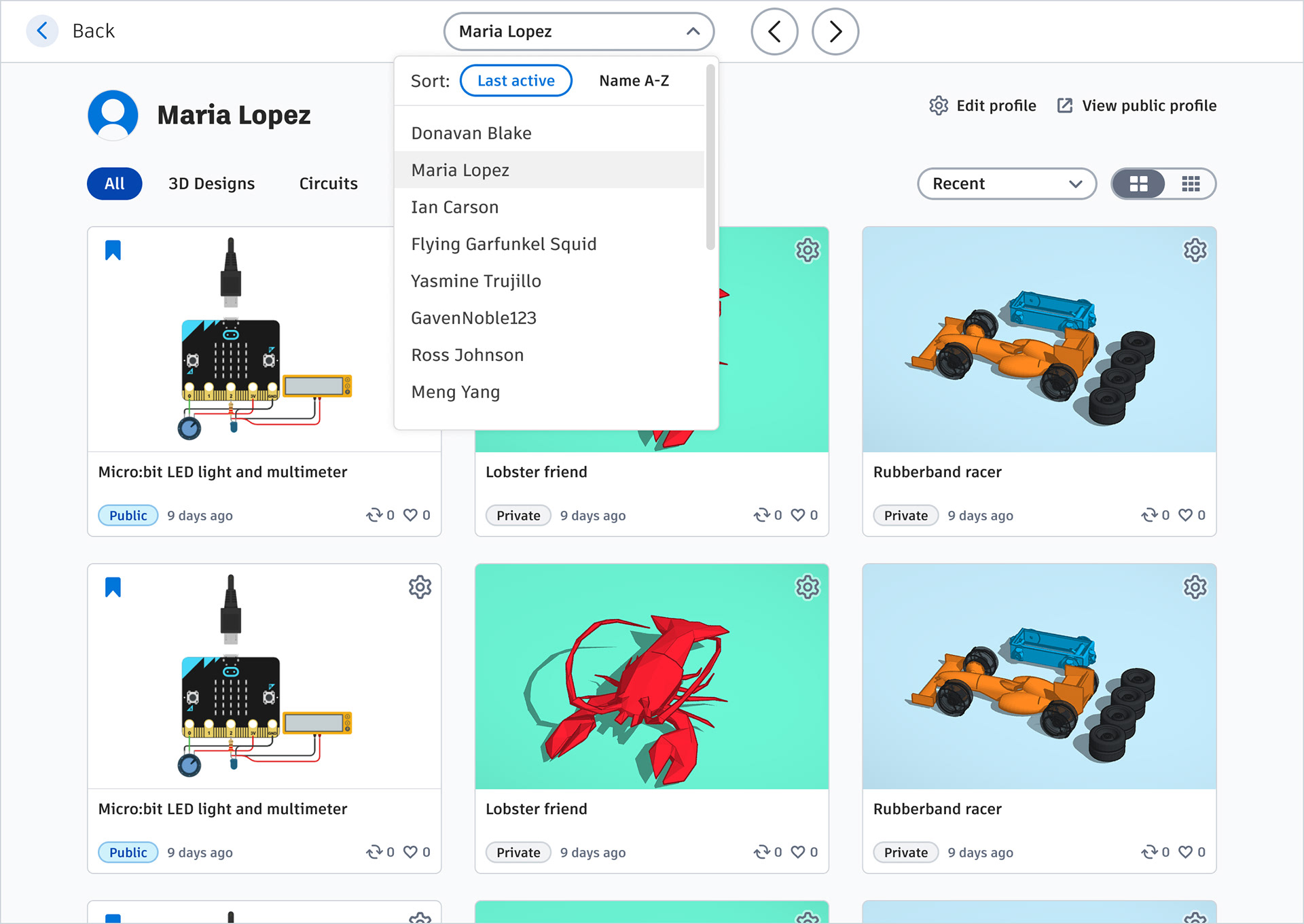
Brand new student view with left and right arrows so teachers can navigate quickly from student to student. Or, they can use the dropdown to jump to a specific student.
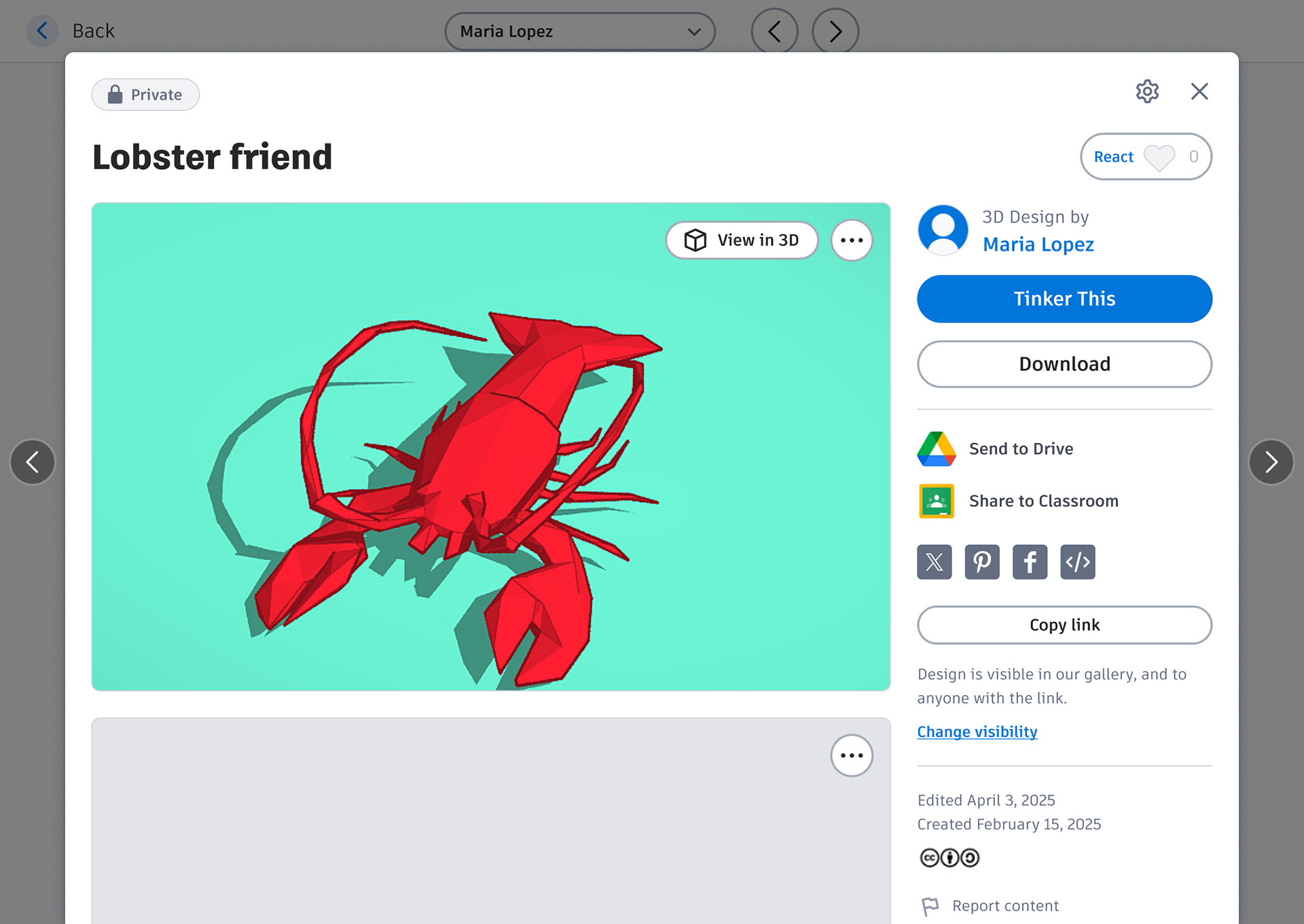
Left and right arrows allow teachers to quickly navigate from one design detail page to the next, speeding up the review process.
UI, accessibility & responsive
While we were making changes to Classrooms we decided to also give the UI an update and make it more accessible and responsive. This work has been split into phases to aid agile development. Some of the first things we’ve addressed include:
• Updated buttons and UI to match Tinkercad’s new website brand styles.
• Updated all type colors for better contrast and legibility.
• Improved the responsive scaling so that teachers can use on smaller devices.
• Design cards highlight students' names rather than design title
Measuring success
The product design process at Tinkercad is always ongoing and iterative. We will continue listening to teachers and centering their feedback as we co-design together to advance our shared goals of STEM learning in the classroom. By centering teachers in the design process we hope to avoid assumptions and better ensure that Tinkercad’s classroom products are effective and relevant to teachers’ actual daily workflows.