This was a branding redesign exercise for a design workshop class. My goal was to address perception problems with MSF's existing identity. Information about the state of MSF's perception problem was found in MSF's report, In the Eyes of Others: How People in Crises Perceive Humanitarian Aid. The report states that many people have a difficult time recognizing the connection between MSF's name in its various translations and the acronym MSF. It also said that the MSF imagery is not always known or understood. For instance, in Kenya, people tended to see the logo as a man holding a spear.
MSF's current existing logo
My logo design focuses on communicating the core beliefs of MSF: Independence, neutrality, and impartiality. A reference to the red cross made sense, as the red cross is the most universally recognized symbol for healthcare and aid, but I didn't want it to be so referential that it would be confused with the Red Cross organization. I also wanted to somehow illustrate the idea of interconnectedness and crossing borders. The final logo design retains a cross in the negative space at the center but the emphasis is on the four heart shapes with linked arms that connect everything together.
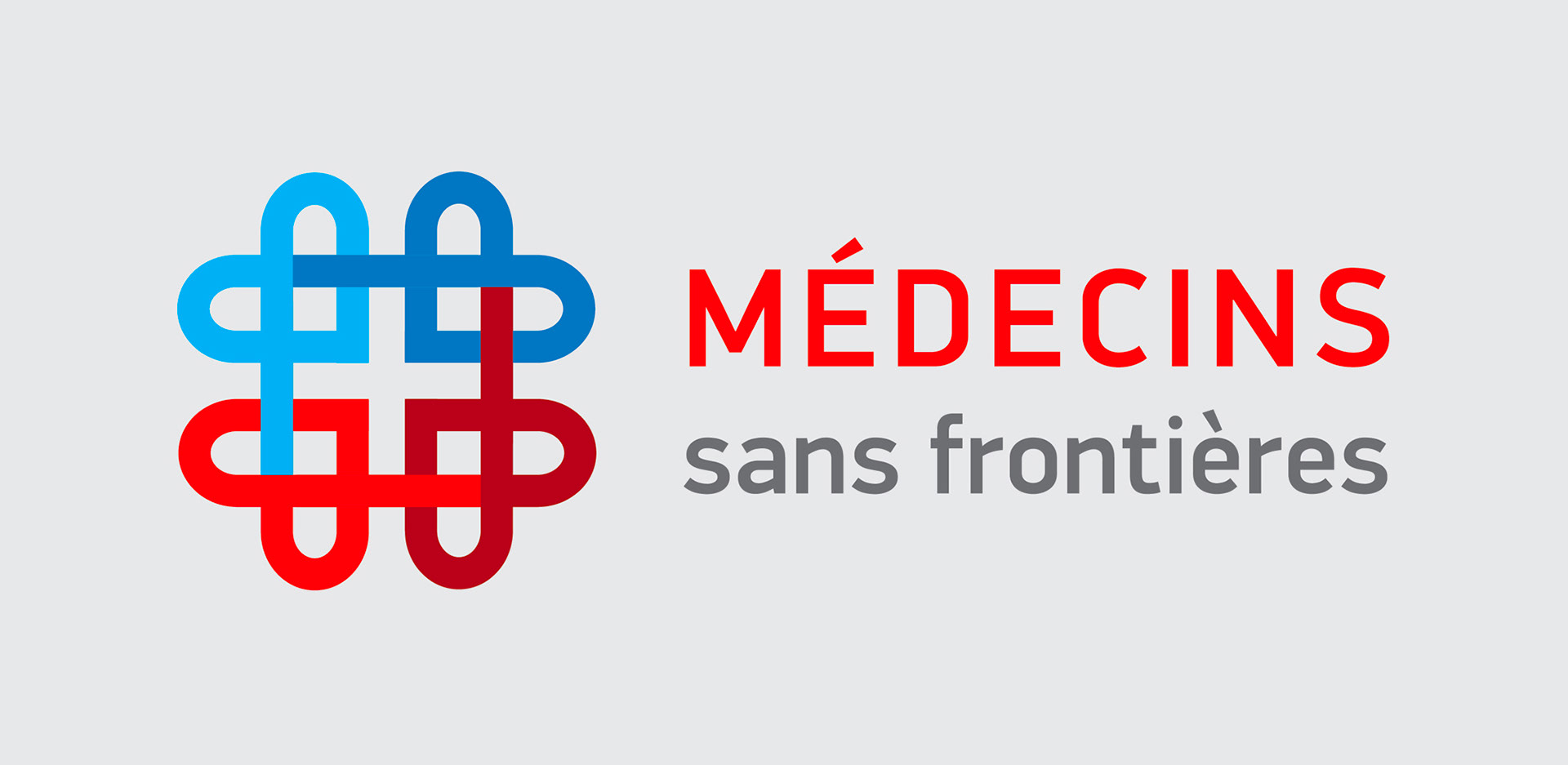
The new logo
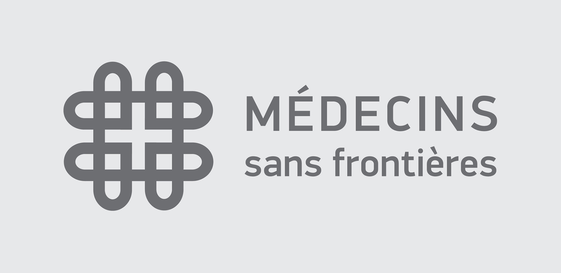
The logo in a single color
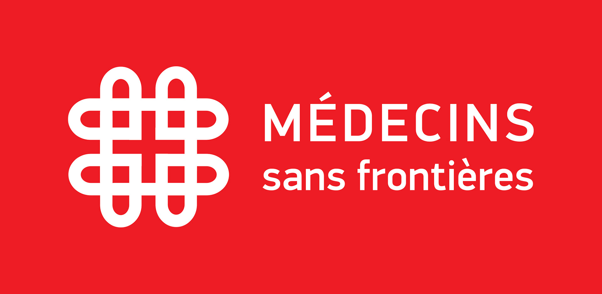
Reversed out of a solid color
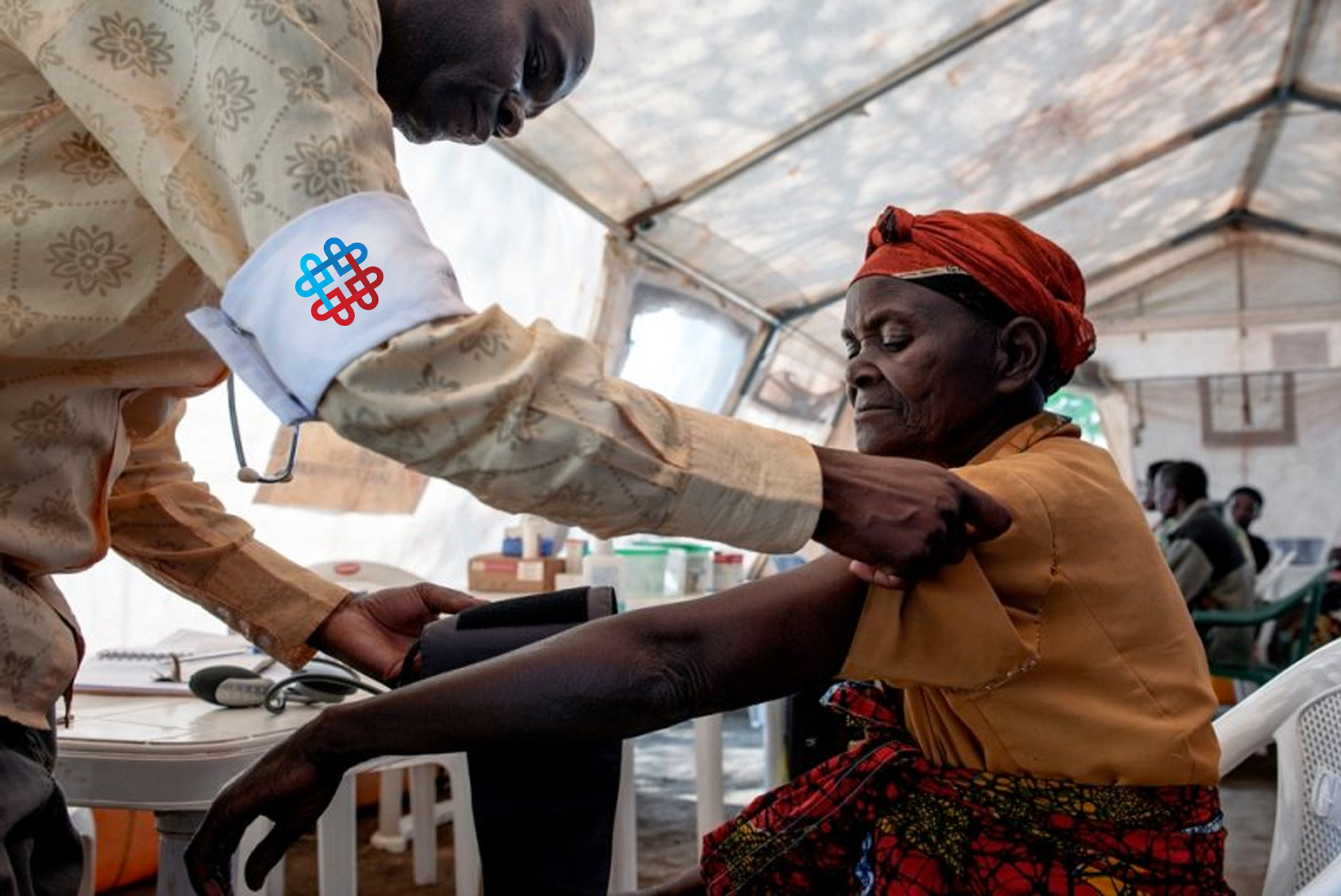
Logo mockup. Image copyright © Médecins Sans Frontières.
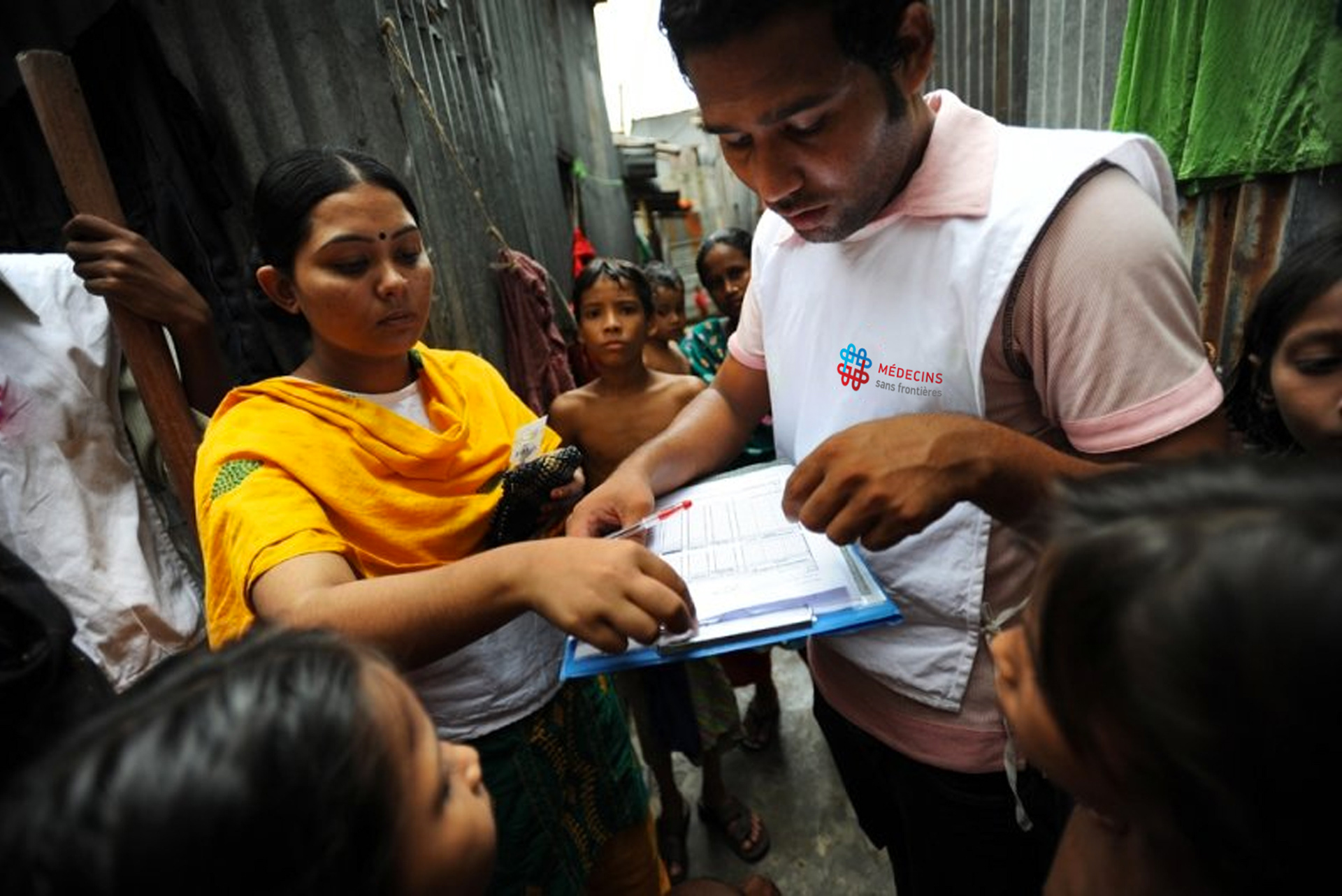
Logo mockup. Image copyright © Médecins Sans Frontières.
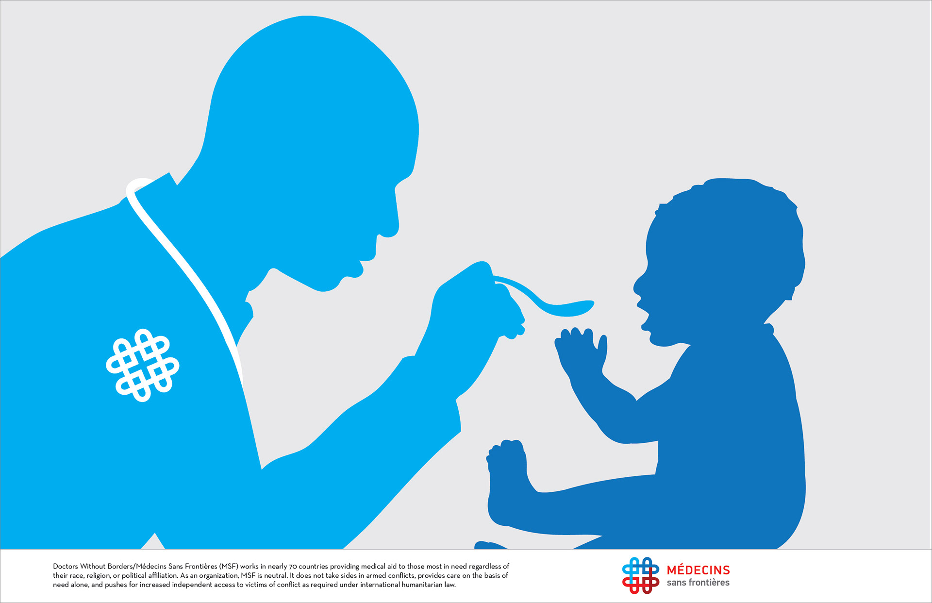
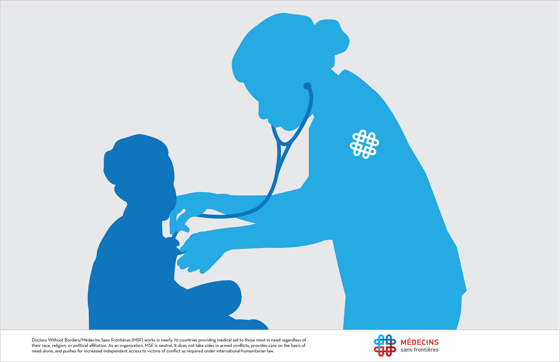
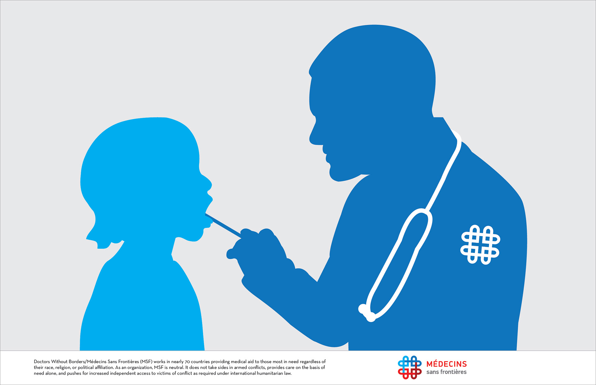
I also created a series of poster illustrations which could be used to demonstrate MSF's humanitarian mission without words to a diverse and international audience.
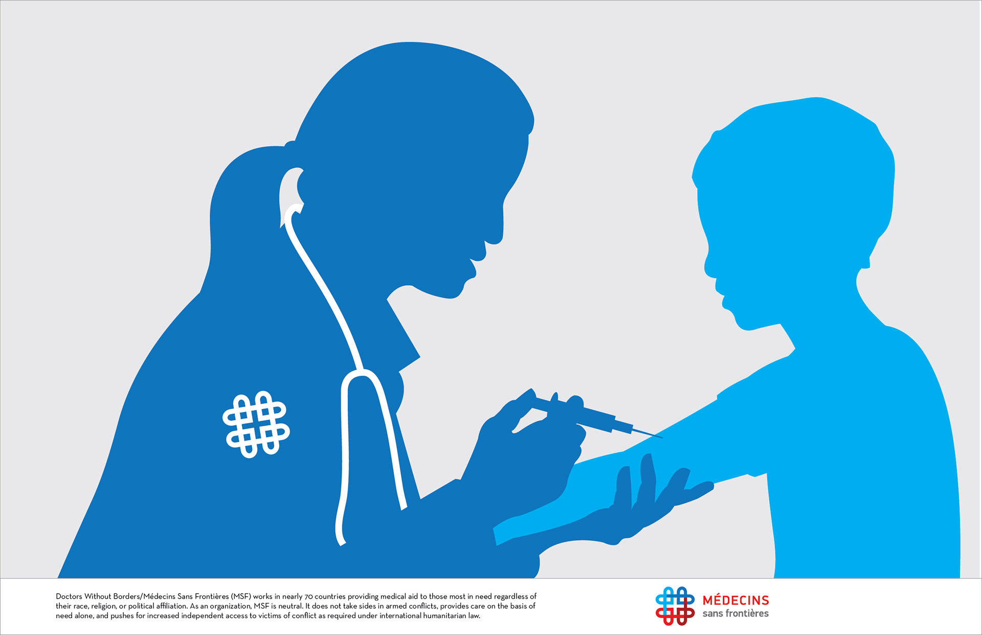
Poster series