Instructables is an online community for people who like to make things. I re-designed the editor interface to make it more intuitive for authors to add Instructables projects to the site.
I was the sole UX designer on a small Agile team that included front-end and back-end developers, QA, a product manager, and an engineering manager. I conducted research, created mockups, gathered feedback, iterated on designs, worked with product manager to break into manageable steps and write up specs, and collaborated closely with our development team.
Time: Research and design ~3 months, development ~4 months, launched mid 2021.
Problem to solve
The editor is one of the most important functions of the Instructables website as it is how we get our content. Members of the community author posts where they describe a how-to project with step by step instructions. It takes a lot of time to document, organize and publish content on Instructables which can be daunting and discouraging.
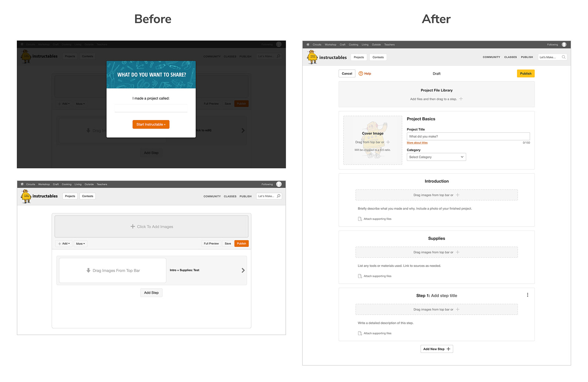
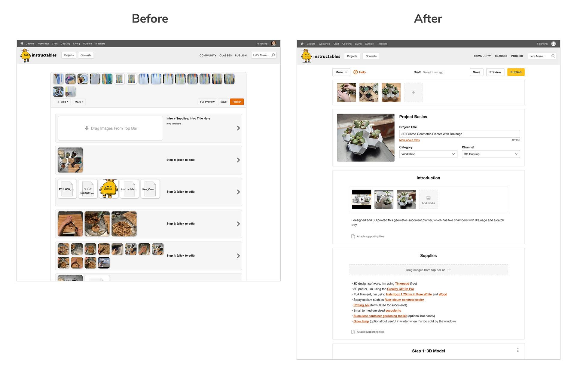
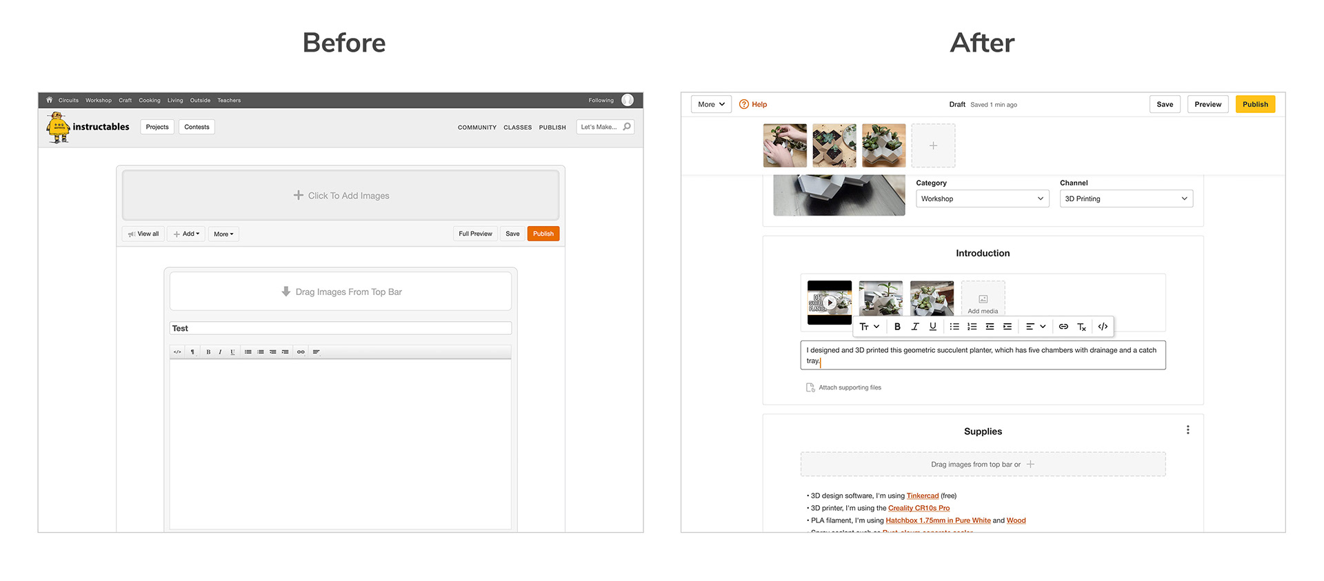
The old editor was outdated and hard to use and didn't provide any sort of tips or guidance. My task was to improve the editor to make it easier and more enjoyable to use and to also make it more intuitive for first-time authors.
User quotes about the old editor:
"It's a little bit like a Jeep, it's kind of functional and practical and gets you from A to B. It's not all the bells and whistles...but you do know where stuff is and it does work."
"I think it is fairly user friendly. I think some of that is because I’m used to it and I’ve kind of gotten used to the little quirks...It kind of reminds me of the days of Windows XP. It feels a little old school."
Process
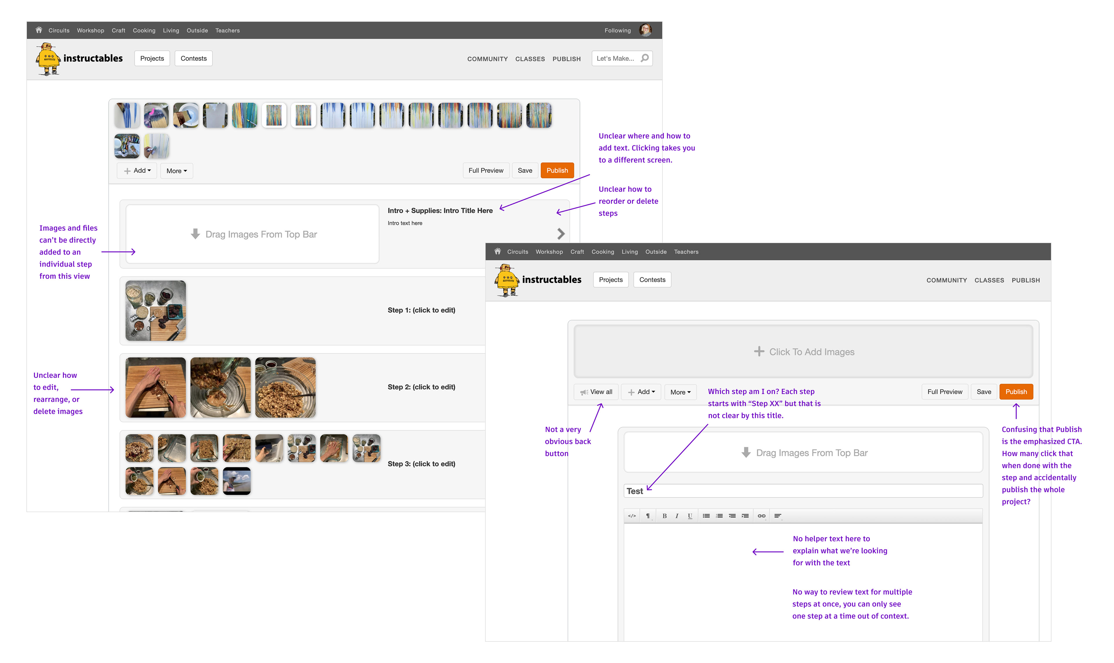
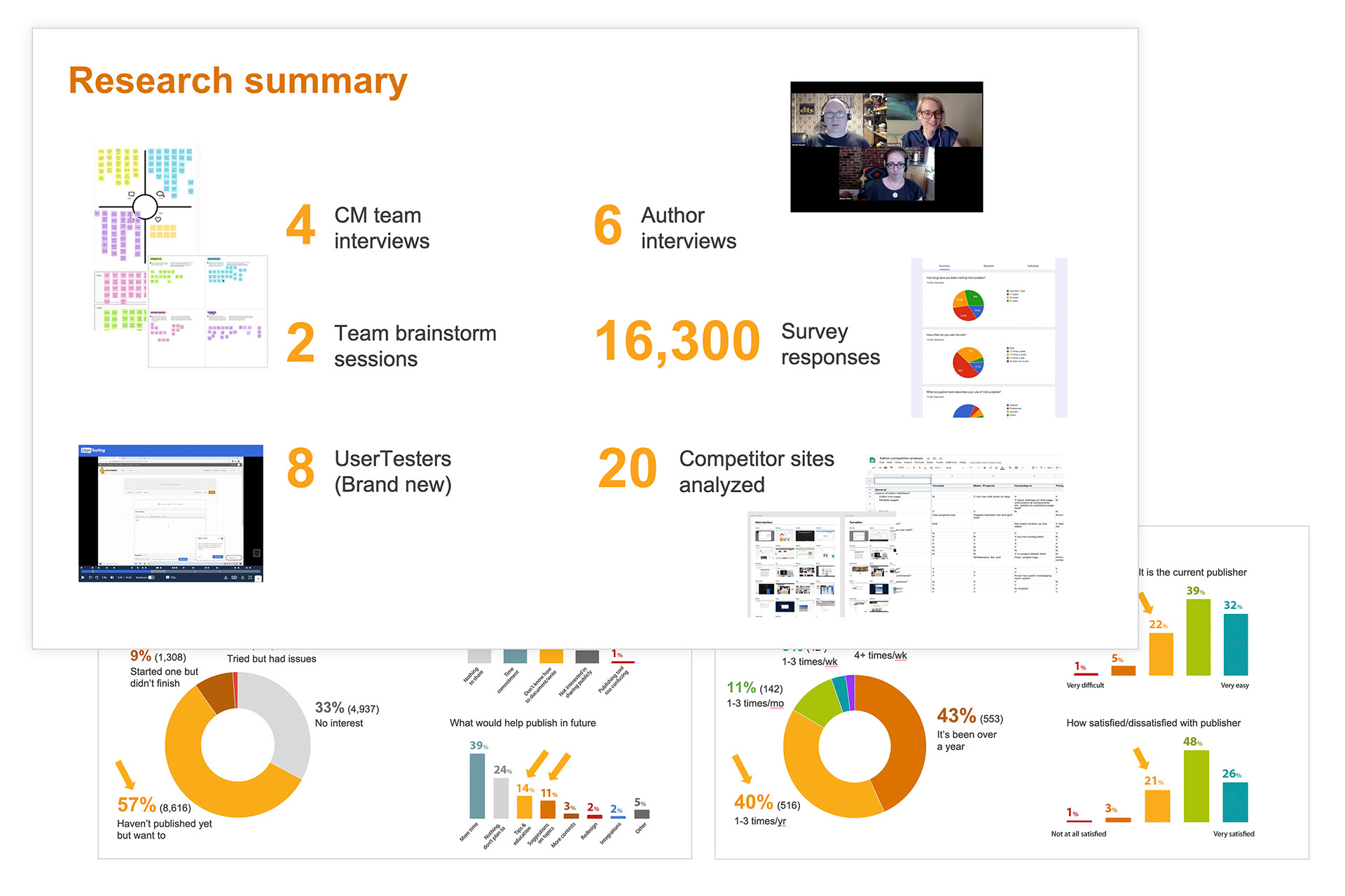
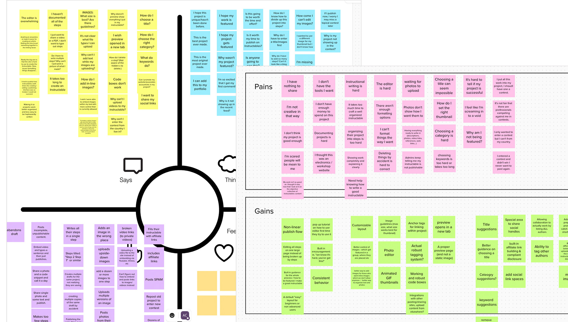
First I led a round of user research so that I could better understand how our authors use the Instructables editor and what pain points they had. I ran UserTesting.com tests to get a feel for how the old editor was perceived by brand new users and conducted a survey and interviews to hear from our long-time authors.
I found that the biggest pain points for long-time authors related to image upload, image placement, and text editing. Newer users struggled to navigate between different views and didn't understand where certain types of information belonged. Also, both old and new authors seemed like they could benefit from better onboarding training and tips to guide them towards creating quality instructables.
Solution
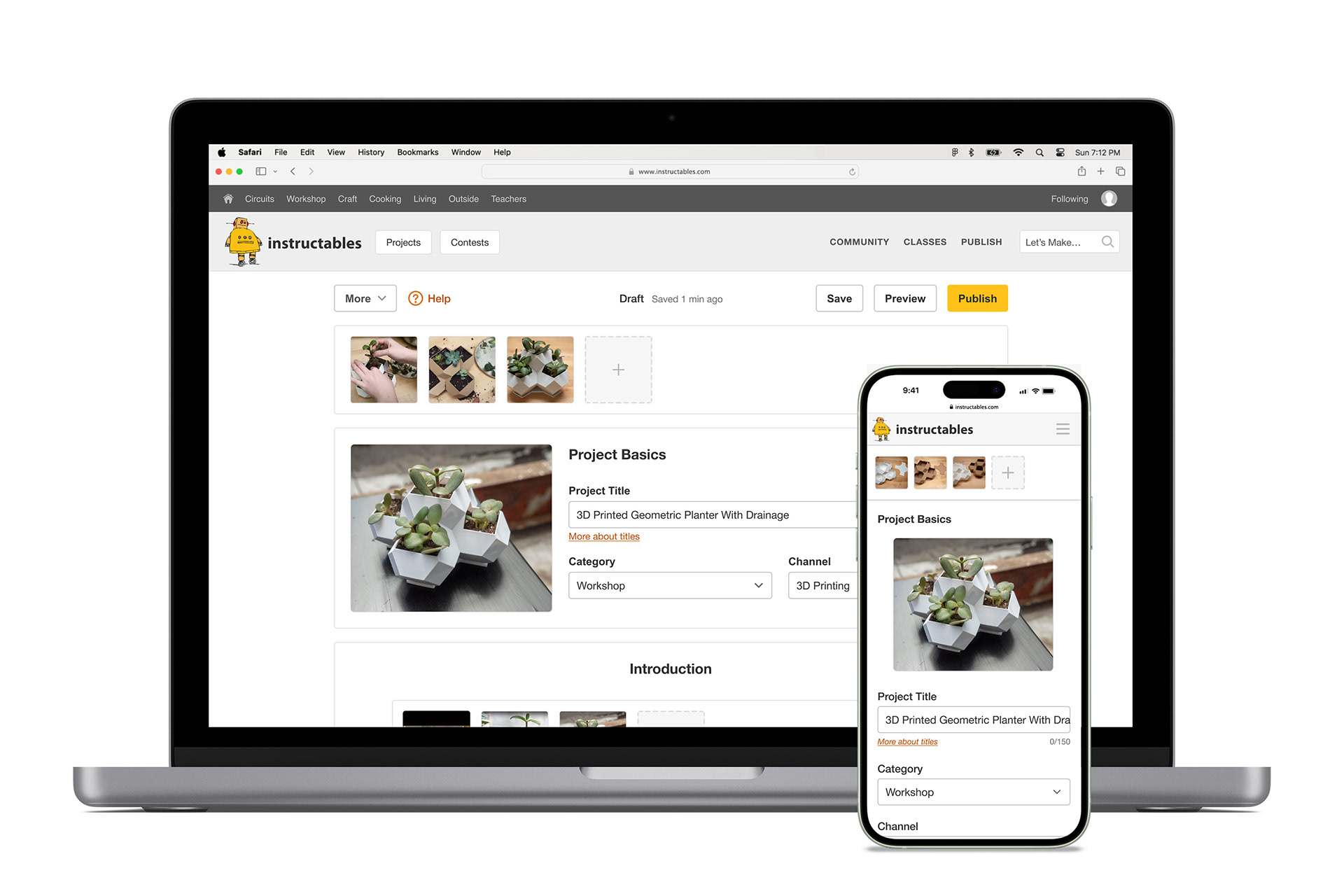
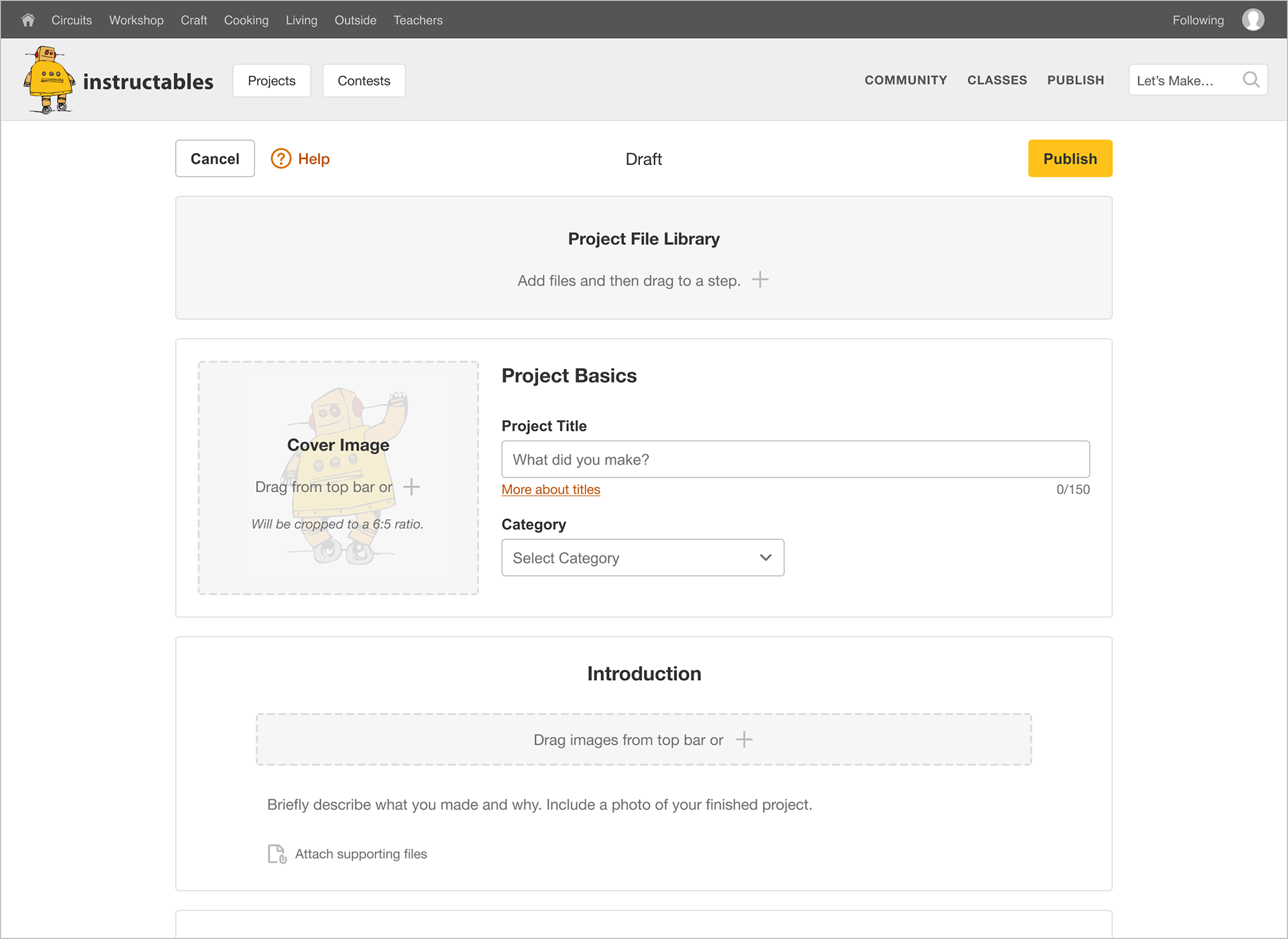
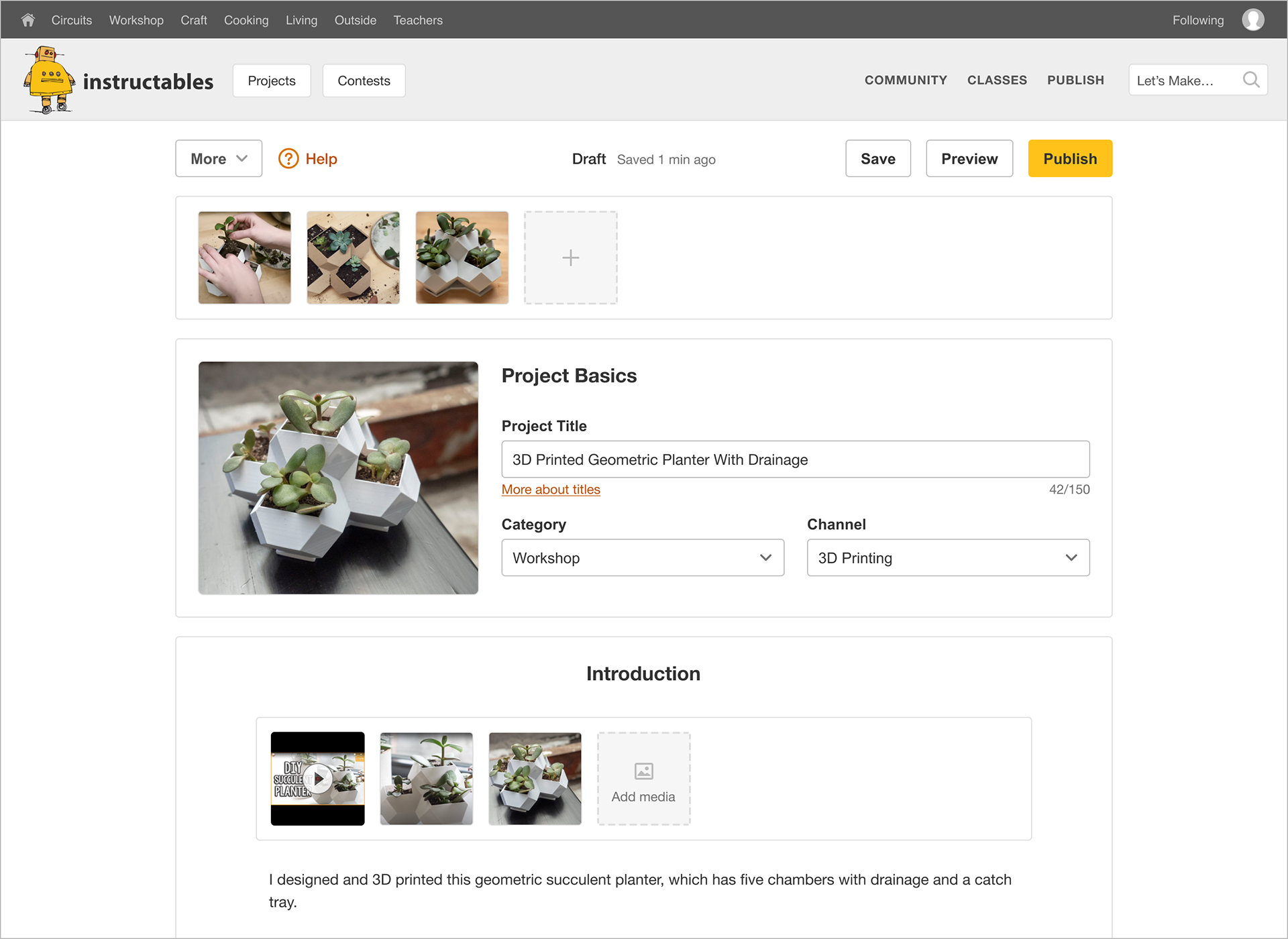
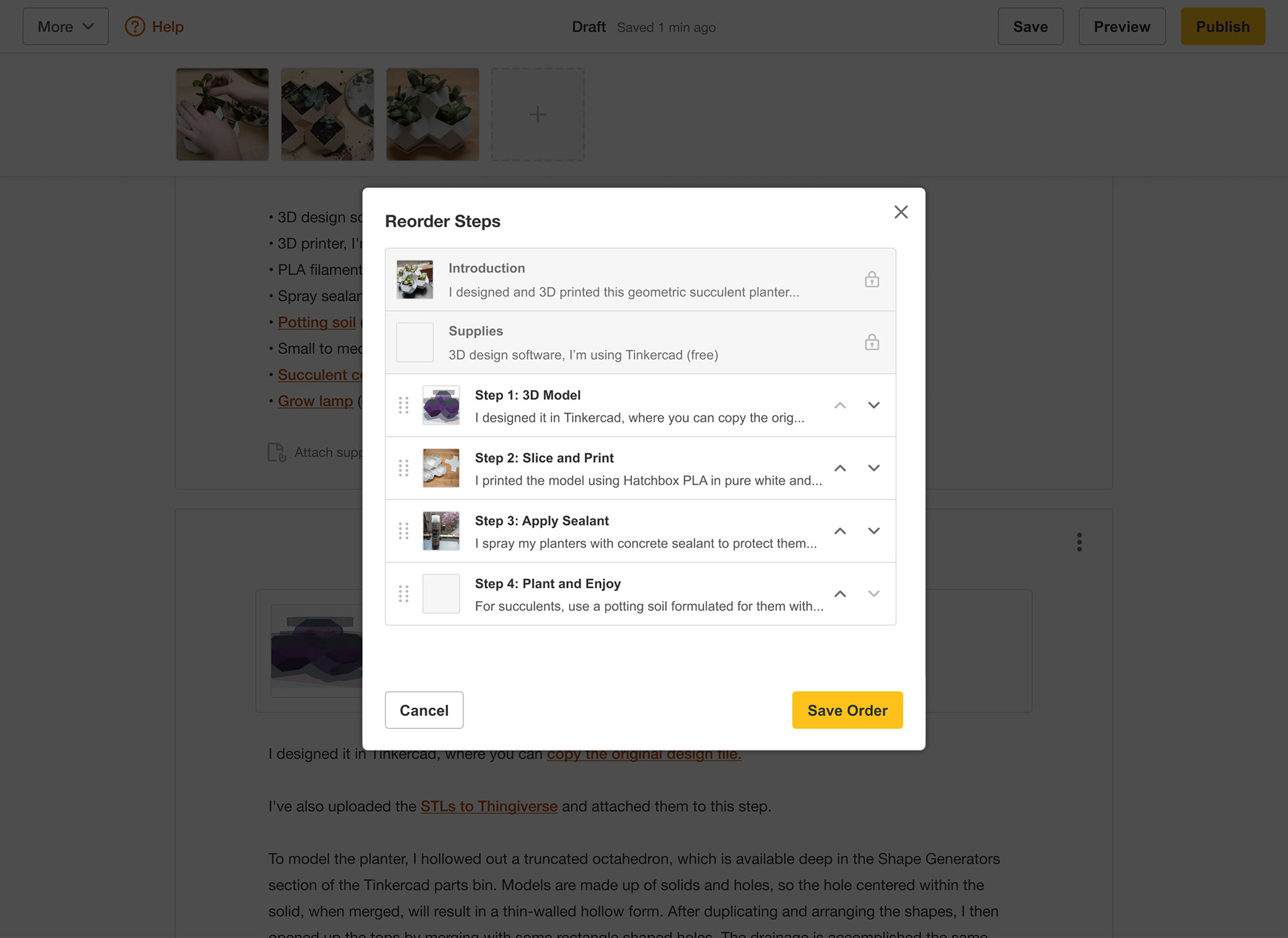
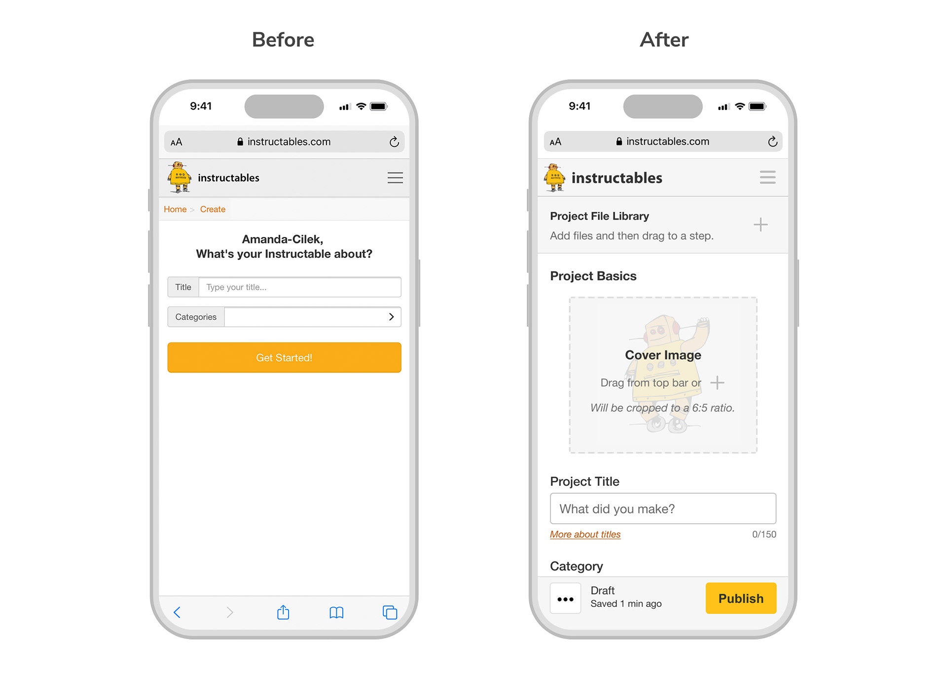
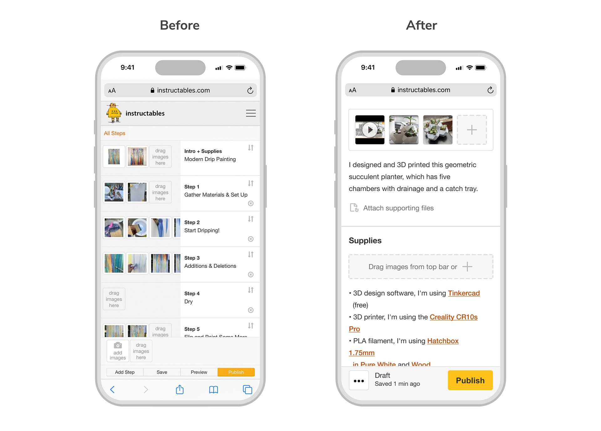
• Improve overall layout and navigation by consolidating views into a single page that is structured to more closely resemble the end result of the published page.
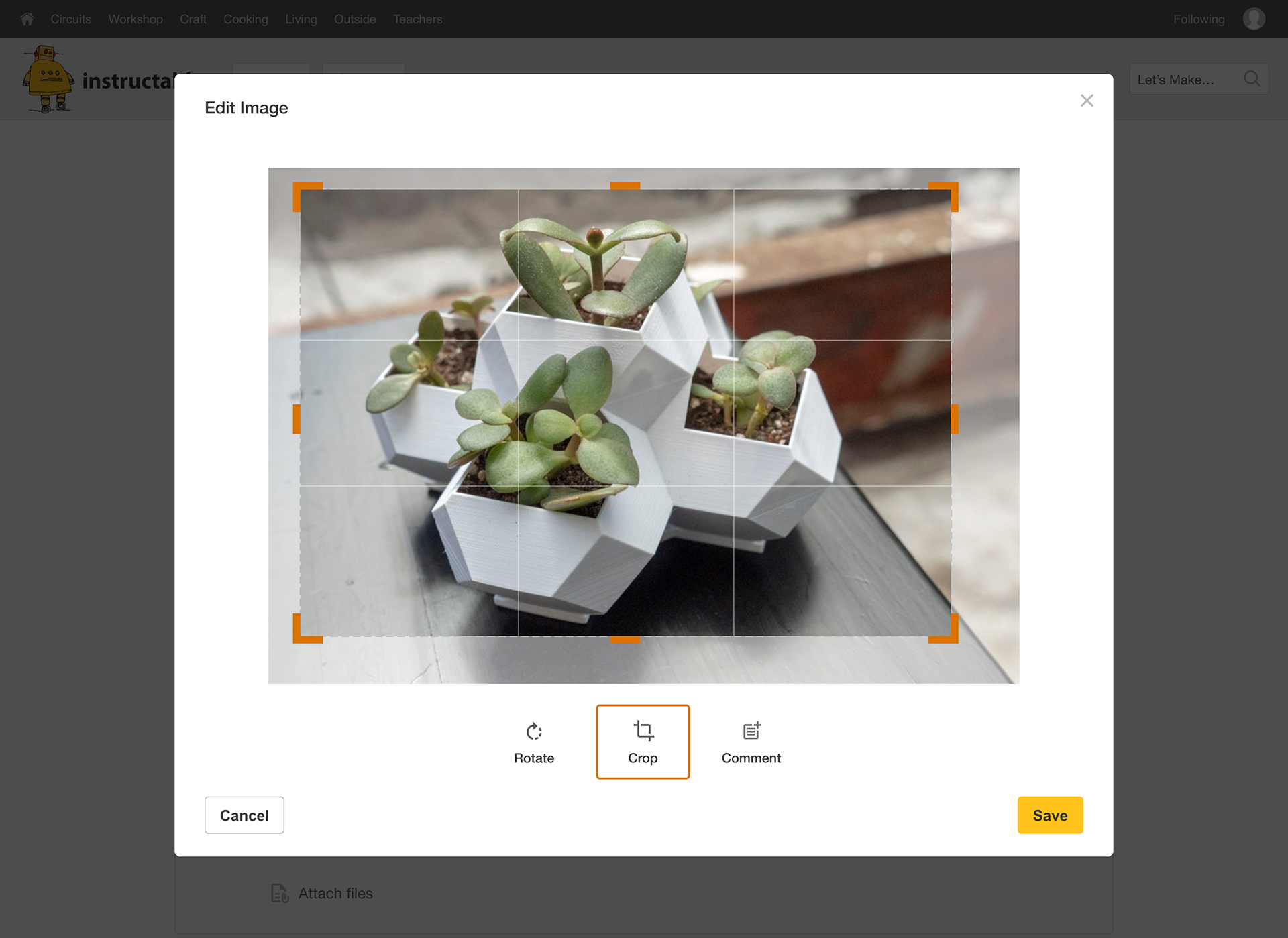
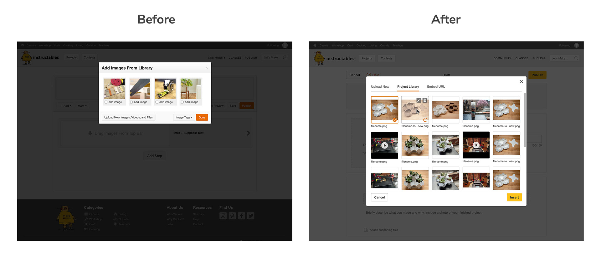
• Improve image handling and add support for basic image editing (rotate, crop).
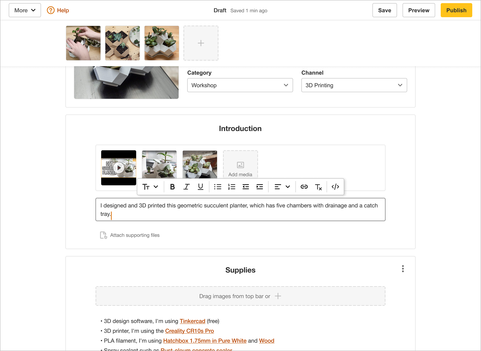
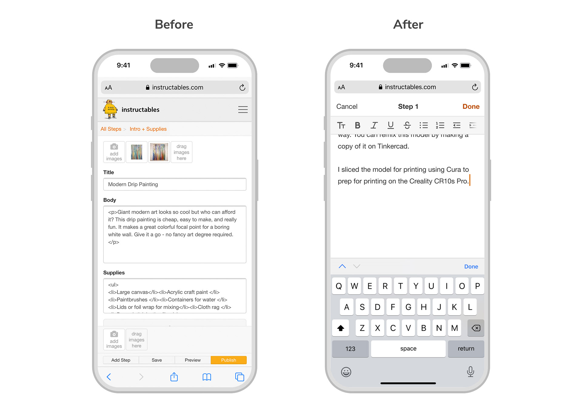
• Replace the old buggy text editor with a new rich text editor.
• Add tips and guidelines throughout to help authors succeed the first time.
• Completely overhaul the mobile editor to make it more user friendly.
Measuring success
User quotes about the new editor:
"I like that a lot, it feels much more intuitive to just be able to scroll up and down through the different sections. It’s fresh, less cluttered. I like that things only appear when you need them."
"I enjoy the simplicity of it, it’s definitely a lot cleaner, and I appreciate that there’s less pop ups, it’s nice that I can just get right into it."
"This will definitely add more direction for people. It looks like it’ll flow a lot better. This is kinda what I was hoping to see.”