Instructables is an online community for people who like to make things. Instructables search is an important entry point to the platform, shaping how millions of users discover projects and how creators gain visibility.
I led a redesign of Instructables search to help people more easily find what they’re looking for. The work required navigating technical constraints, working with product and engineering to agree on direction, and treating search as a core product capability rather than a standalone UI feature. I owned user research, design direction, and final feature specifications in close partnership with product and engineering.
Context and problem to solve
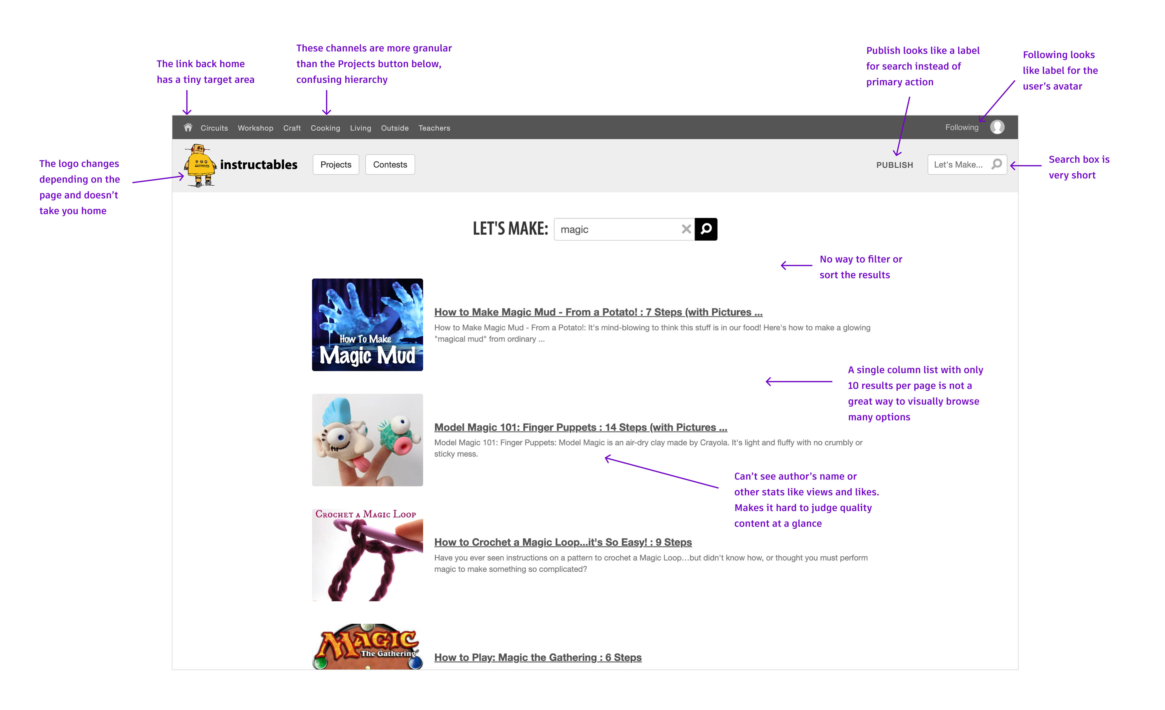
Instructables hosts a vast and growing library of over 350,000 community-generated projects across many skill levels and domains. Over time, search had evolved incrementally, accumulating UX and tech debt that made it difficult for users to find what they were looking for and for creators to trust that their work could be discovered.
Users frequently struggled to narrow results or understand why certain projects appeared, leading to frustration and abandonment. At the same time, creators lacked confidence that quality content would surface consistently, especially beyond the most popular projects. Search was undervalued and at risk of further degradation or even removal, with no clear direction for how it should serve users.
The core challenge was not simply improving the interface, but defining a more coherent and trustworthy search experience that balanced user needs, creator success, and technical feasibility.
User quotes about the old search experience:
"Search resulted in far too many extraneous hits no matter what criteria I used making it nearly impossible to find something relevant."
"Search resulted in far too many extraneous hits no matter what criteria I used making it nearly impossible to find something relevant."
"When I did browse, I got frustrated because it was difficult to narrow down what I was looking at."
"The images are smaller, more text based. I'm not into reading text right now, I'm trying to find what appeals to me on a visual level."
Process
Before design work could begin, I needed to validate that search was both highly used and a meaningful driver of user experience. Despite persistent qualitative feedback pointing to discovery challenges, search had often been treated as a secondary feature.
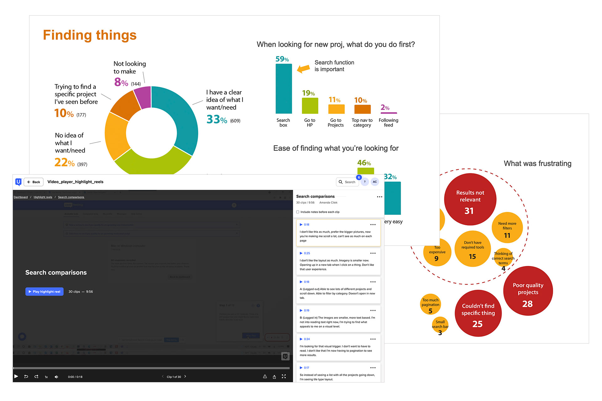
I used survey data to show how frequently users relied on search and where it was failing them, helping establish search as a critical product surface and build alignment with leadership and product partners around the need to invest.
I then led additional user research to better understand search workflows and pain points, including usability testing with new visitors and interviews with long-time community members. I partnered with product management to translate user needs into a clear set of functional requirements for a new search experience, including expectations around relevance, filtering, and result quality, creating a clear set of requirements that engineering could evaluate and implement.
Key insights
• Survey data showed that 43% of site visitors are looking for something specific, and 59% would go to the search box first, reinforcing that search was a core workflow rather than an edge case.
• Users cared most about quickly understanding why results appeared and having meaningful ways to refine them.
• Creators wanted confidence that quality content could be discovered beyond the most popular or recent projects.
• The old site navigation was difficult to use and the search box was not standing out enough. It was especially hard for some users to navigate the site on mobile.
Brainstorming
I led exploratory brainstorming to assess how search could be improved, including approaches to filtering and the relationship between browsing and searching. This work supported clear tradeoff discussions with engineering and helped the team converge on a direction.
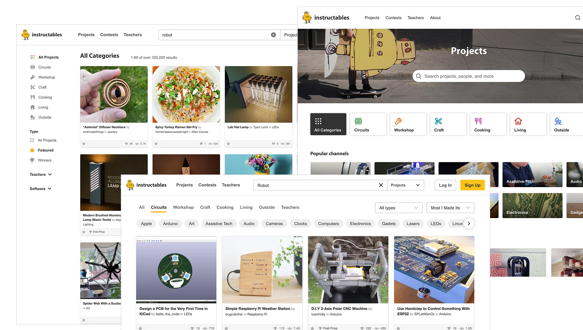
Exploration: Left search? Search tags? Combined search + browse?
Areas of impact
• Improved discovery: Clearer result presentation and refinement patterns made it easier for users to find relevant projects.
• Increased trust: Greater transparency in how results were surfaced improved confidence for both users and creators.
• Platform scalability: The work established a more coherent foundation for future search enhancements.
• Cross-functional alignment: Shared principles and success metrics helped reposition search as a strategic platform capability.
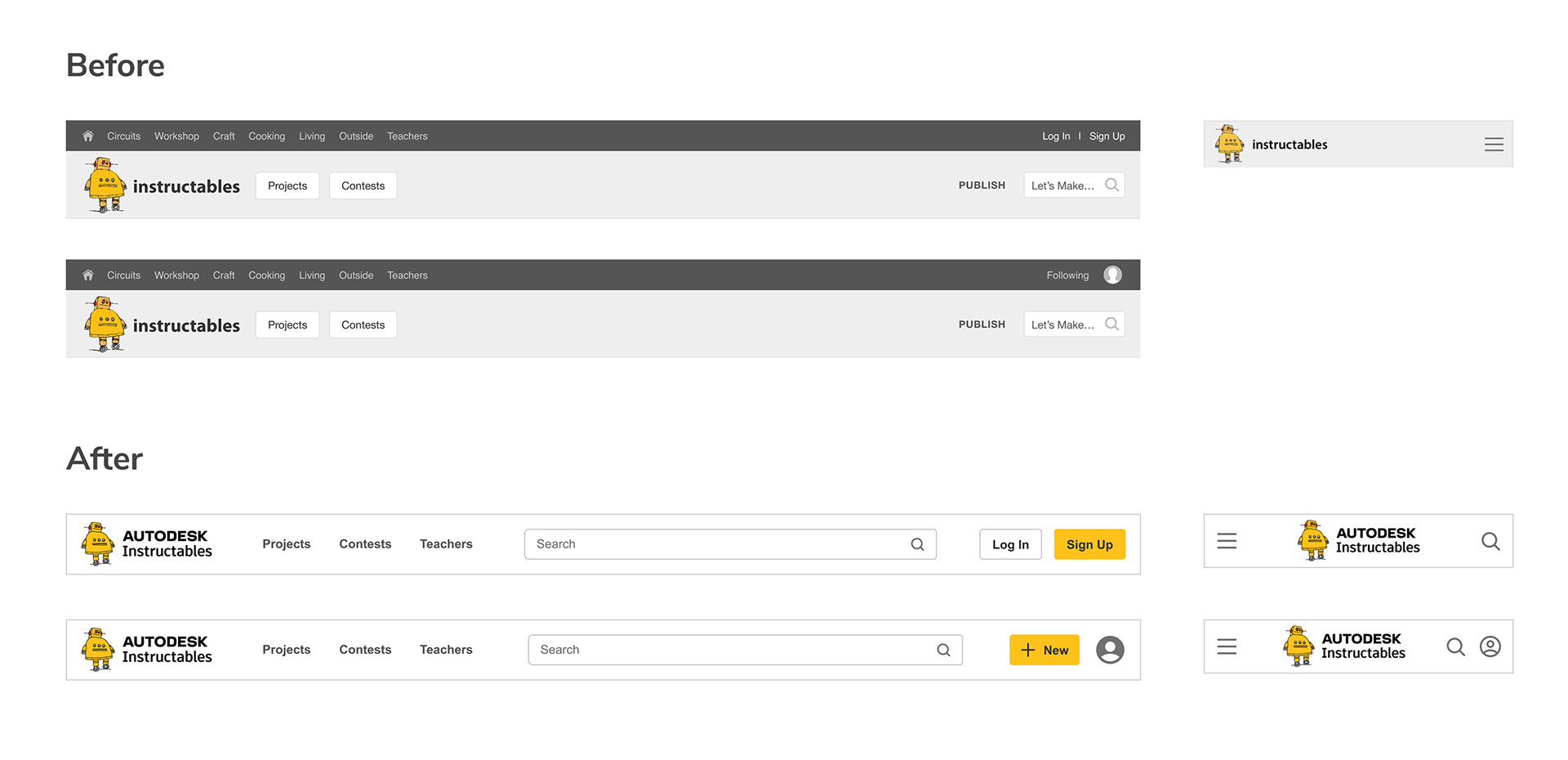
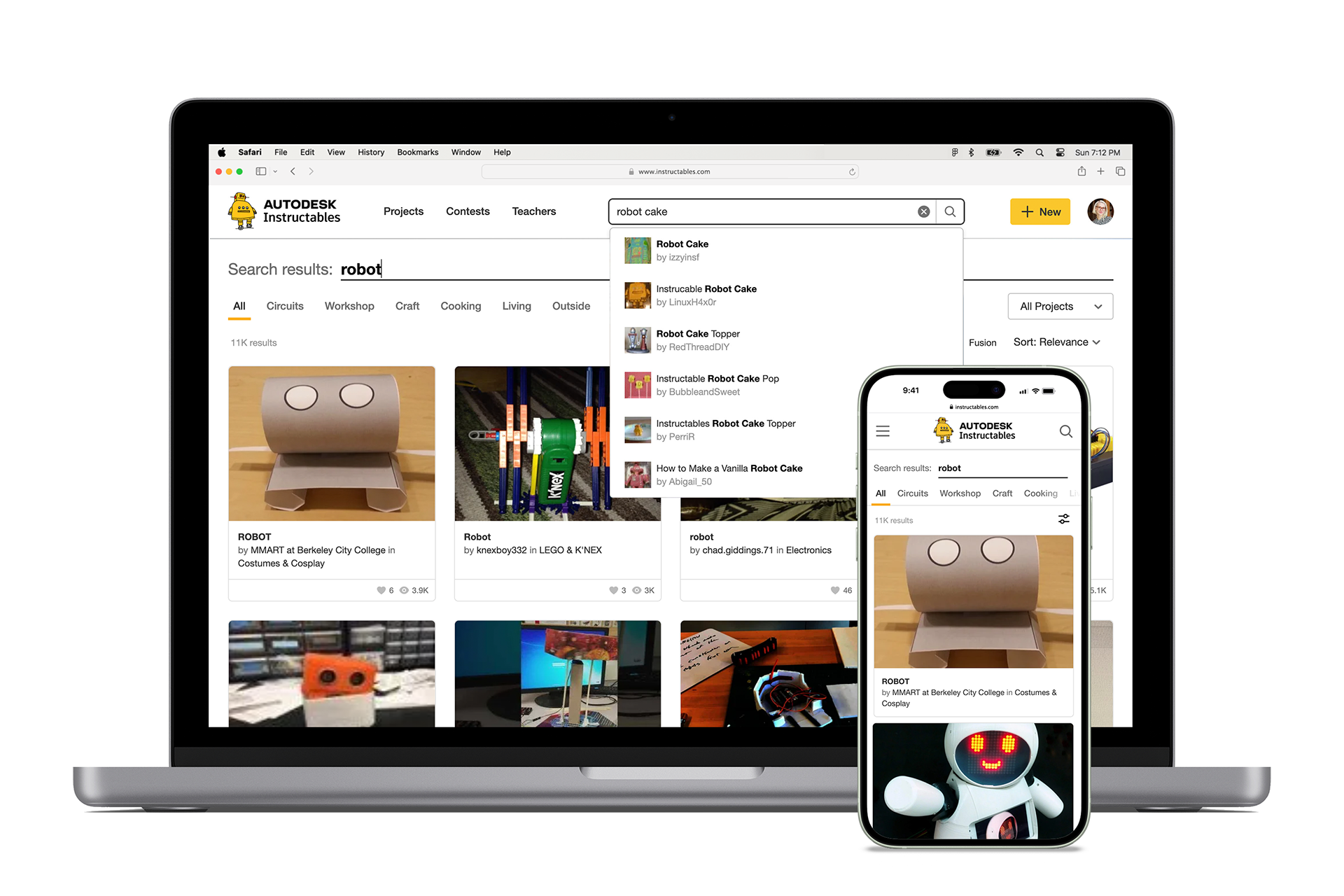
New site header with improved hierarchy of information and more prominent search.
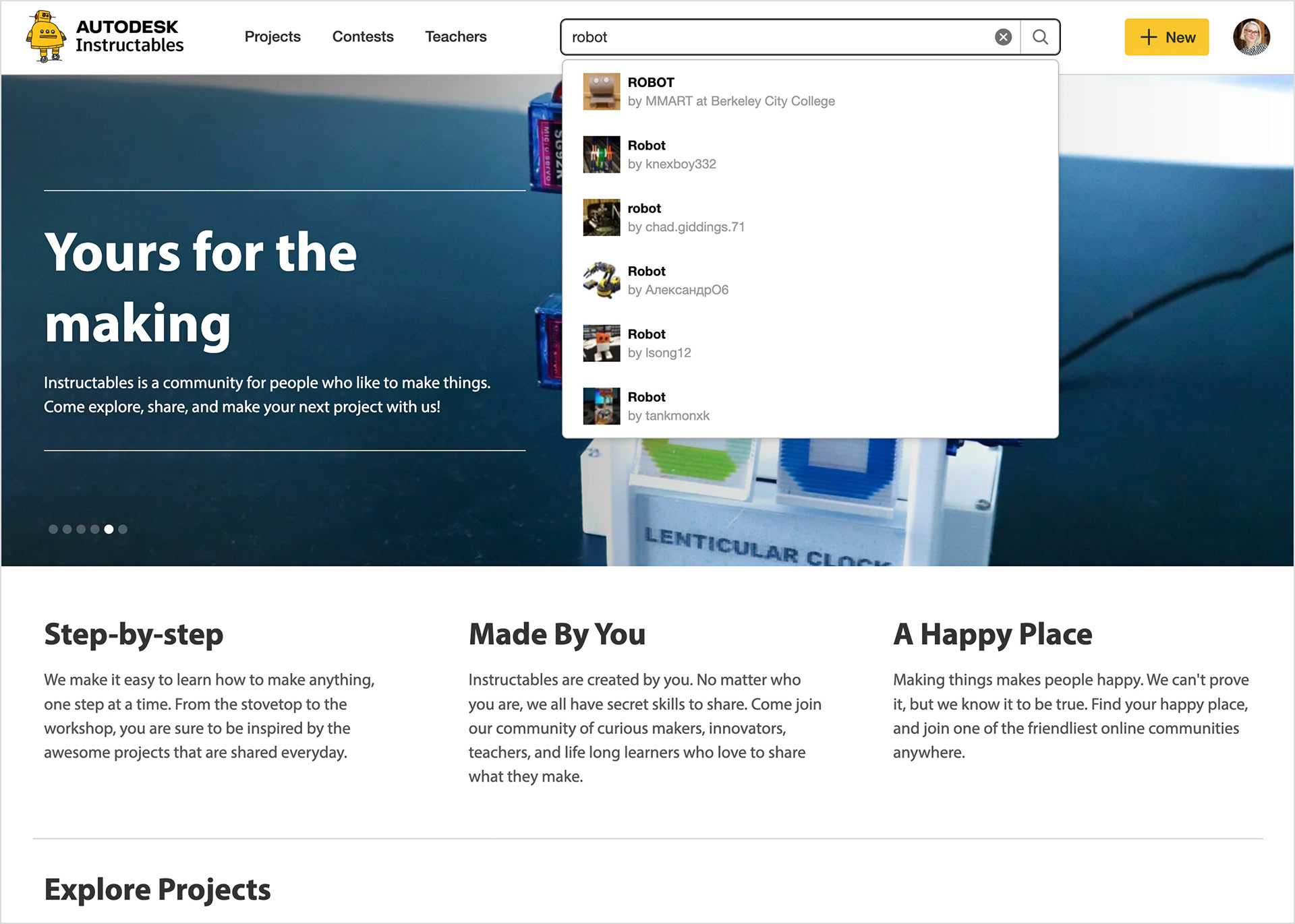
Showing a new autocomplete feature to display matching results as the user types, saving time and getting people to what they are looking for faster.
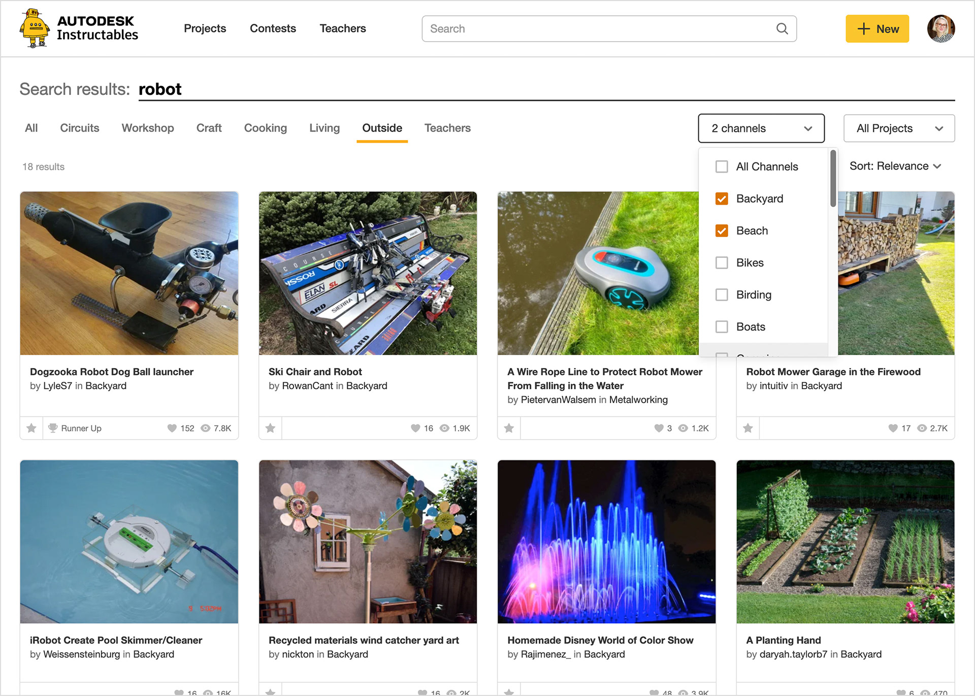
New search results displayed in a large image grid for easy visual scanning, with new filters and sorting options to help users hone in their results.
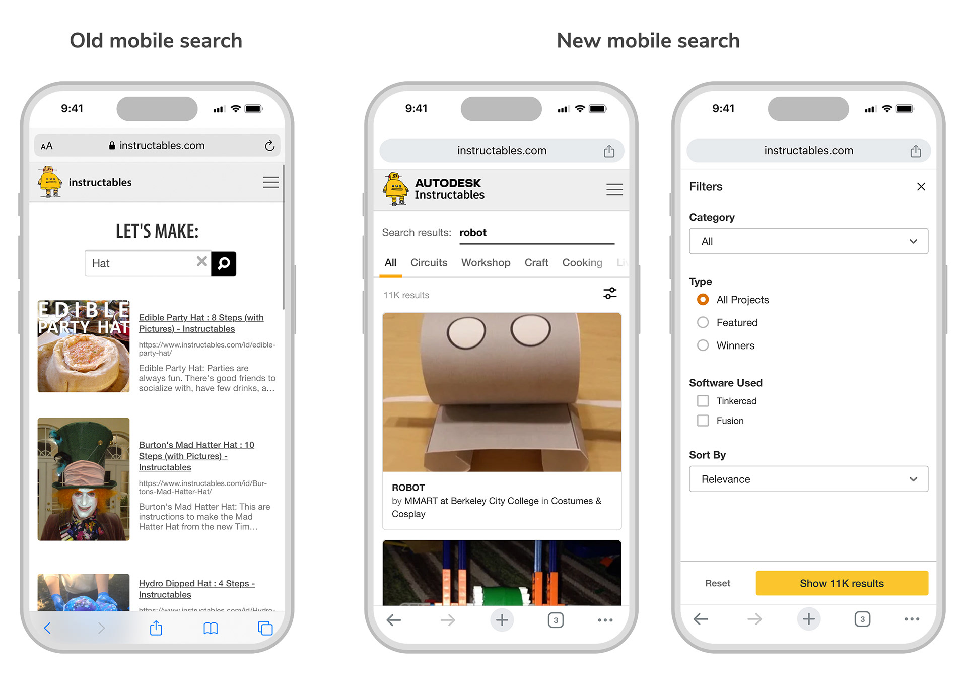
Improved search on mobile with access to filters.
Outcomes
The updated search experience led to improved engagement and clearer user feedback around relevance and usability. Decisions made through this work informed later search improvements and helped establish search as a core product experience rather than a one-off feature. This project demonstrated how design decisions made at the system level can improve both user experience and long-term product health.