Medic (www.medic.org) is a global healthcare nonprofit working to improve health equity and access in underserved communities through mobile technology.
• Goal: Make the app more mobile friendly so that health workers can easily conduct their tasks on the go.
• Time: Research and design in 2017, development was split into some smaller parts that launched in 2018.
• Role: Conducted user research, created mockups, gathered feedback, iterated on designs, pared down to MVP, wrote up final specs for developers.
Discover
The design process began with field visits where we shadowed Community Health Workers (CHWs) and observed them using the app during their daily visits. We conducted early stage research, identified key problems, and most importantly, listened to our health workers and heard their stories.
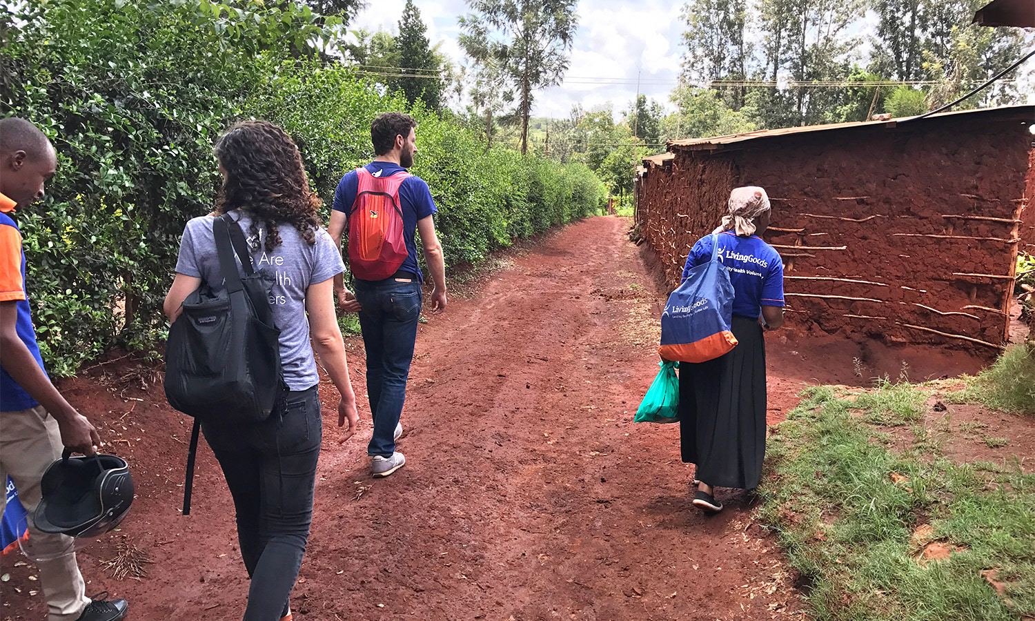
Our team shadowing CHW Rachel on her household visits in Thika, Kenya.
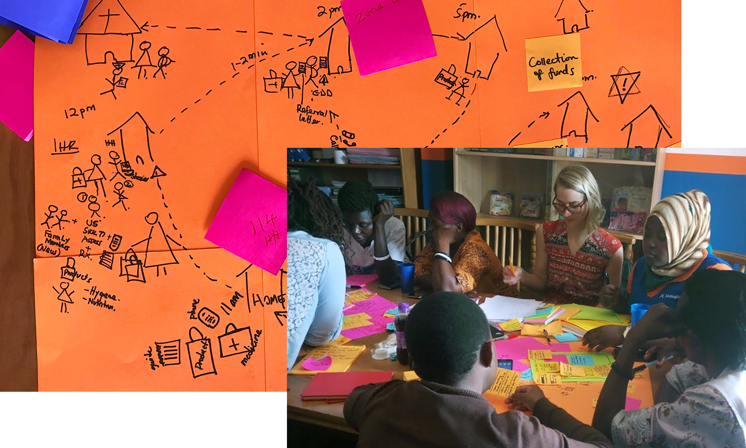
Day-in-the-life discovery, hearing CHW stories and sketching workflow maps
Medic works with marginalized communities, particularly in rural and low-tech settings. Many health workers work in low-connectivity environments, some have never used a touchscreen before, and others may have low literacy. We often needed to develop creative solutions to complex challenges and extreme constraints.
The core Medic app works on Android feature phones and doesn't require a constant internet connection. Instead, data is saved to the phone and synced when syncing is available. This enables CHWs serving in remote areas to make their household visits and stay in touch with area hospitals and clinics on their community's health data.
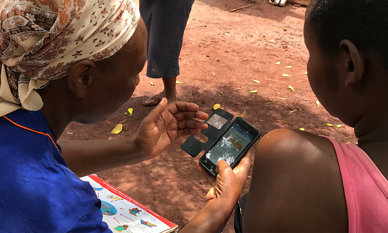
CHW Rachel using the Medic app to walk through an antenatal care visit.
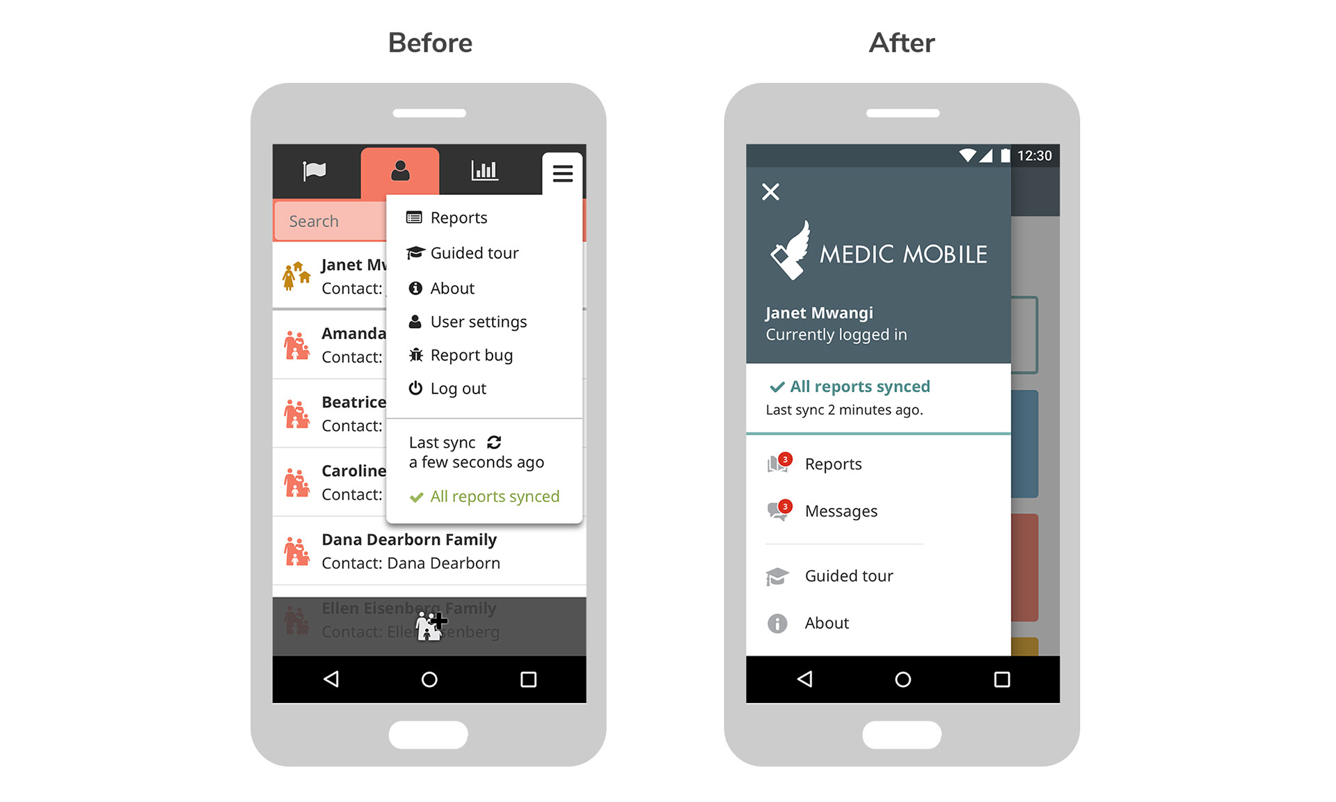
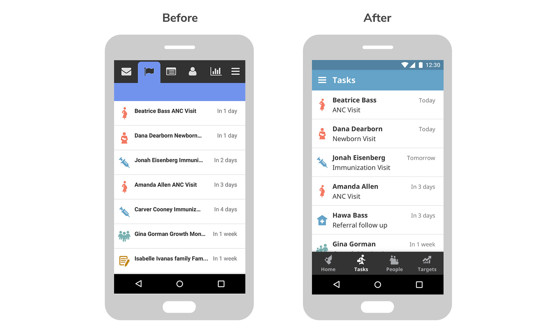
CHWs visit families door to door proactively. If they find a woman who is pregnant or a child that is sick, they will register them, administer basic aid, and then schedule recurring follow-up visits to check in. The app reminds them of upcoming follow-up visits but we learned we could do a better job of surfacing these. We also learned how important it was for the CHW to know the sync status of their phone - has their data been sent in or is it still pending? How recently was it last synced?
We also observed that poor eyesight and lighting conditions played a big role in reducing usability of our app. CHWs with poor eyesight held the phone far away from them in order to read. Bright outdoor sunlight made the screens dark and some CHWs had to shade their phones and squint to make out the text. We also observed frustrations with page navigation, using the back feature, and trying to click on small touch targets.
User quotes:
"Yes, the menu is very small. It is hard to read."
"What is that icon?"
"It is better when the name is there. It is cramming to try to remember all these signs."
"App colors feel gloomy."

Ideate
This project was the result of countless internal and external reviews and many conversations with health workers, management teams, partners, and Medic staff.
We decided early on to use Google's Material Design for our inspiration due to the fact that our users were all Android users and already familiar with Material design patterns. I began ideation by creating a lot of exploratory mockups to visualize options.
What if we went full Material Design?
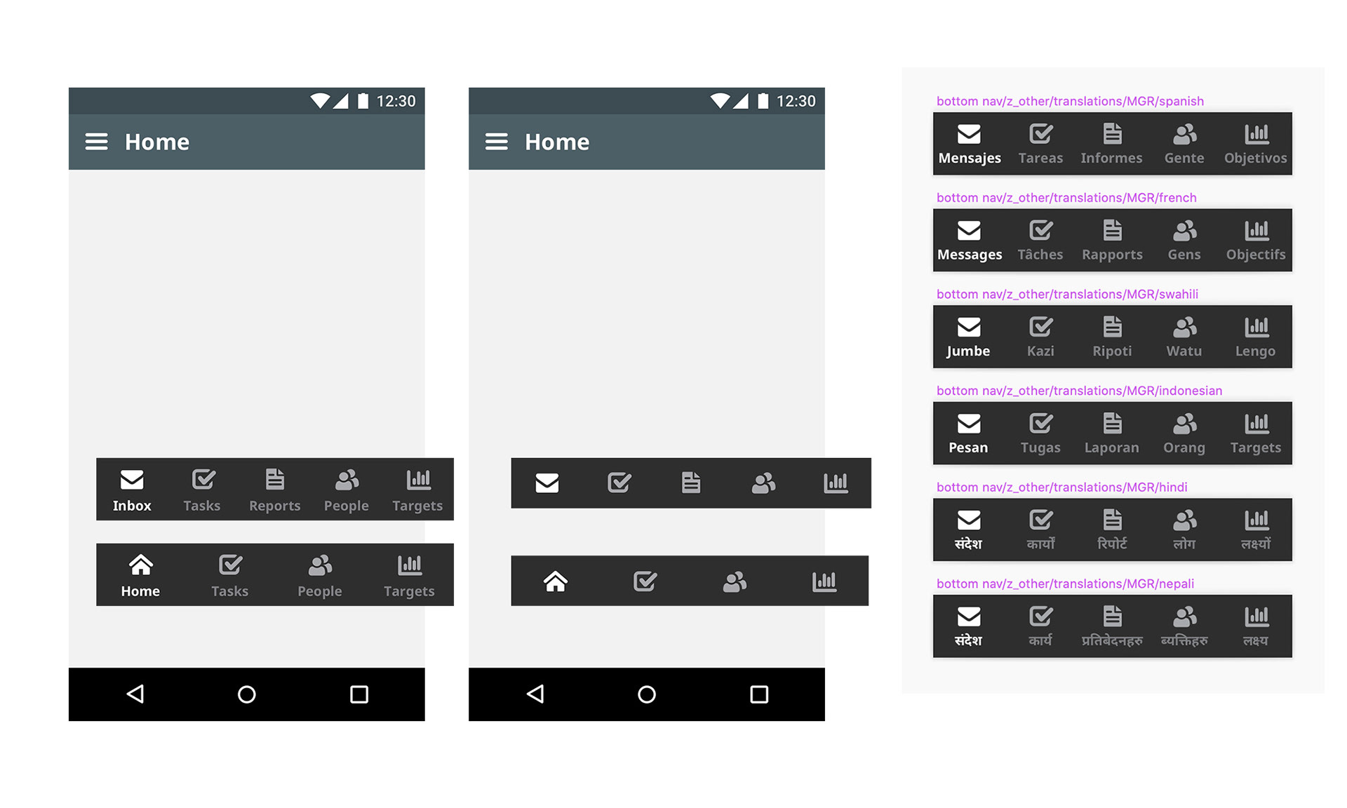
Bottom bar options. Four or five tabs? Text labels or no labels? Does it work when translated?
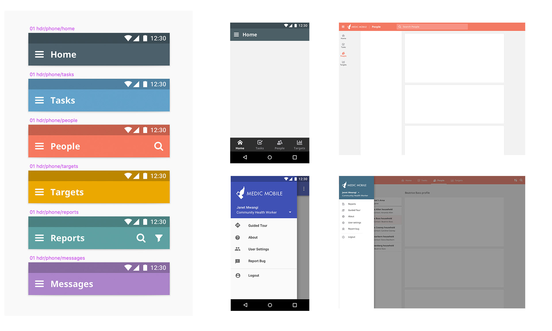
New consistent headers. How does mobile navigation translate to desktop?
Test
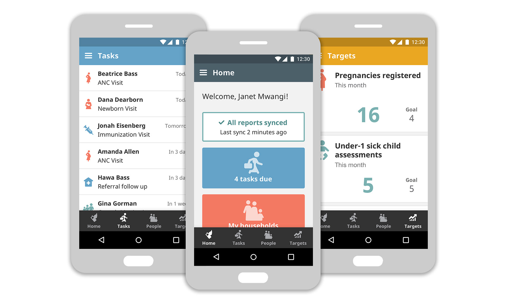
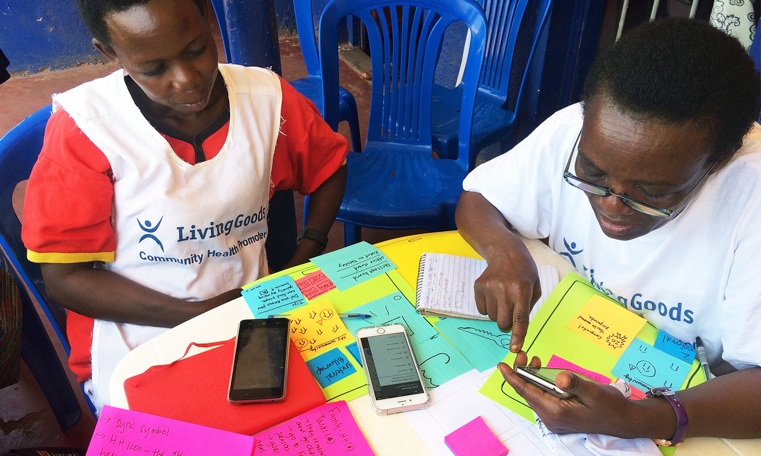
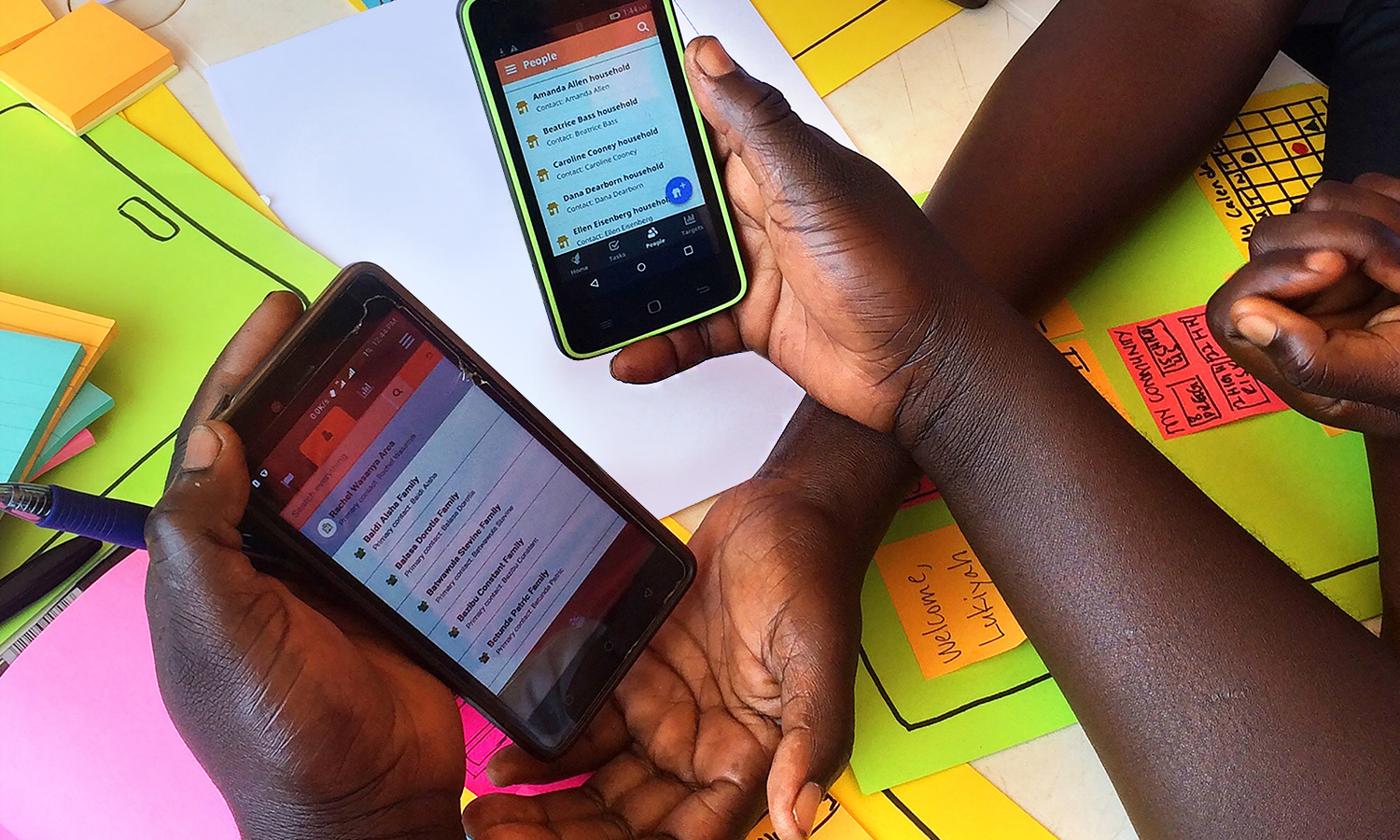
Once we had some concepts we were feeling pretty good about (and a lot of new questions!) it was time to test and see what the users thought. We visited a group of CHWs in Kampala, Uganda and conducted participatory design sessions to get their feedback. I created clickable InVision prototypes to simulate the new experience and we loaded the prototypes onto phones for users to compare. We had low-fi paper prototypes for users to design their own ideal homepage and we also walked through an exercise for interpreting and rating new navigation icon ideas.
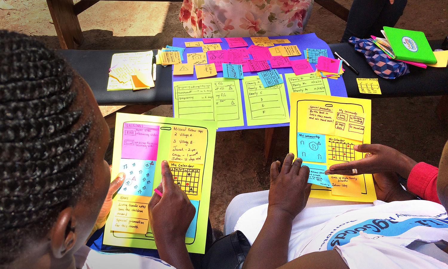
Prototyping and testing the new home page concept and potential widgets.
User testing an InVision prototype of the new navigational system.
Users comparing the old design with the new prototype.
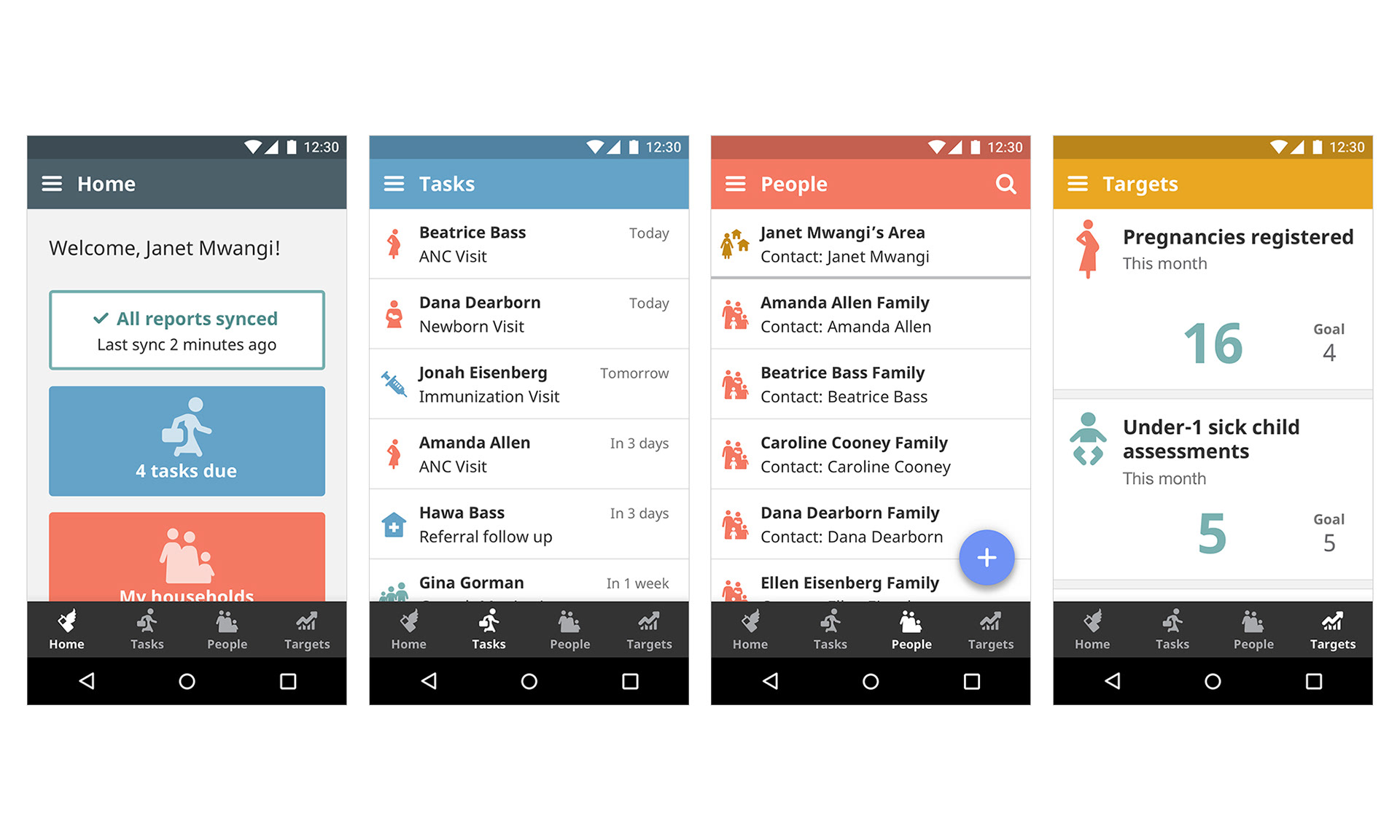
Final result
We got a lot of great feedback from the user sessions as well as from internal employee surveys and focus groups. I took all of the feedback in and make countless tweaks before arriving at a final design that we all felt really comfortable with. Here is a highlight of some of my key suggestions for improvement:
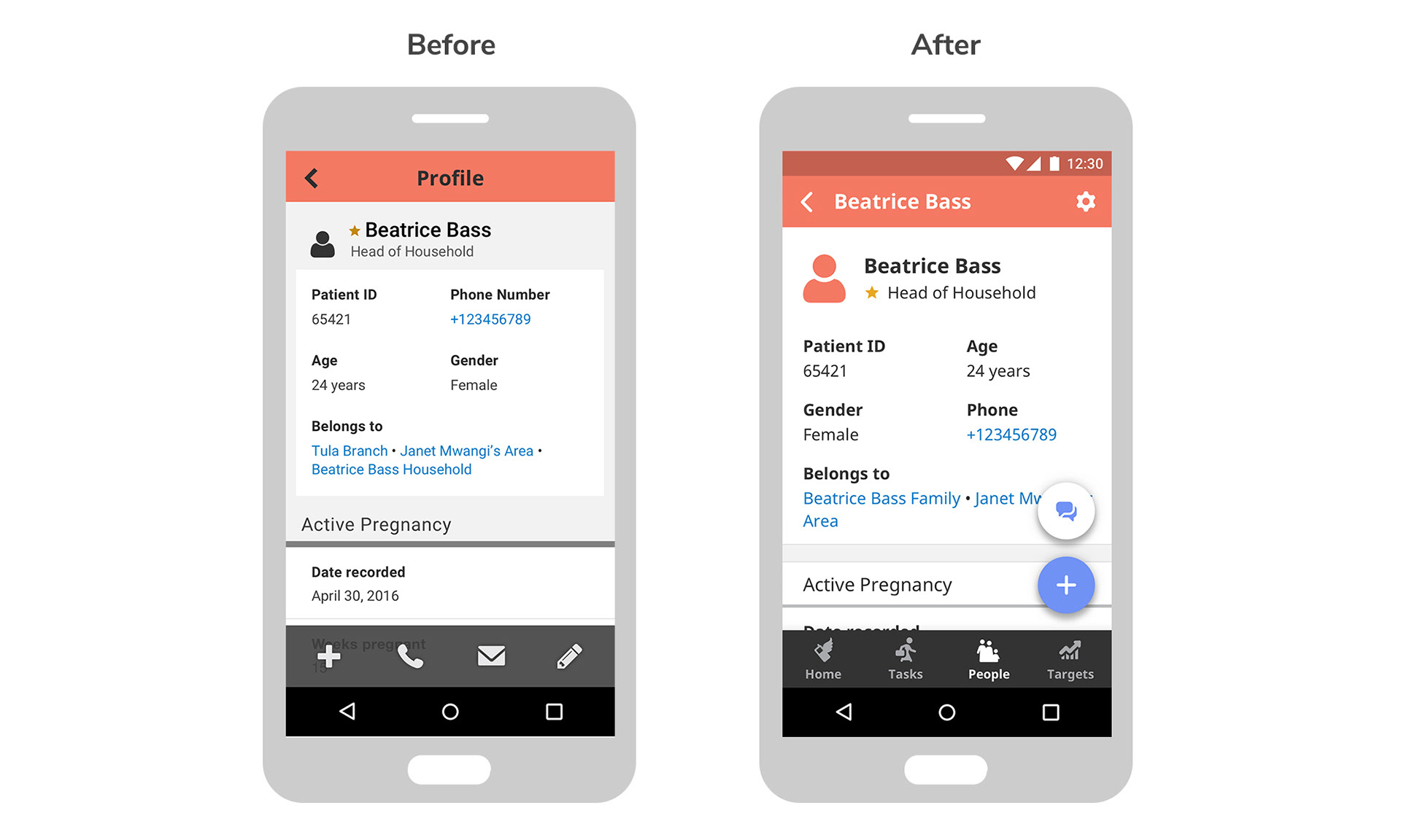
• Make the type more legible. I increased the default text size to 16px across the app, and changed the default typeface to Noto Sans (crucial for future scalability and localization of our app).
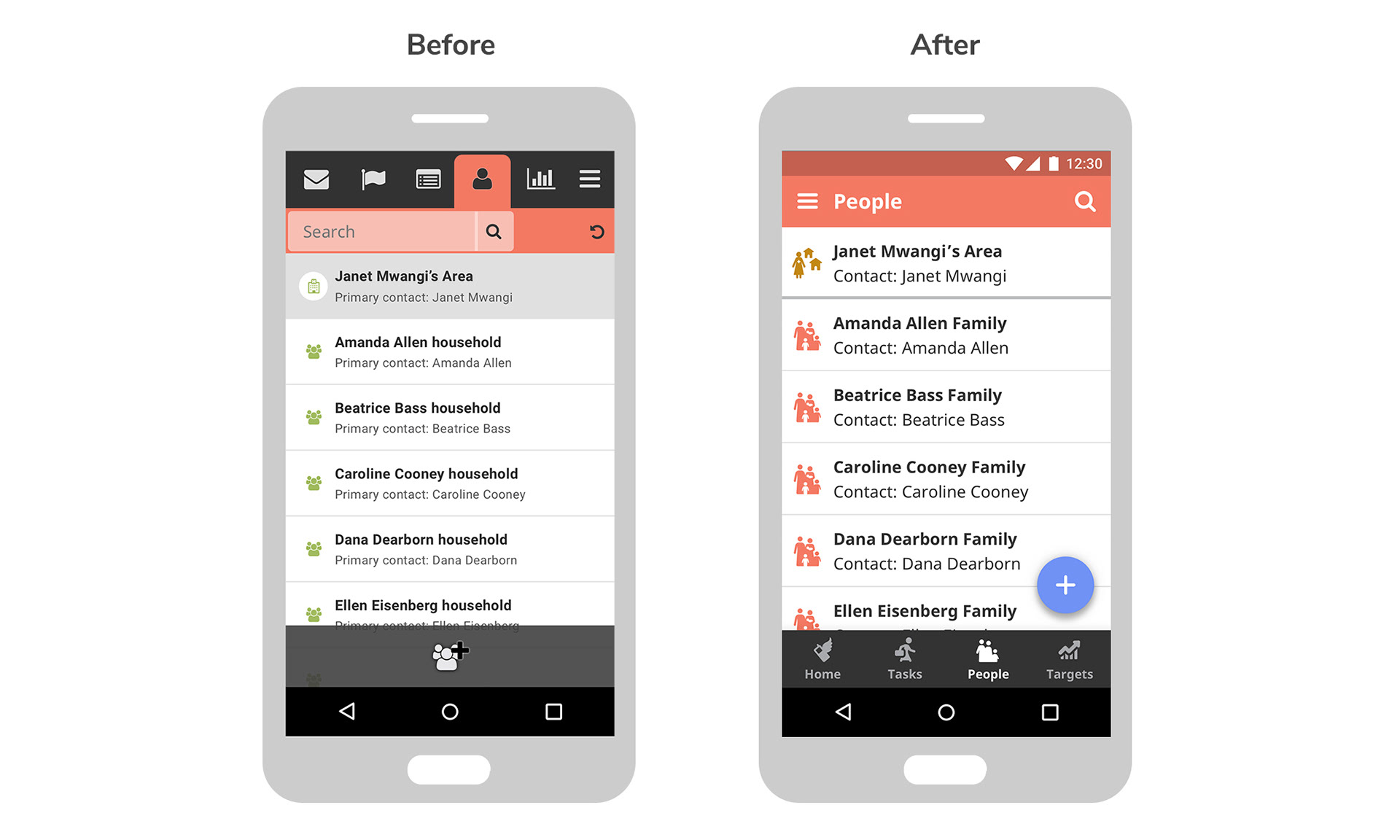
• Improve color contrast. I updated the styling of content throughout to replace grey backgrounds with white to increase text contrast.
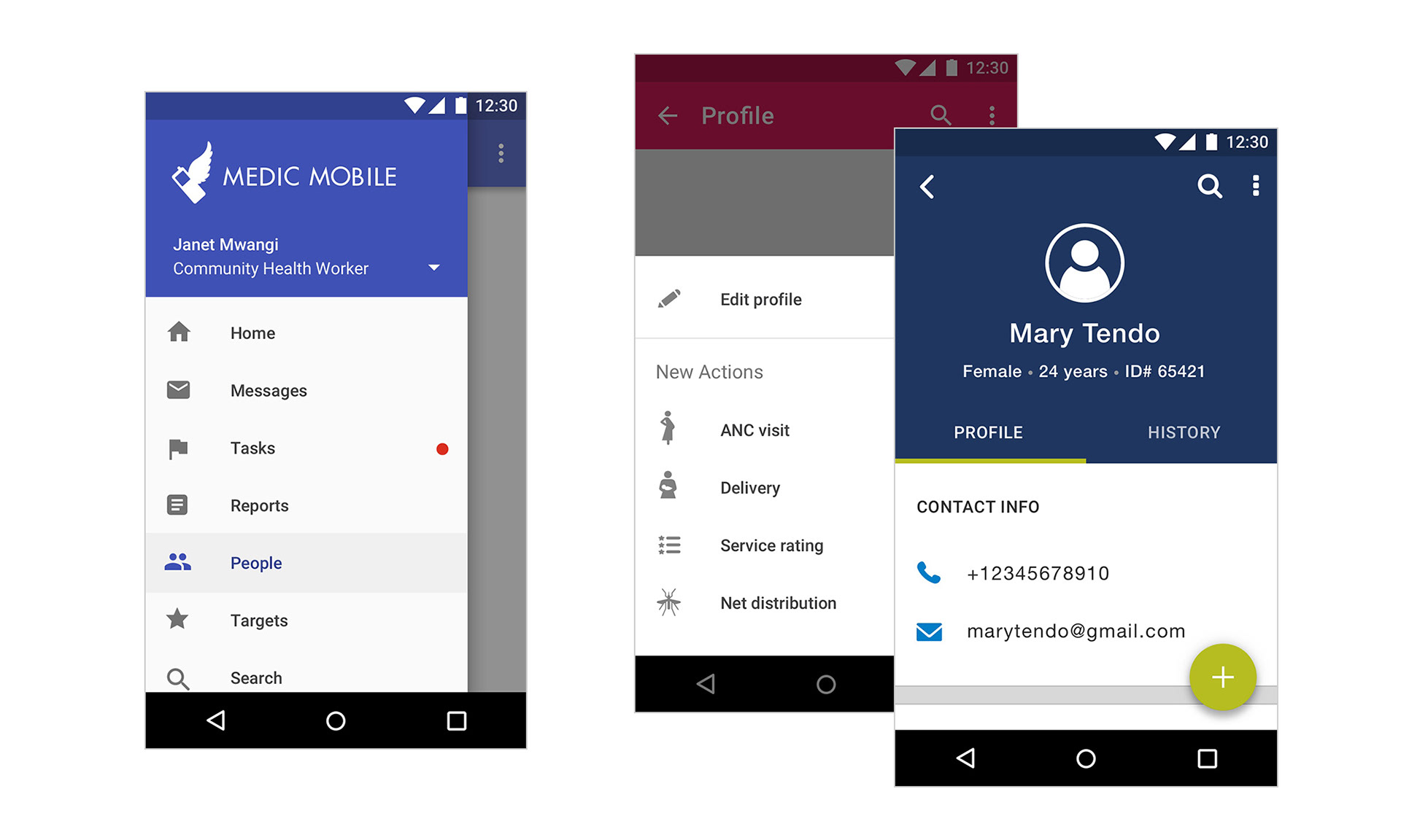
• Add a new home page with snapshot data. This provides a positive place for users to begin their day and summarizes key information like open tasks and sync status.
• Move navigation to bottom, add labels. The bottom bar is more ergonomic and accessible. We also added text labels underneath the icons to eliminate ambiguity.
• New top header, add page titles. Page titles provide context and ensure users always know where they are. I also updated page colors for easier differentiation.
• Android menu drawer. The menu drawer is a familiar Android pattern that allows for larger click targets with space for branding, user name and sync status.