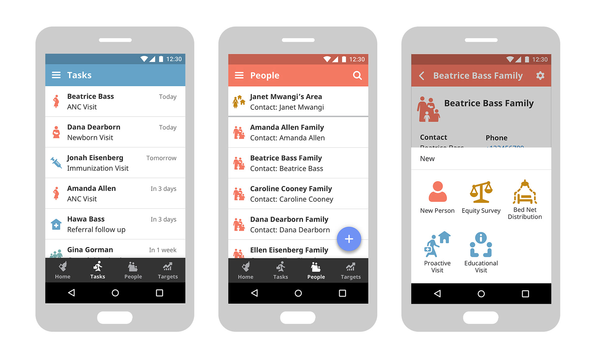
Icons are used throughout Medic’s app to simplify communication and direct attention. The old icon set evolved slowly over time and was not very consistent stylistically or thematically. My main goal with the redesign was to ensure each image was clearly understood and culturally appropriate. I also wanted to make the visual styling more cohesive, implement a more consistent meaning of color, and create designs that would work well in a single color.
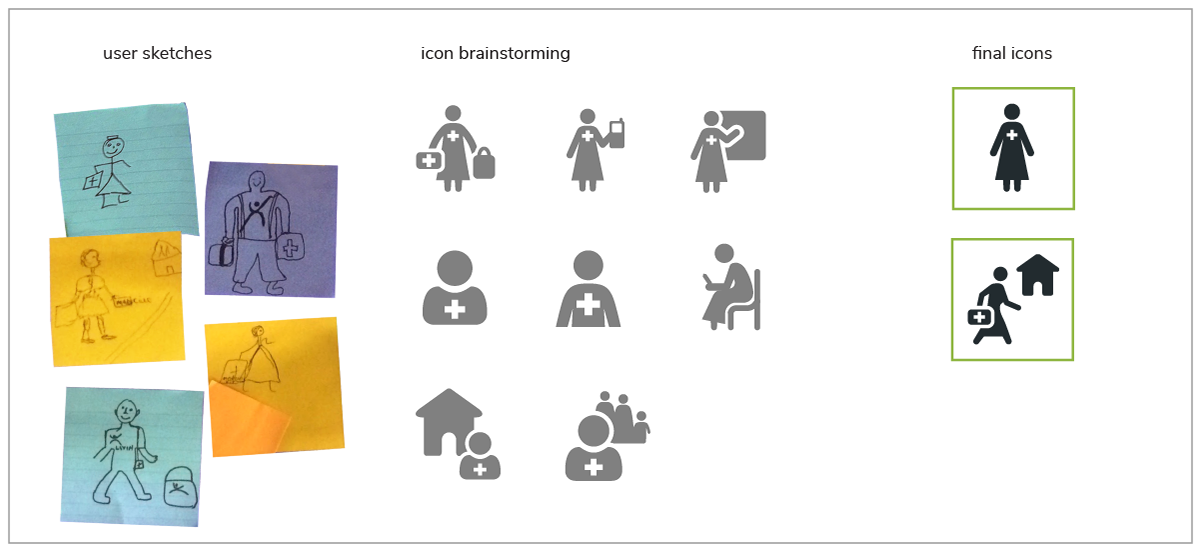
To begin, I conducted an audit of all of our old and existing icons. I made note of duplicates and inconsistencies, as well as potentially confusing images. Then I brainstormed alternative concepts, using the Noun Project to quickly gather some sample images for user testing. I grouped the icons by concept, made them the same size and color, and arranged them in a numbered grid for easier comparison. After rounds of user testing and synthesis of the findings, I used the winning ideas as inspiration to create our own unique icon set.
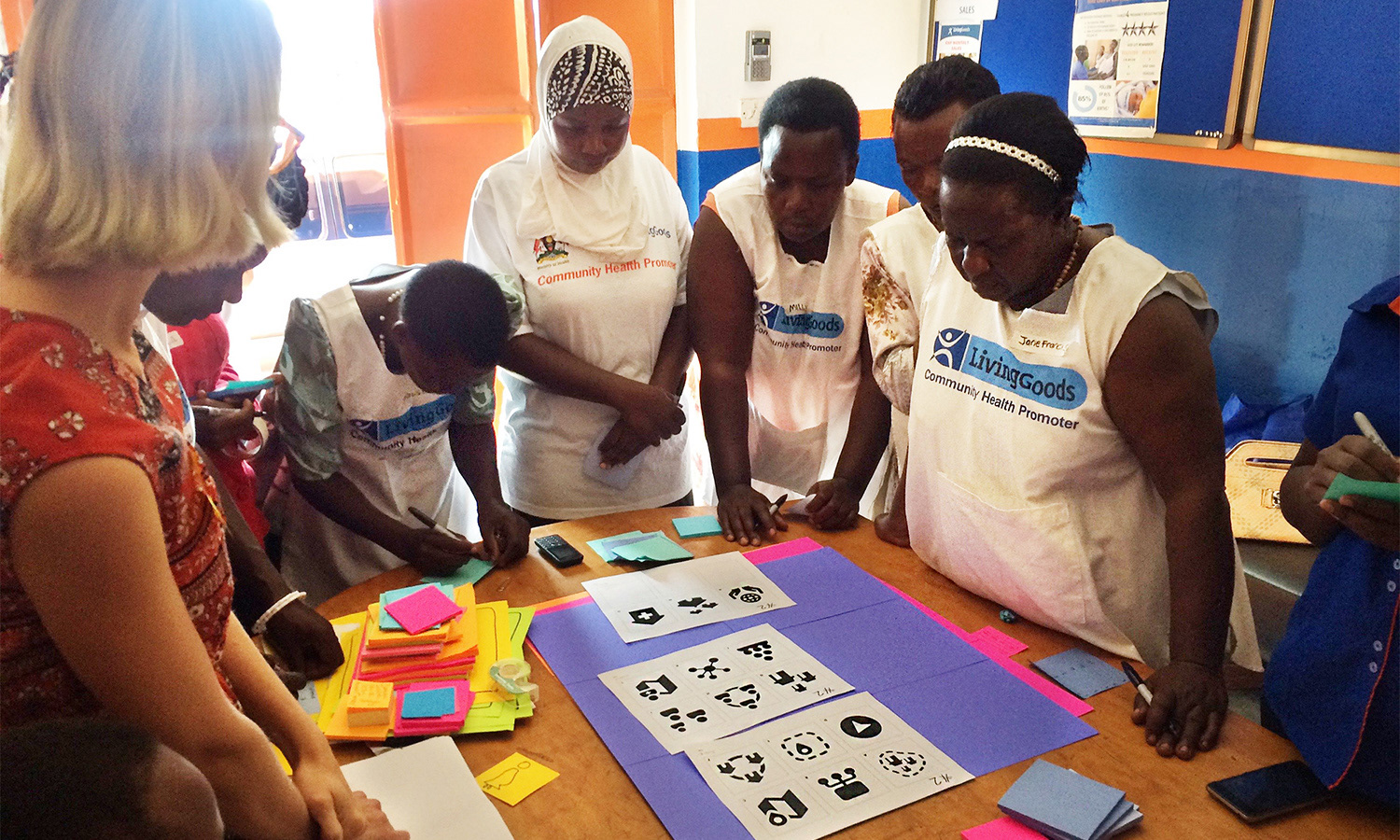
Leading a user feedback session to test various icon options for the webapp.

We encouraged users to draw their own images and add them to the available options.
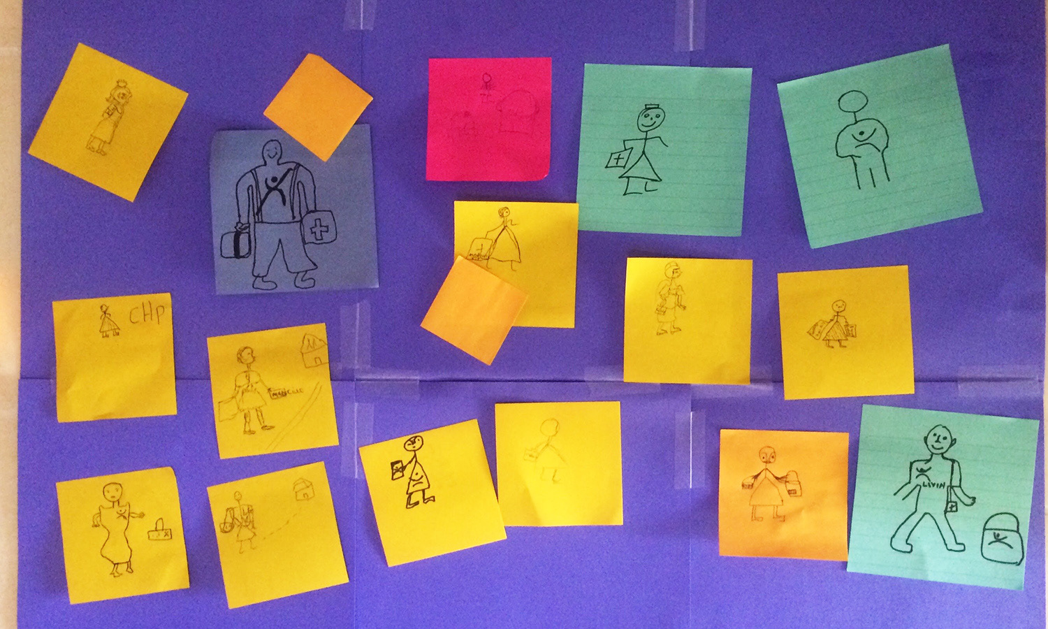
User drawings to represent the concept of a "community health worker" (their own role).

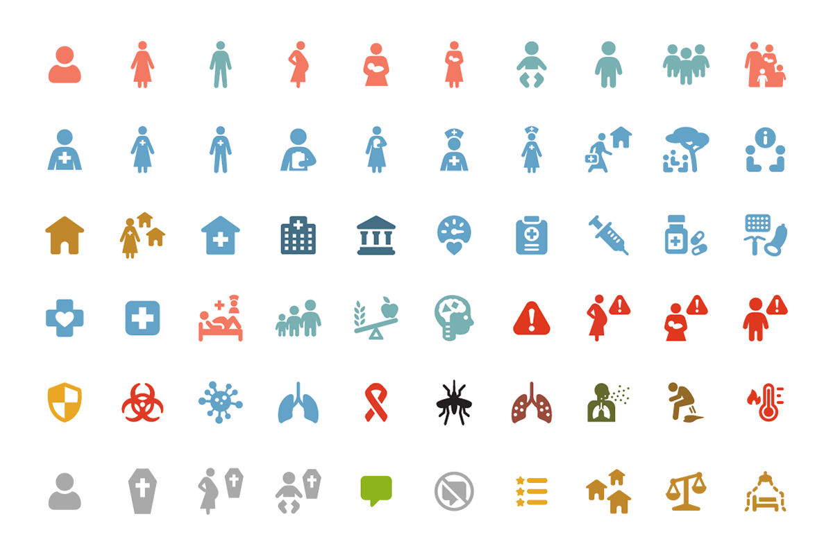
A portion of the final icon set, in colors that add to the meaning and understanding of the image.
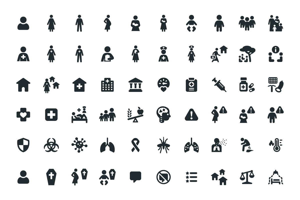
A portion of the final icon set, in one color
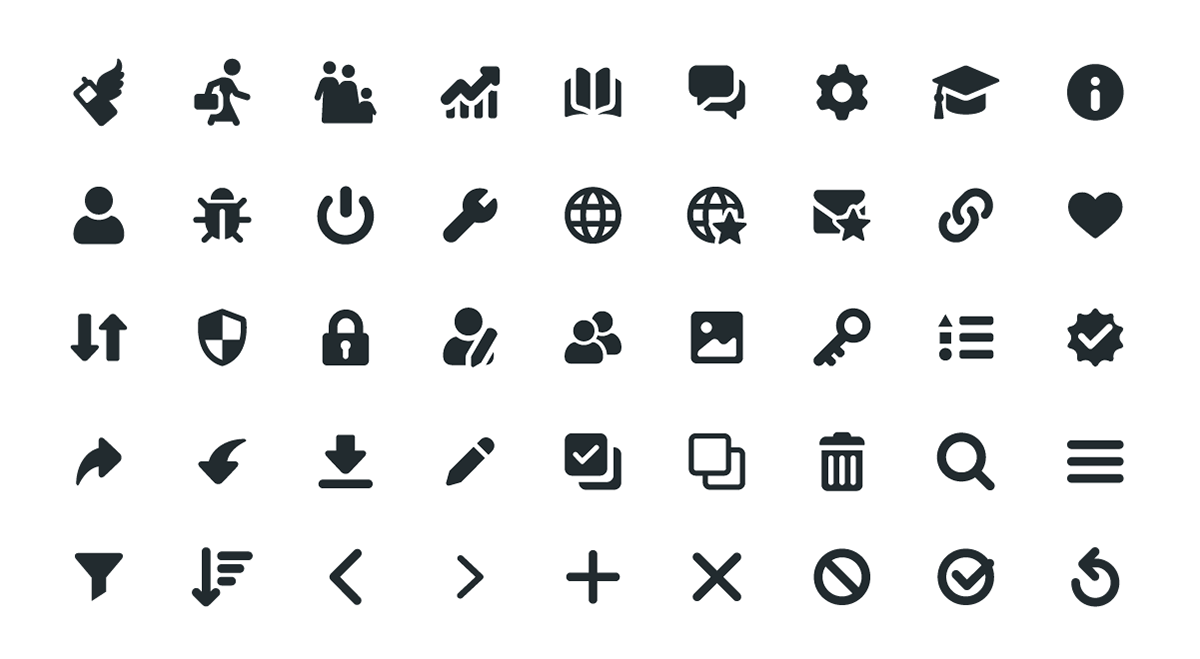
App page, system, and navigational icons