Tinkercad is a free app for 3D design, electronics, and coding used by millions of students and creative innovators worldwide. This project was a refresh of the logged in Tinkercad dashboard navigation to improve overall usability and functionality and align with new branding.
I was the sole UX designer on a small Agile team that included front-end and back-end developers, QA, and both a product manager and an engineering manager. I was responsible for overall design direction, feedback and iteration, and final design specs. I worked closely with developers throughout to scope work, prioritize the most important updates for launch, and track follow-up work.
Time: Design in Fall 2023, development ~ 3 months, launched in March 2024.

Problem to solve
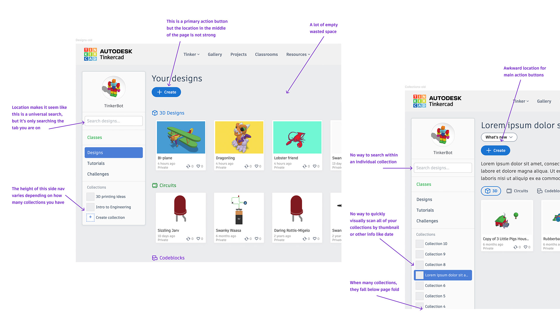
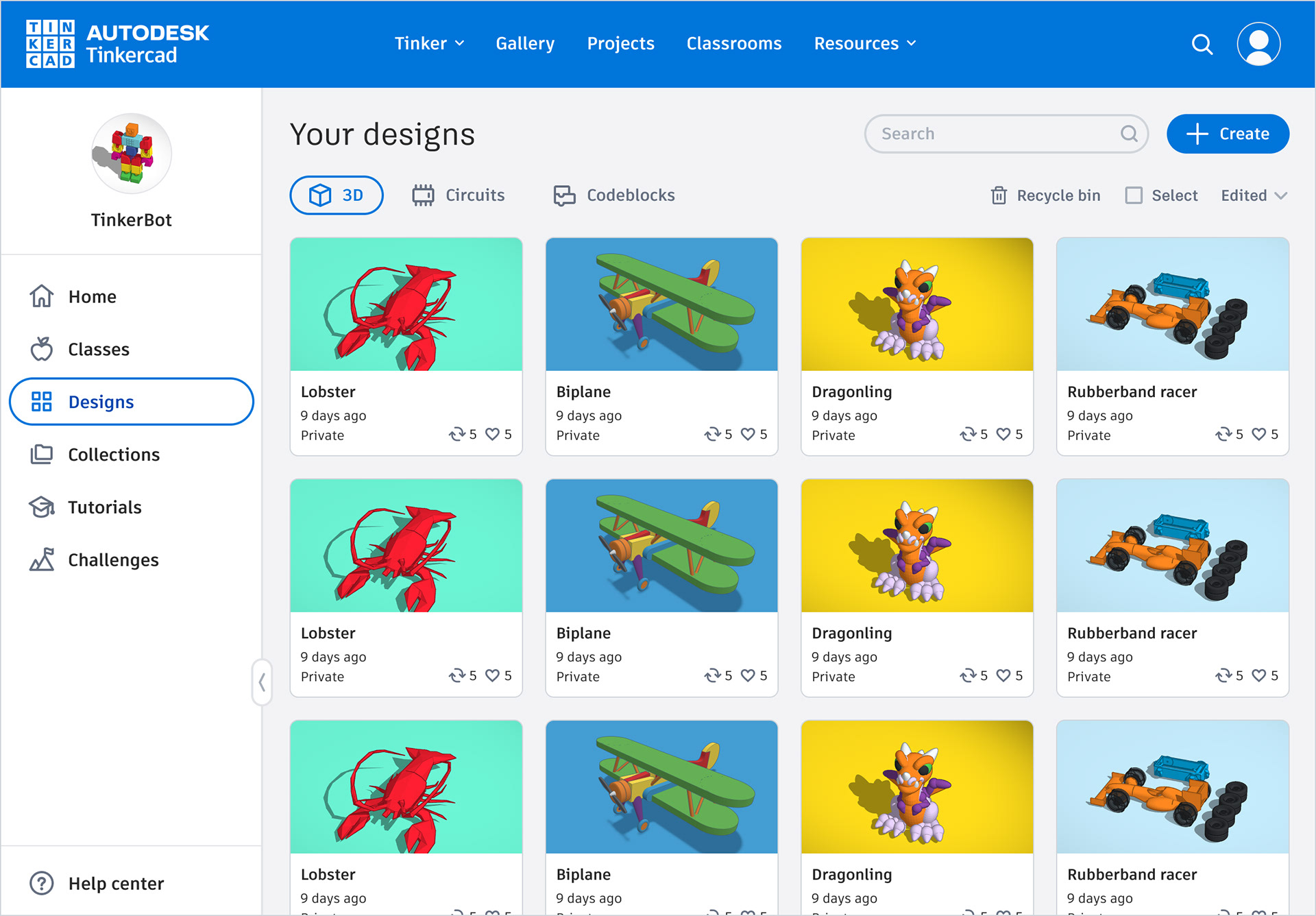
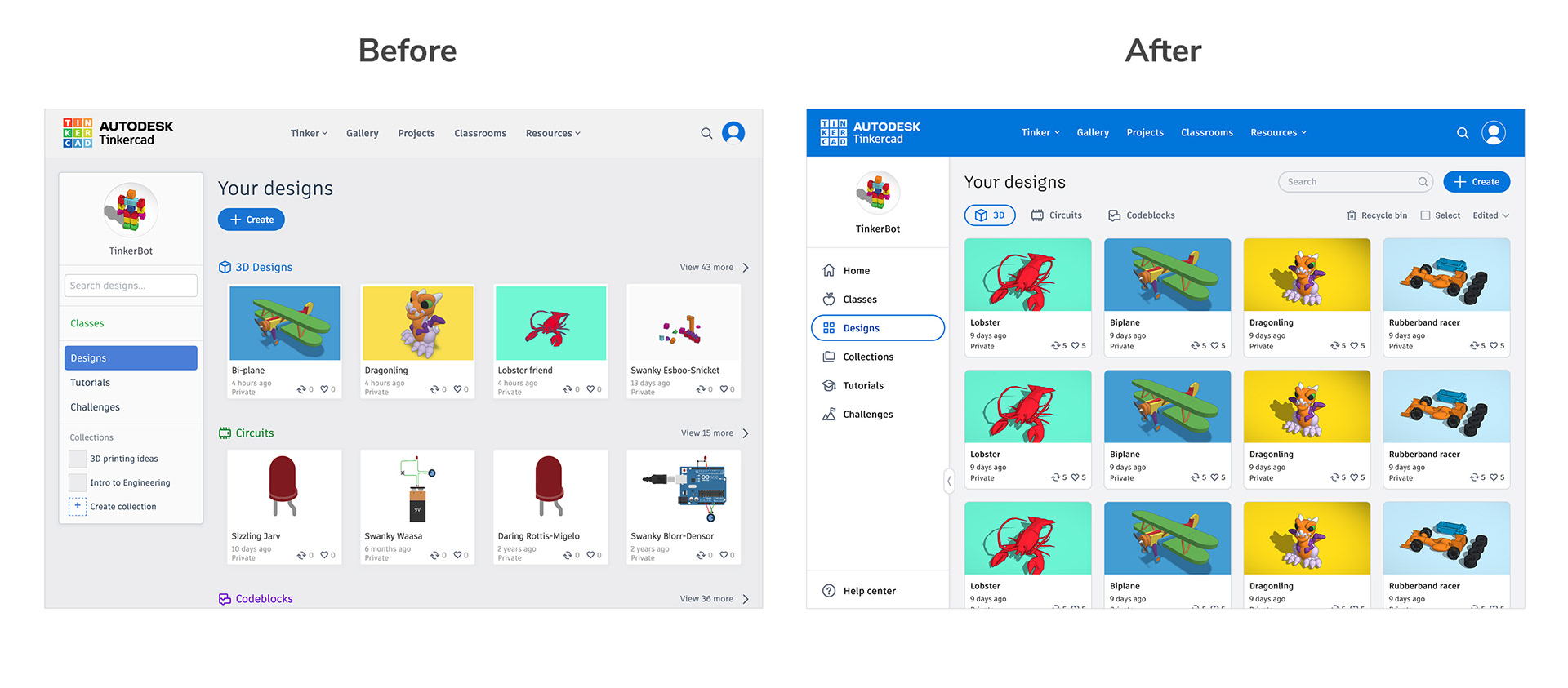
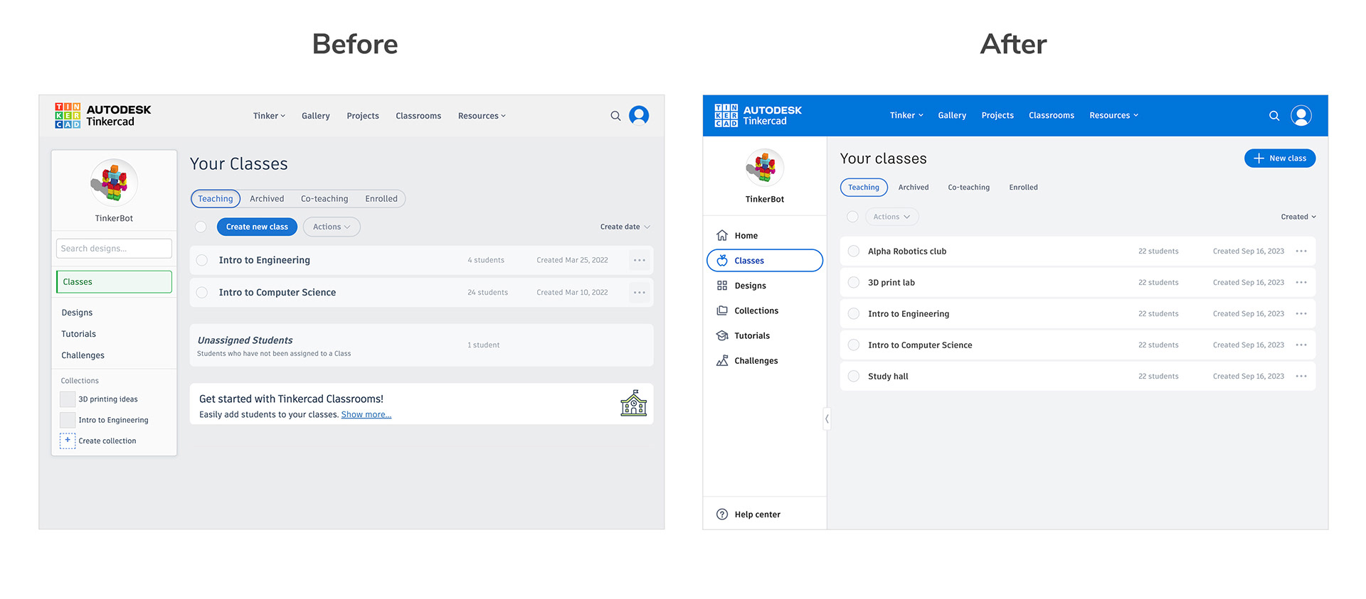
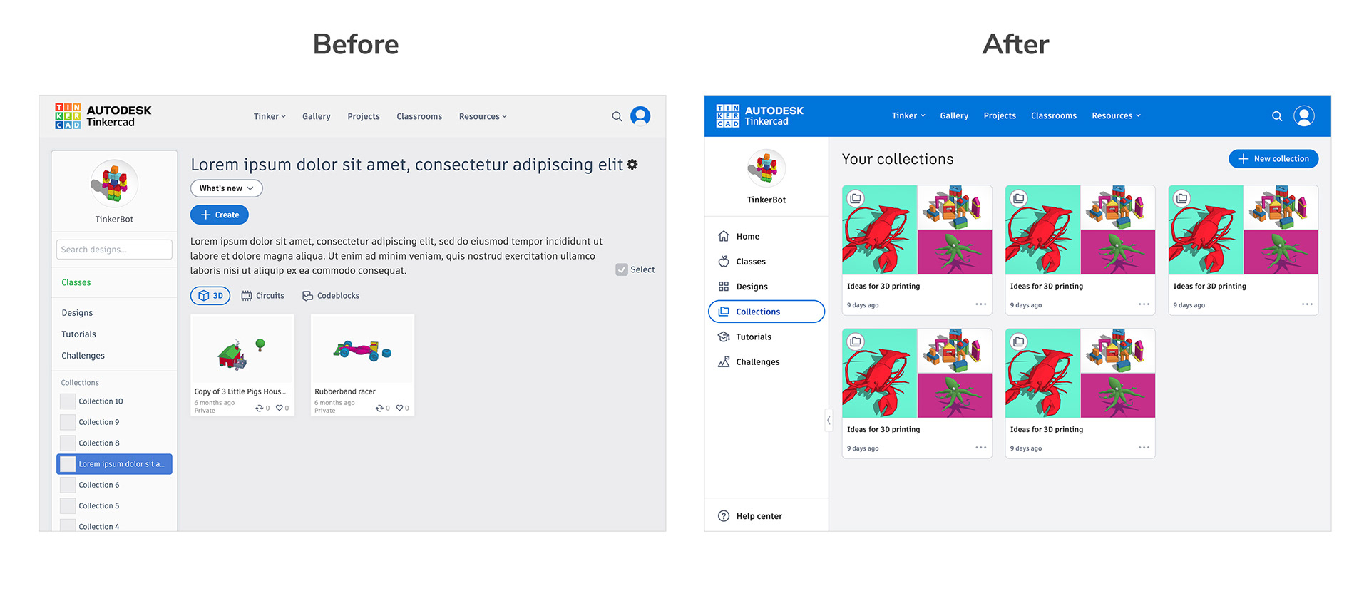
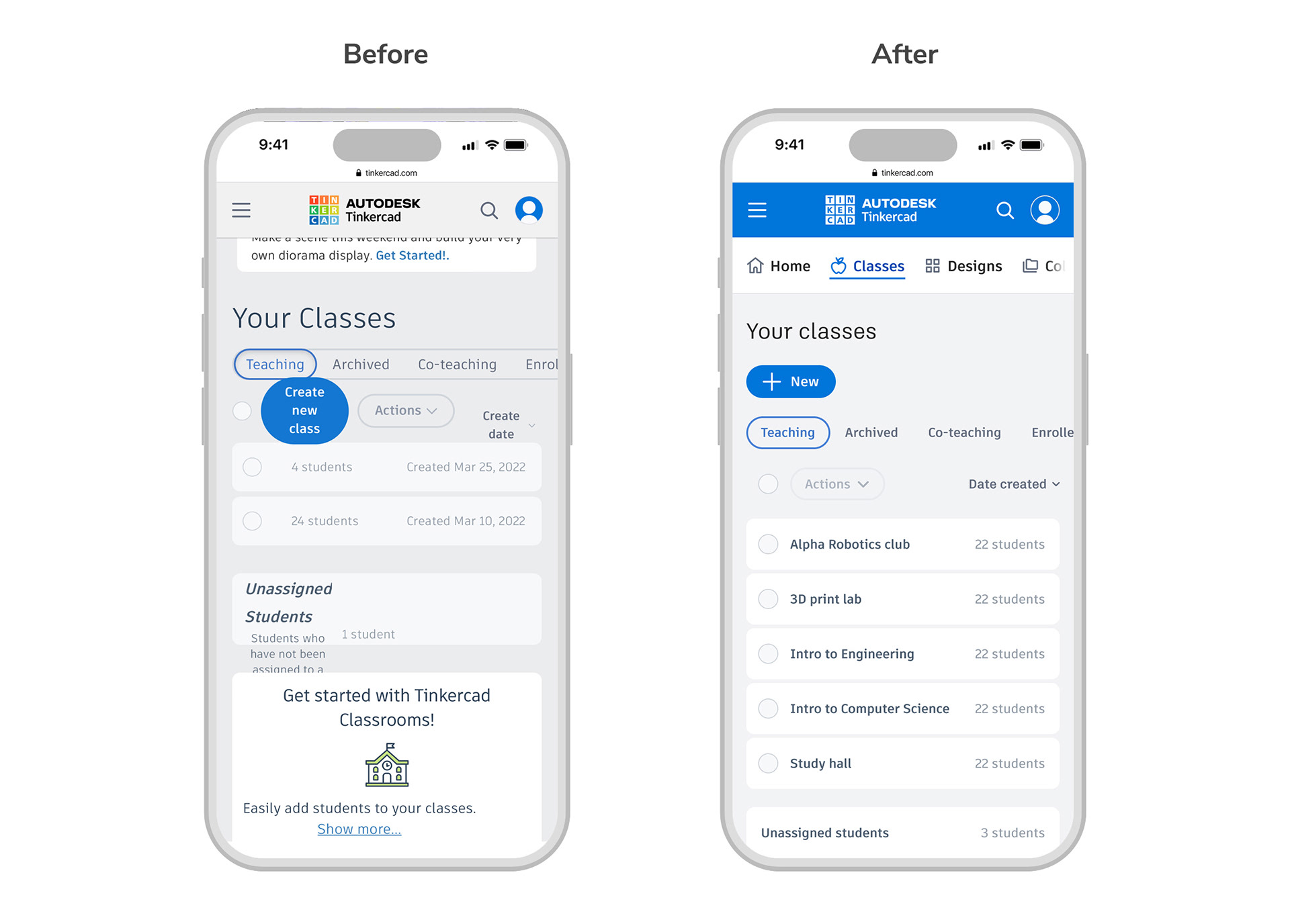
The Tinkercad dashboard is the first place people land when they log in, so it’s very important in terms of overall wayfinding and communication. The old dashboard had an outdated layout and didn’t have any way to surface timely updates and announcements. Collections (groups of designs) lacked a centralized place to view and organize them. The dashboard search function was also buggy and didn't work as expected.
Additionally, the old dashboard was not very mobile friendly. The page navigation took up the entire screen so you had to scroll down repeatedly to see actual page content. Some of the page content didn’t scale to mobile sizes at all.
Process
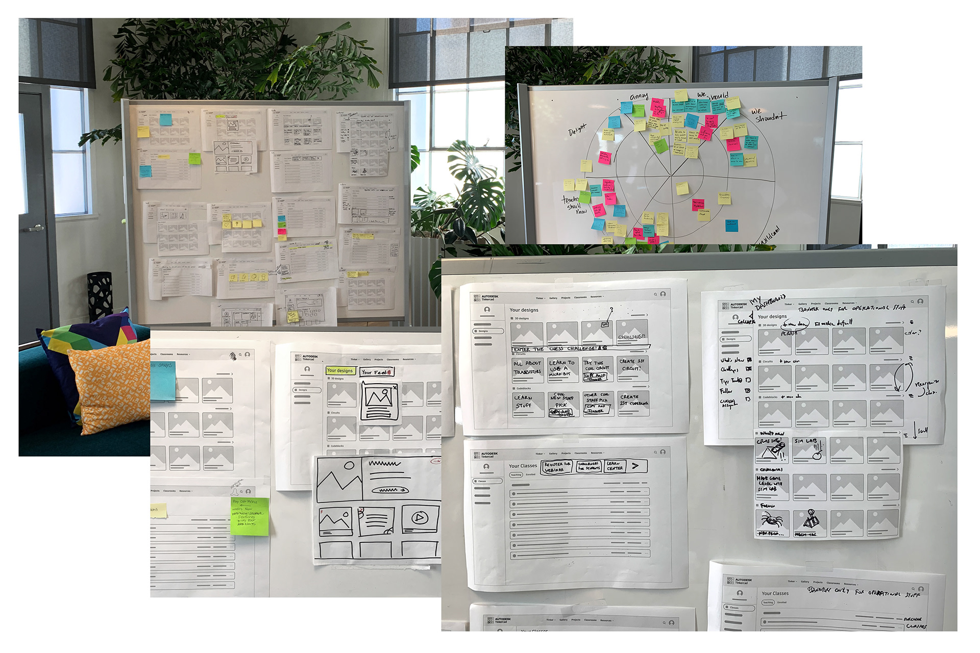
This project originated with a self-initiated heuristic evaluation of the old dashboard navigation. I championed the need to improve the user dashboard and took the initiative to get this project going. After chatting with developers we quickly realized we had a lot of shared goals, as the old dashboard code was bloated and very hard to work with. We decided that along with the redesign we would rewrite the dashboard in React.
The team also had a lot of ideas around dashboard improvements. I led a series of internal group brainstorming exercises to hear people’s thoughts and imagine the ideal future of the dashboard. Some of the ideas raised included adding space for in-app communication about new features and upcoming events and adding more personalization based on user role so that we could show users what's most important to their own workflows.
Solution
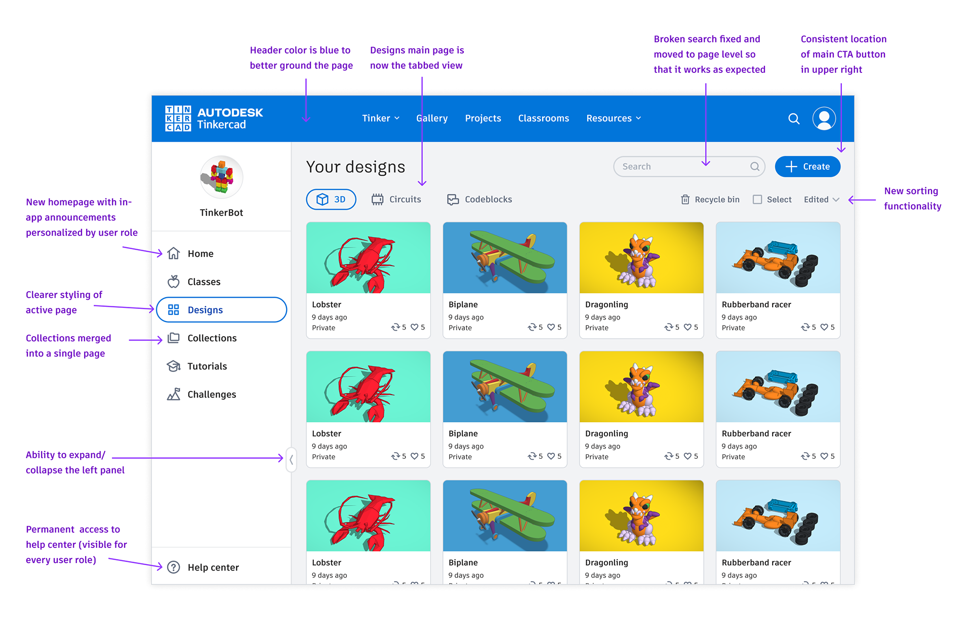
After gathering all of the feedback, I narrowed in on a first round of improvements that would add a lot of immediate value to users and also set the groundwork for further enhancements later on. Some improvement highlights:
• Ability to expand/collapse the left panel improves usability on smaller devices such as Chromebooks and tablets which are very common in schools.
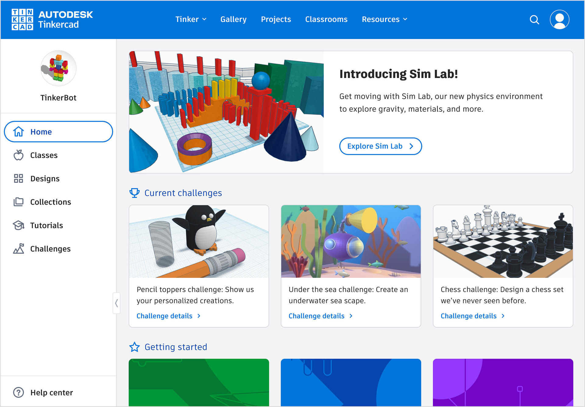
• New Homepage with new in-app announcements bar to communicate about new features and resources (personalized by user role).
• Collections merged into a single page instead of stacked in the nav. Adds a new overview page to visually browse and manage collections.
• Broken search fixed and moved to page level so that it works as expected.
• Mobile nav changed top sticky scrollbar for visibility and space saving.

Challenges faced
This project was challenging for a number of reasons. The scope was huge, the stakes were high, and the stakeholders were many. We were also collaborating with a separate development team which added complexity in communication and prioritization. In particular all of our vast changes put a heavy burden on our QA team. In hindsight we wished we would have held an official kick off meeting with all participants, including QA, so we could explain the plan and get everyone thinking early about their roles.
Another challenge was that our list of desired improvements and ideas far surpassed our bandwidth and initial scope. We ended up having to set aside many ideas for a later time, but, we feel confident that the work we’ve done has set us up for successful iteration in the future.
Measuring success
We were able to track and measure the effectiveness of the new dashboard communication banner:
• When used to promote our Send to Fusion marketing page, the banner increased traffic to the page by 4x (compared to traffic prior to promotion).
• When used to promote our new skill badges feature, 53% of survey respondents who ended up awarding a badge said they learned about the new feature from the dashboard.
Response from a happy stakeholder:
"The design meets all of our early target goals and exceeds them. It is more fun, useful, clear, and generally delightful. The dashboard is setup to be a place to better connect with our customers and help them to be successful as amazing teachers, designers, Tinkerers."
Some quotes from users:
"I believe my favorite addition is the recycle bin. I do appreciate the location of the search button too."
"Much cleaner, and it certainly helps me to navigate and order the many designs that have been building up."